Today, every business needs to have an online presence. Regardless of the types of products or services you offer or the industry you serve, an effective business website is critical to your success.
Fortunately, creating a quality company website is easier and more affordable than ever before. You don’t have to break the bank in order to have an online presence that looks professional and helps to accelerate your growth. In this article, we’ll take a close look at some of the best corporate websites out there. You’ll see real-world examples and find plenty of inspiration.
Create Your Own:
If you’re looking to create a beautiful and effective website for your own business, we highly recommend the Divi WordPress theme from Elegant Themes. Divi is an incredibly versatile theme that allows you to create a beautiful website for any business without touching the code. It comes with a huge collection of pre-designed layouts specifically created for different types of businesses, making it easy and inexpensive to have a great website.
The Best Company Websites
Let’s take a look at the details of some outstanding examples, including some small business websites. You may also be interested in our list of the best corporate and business WordPress themes.
DFDG Architecture
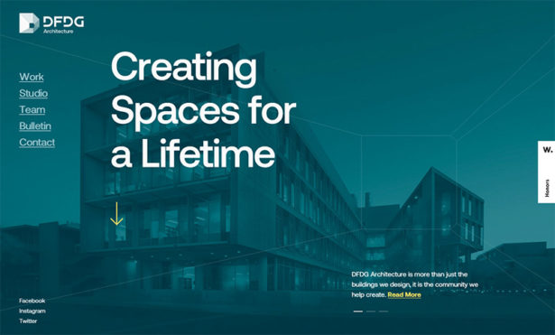

DFDG Architecture’s company website features a quality design that uses a large background photo on the homepage. The site uses beautiful photos, especially on the “Work” page that shows off some of their past projects. The site is easy to navigate with an excellent user experience, provides all of the necessary information for visitors, and makes it easy for potential clients to get in touch with the business.
Martin Building Co.
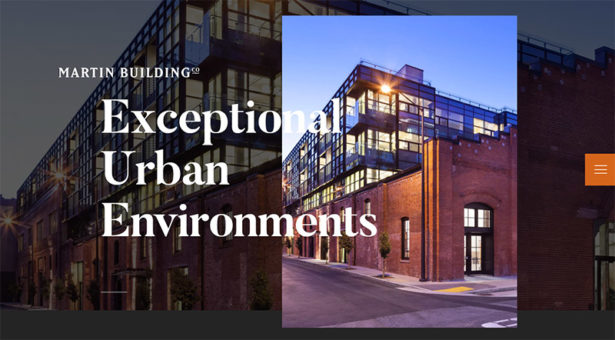

Another architectural firm, Martin Building also uses big background images and professionally shot photos throughout the site for an excellent visual appearance.
When you click from one page to the next, the experience is enhanced with some unique transitions. It’s a somewhat subtle difference but it provides a positive user experience. This may also help to keep visitors on the site for longer periods of time. You’ll also see some subtle effects when scrolling longer pages, like the homepage.
ITI
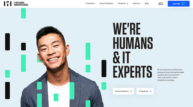

ITI’s company website uses an exceptional design that includes big, bold typography, some subtle effects, and quality visuals. The blue “let’s talk” button in the header really stands out and encourages visitors to take action and get in touch. The site includes a blog that provides plenty of written content aimed at their target audience. Of course, you’ll also find all the necessary details about the services they offer and how they can help.
Paragon Oak
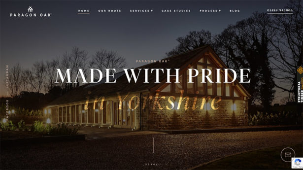

Paragon Oak operates in the construction industry and its website presents an outstanding first impression to visitors. Visually, the design looks great with a full-screen background image. As far as functionality is concerned, visitors will easily find all of the important details related to Paragon Oak’s services and the process they use. The site includes several case studies from past projects, giving details of the work done and including high-quality photos.
PRCO
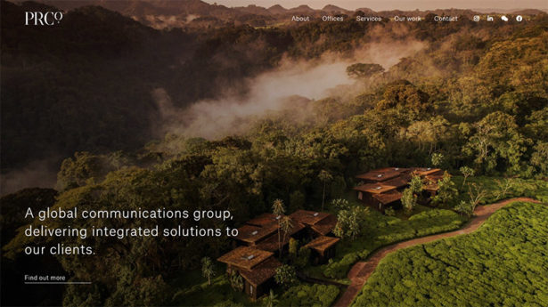

PRCO is a global PR agency and their homepage takes a bit of an unusual approach. Above the fold, you’ll see a full-screen background images along with a brief statement about what PRCO does. As you scroll down, you’ll see a number of images with headlines that link to different sections of the site. However, there is very little text on the front page.
The site is organized and structured in a very logical way. This makes it easy to navigate and find what you’re looking for. PRCO establishes credibility by showcasing some of the highly-recognizable brands that they’ve worked with, like Tommy Hilfiger, Ferrari, Four Seasons, and others.
Ashcroft Law Firm
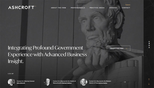

With a dark design and large background photos throughout the site, the design of Ashcroft Law Firm takes a different approach than most corporate website design. The site has everything you would expect from a law firm. This includes a staff page and their areas of expertise and practice. While other entities provide similar information on their website, Ashcroft’s features a little more style while still providing a seamless user experience.
Stink Studios
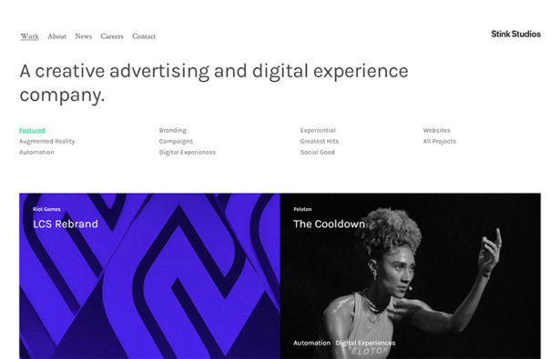

The company website of Stink Studios uses a very clean design with minimal visual elements aside from photos and images. The simple design strategy helps to keep the focus on the content, where it belongs.
One unique design decision was to place the logo at the right side of the header instead of the left or center. As you scroll down the page, if you hove the mouse to the left side of the page, the navigation menu shifts to the left of the layout.
The Ruby Company
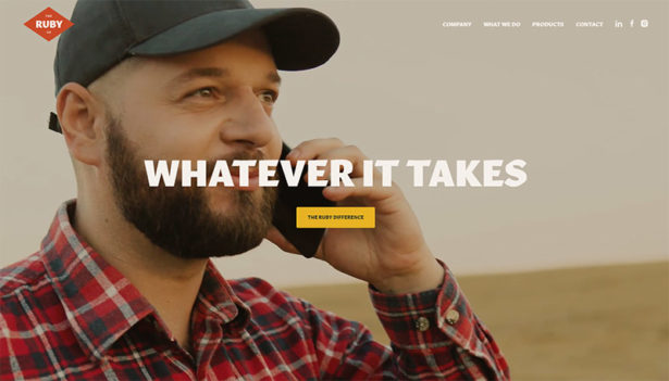

So far, we’ve looked at a number of examples of business websites in industries like real estate and finance, and now we’ll look at a corporate website from an agricultural industry. The Ruby Company offers product supply and logistics and their site is very well done.
Here you’ll find large, professional-quality photos, beautiful typography, and even some illustrations and other visual elements that add to the look. You can easily find all of the relevant about the company and products through a navigation menu that is simple to use. Page transition effects also show the attention to detail that went in to the creation of this website.
Babord Group
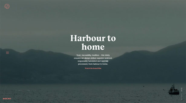

The website of this seafood provider uses a full-screen video background on the homepage and plenty of attention to detail throughout the site. The navigation menu opens up as you click on the hamburger icon to the left side of the screen. When you click on one of the main links in the menu, sub-navigation options appear.
You’ll see subtle background patterns throughout the site. They provide some excellent visual interest without being overwhelming or dominating the design. And professional images (and video) complete the outstanding look. Although it looks great, the site also functions well. It doesn’t sacrifice usability in order to look great.
Oh Planning + Design
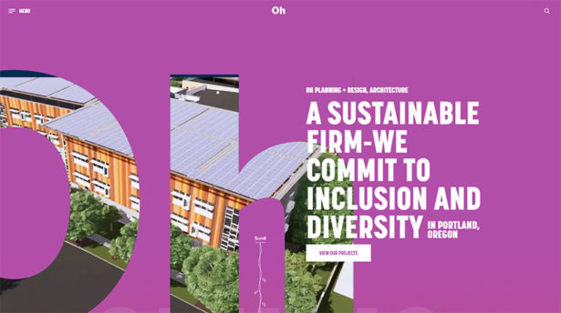

If you like color, you’ll love Oh’s website and branding. This architectural firm uses a beautiful design with vibrant colors and plenty of photos. They have a dedicated page for each of their featured projects with a description and several photos. You’ll also appreciate the navigation menu, which is both well-designed and logical.
The Aberg Group
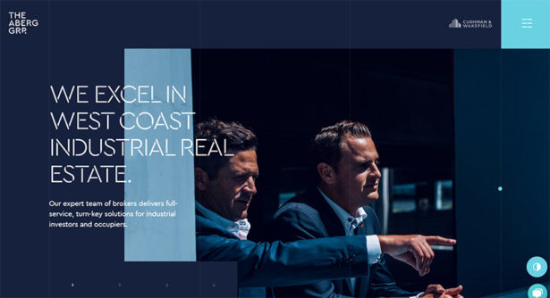

Industrial real estate company The Aberg Group uses a dark blue background and lots of high-quality photos. The site also includes some small amounts of animation as you scroll and interact. Links in the navigation menu lead to the major sections of the site so you can move around with ease.
WSA
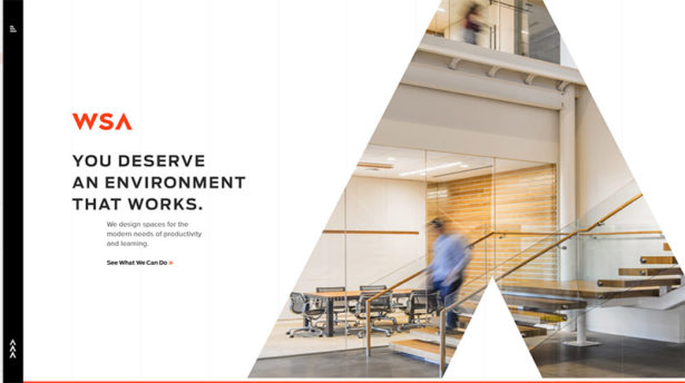

The WSA website includes a lot of photos and some splashes of bright color. The detail pages for their past projects include text to tell the story, plenty of photos, and even video. There are also some short testimonials that are highlighted on these project pages.
Keatons
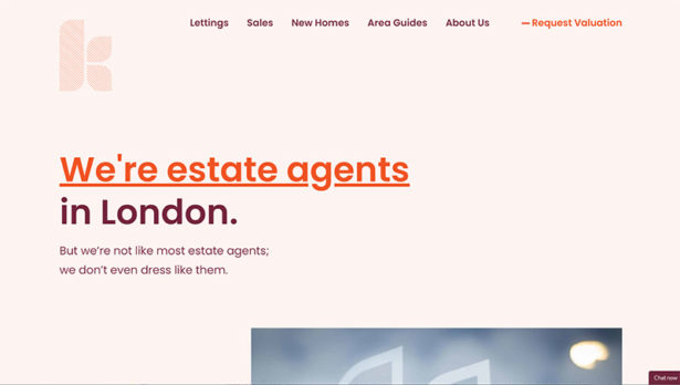

The Keatons website uses a fairly simple design, but it’s well done. As you scroll down the page or navigate the site, you’ll notice many subtle animations and effects that add a nice touch.
Finding information is very easy thanks to a logical structure and a clear navigation menu. There is a team page with bios for team members and plenty of details on properties for anyone looking to rent or buy. The “request valuation” link also presents a call-to-action that helps to generate leads.
Adam Church
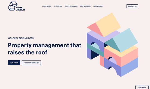

Adam Church offers property management services and their company website is an impressive example that could be used to inspire other businesses and designers. The design of the site is very clean and clutter free. It makes use of color to add a strong visual element to the site. For example, as you scroll down the homepage you’ll come to a “meet your team” link with 4 photos of people to the right. Each photo uses a different background color and all of the colors work together to create a really nice visual.
Throughout the site, you’ll see call-to-action buttons that say something like “talk to us”, “let’s talk”, and “contact us”, encouraging visitors to get in touch.
Conrad Architects
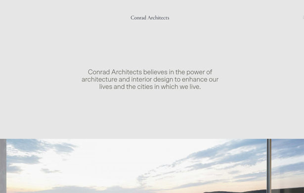

While we’ve showcased a few websites from architectural firms, this one from Conrad Architects takes a much different approach with a very clean and minimal layout and design. As you would expect, the site does use some large photos to showcase their work, but the photos are about the only visual element in a design that is otherwise very simple.
Through the nav menu, you can find information on various projects, including case studies, as well as the company itself. The “journal” is a blog on that site primarily used to show off completed projects and to share other news.
CA Ventures
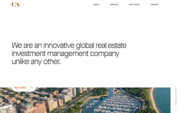

This real estate investment management company has a beautiful website that’s also effective. It features a clean design that makes use of large, high-quality photos that add to the visual appeal.
The company’s services are described in detail and accessible through the dropdown navigation menu. Like some of the other sites covered here, GA Ventures includes a “news” section to share important updates. They’re doing of very good job of keeping this section of the site active with several recent articles being published.
Gantry
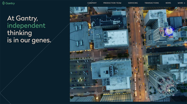

Gantry’s website with a dark blue background features a beautiful design, but the site is also equally functional and helpful. An independent mortgage banking firm, their site has details of past transactions, staff bios, company news, and more.
Unleashed
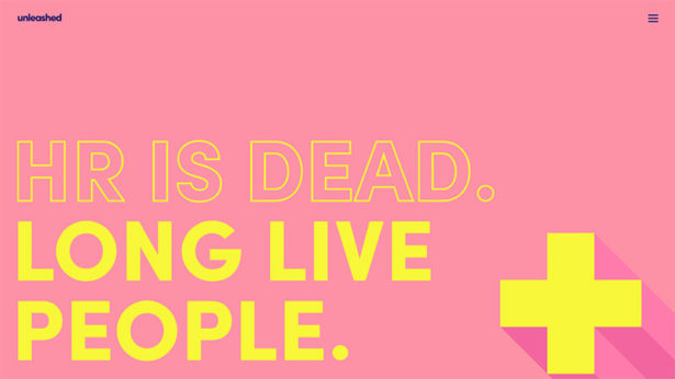

Unleashed’s website is colorful and fun. You’ll love the big, bold typography and lots of scrolling effects. The navigation menu jumps to specific pages, or you can just scroll down.
Although the site is somewhat playful, the information and content of the site is thorough. Unleashed is a great example of one of the best corporate websites that has plenty of character.
NFG Group
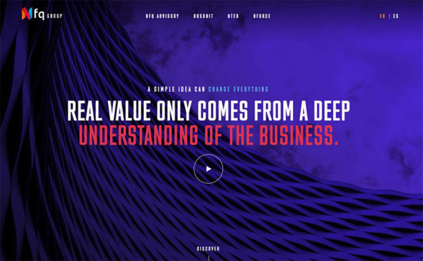

This is one of the most colorful sites showcased here. The homepage uses a full-screen background, you’ll see more color and some subtle effects. Both the header and footer include links to the primary pages.
Kovitz
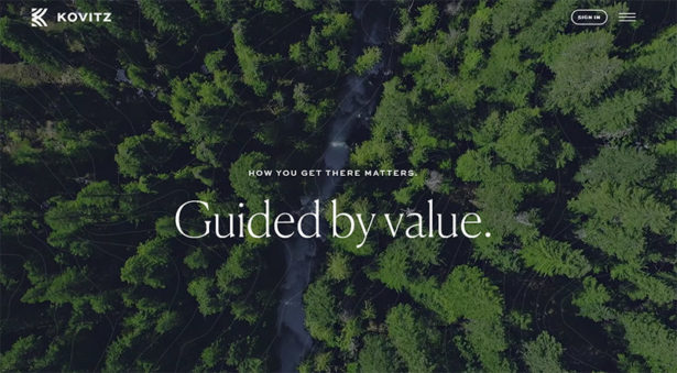

Wealth management firm Kovitz uses a full-screen background video on its homepage. The site also makes use of quality illustrations and some subtle page transitions.
The navigation menu helps visitors to find the right content by breaking down the services into three categories: individuals, institutional, and family office services. Overall, the Kovitz website is very well designed and presents a friendly user experience.
BURFA
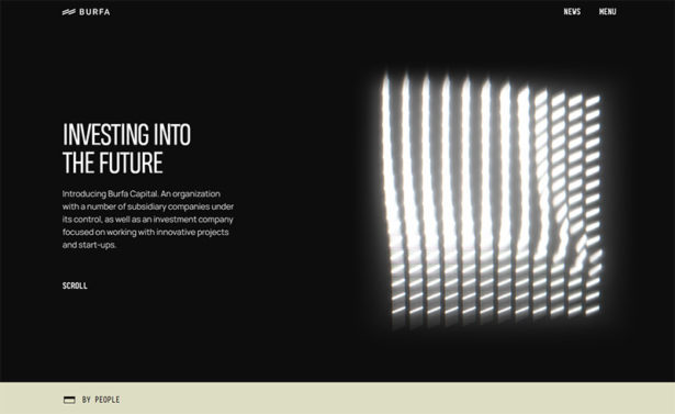

BURFA is a parent company, so their website includes information on the various subsidiaries and projects. The layout is fairly simple and clean and by scrolling down you can access all of the content on the site.
Racine
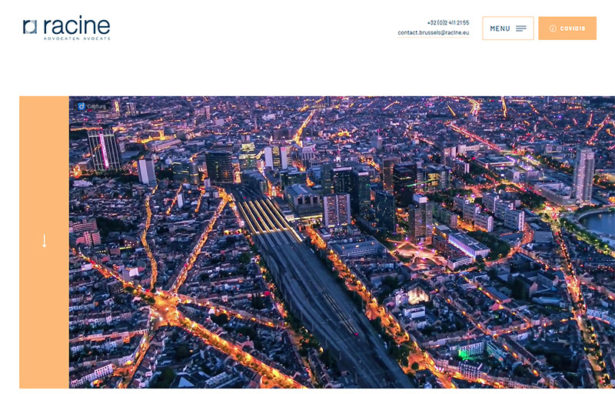

Belgian law firm Racine uses an aerial video of Brussels on the homepage. The site features quality photos and a clean design, while presenting all of the content you would expect from the website of a law firm. This is not a huge site in terms of the number of pages, so the navigation menu makes it easy to find what you’re looking for.
Helios
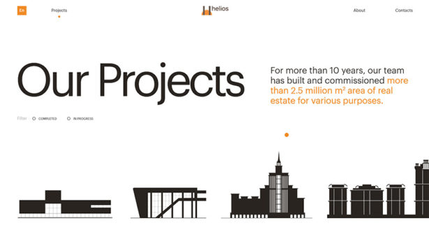

General contractor Helios shows off their work in a creative way. You can scroll over one of the building silhouettes shown at the bottom of the screenshot above, and then click to see more details of the projects, including multiple photos.
The New York Times Company
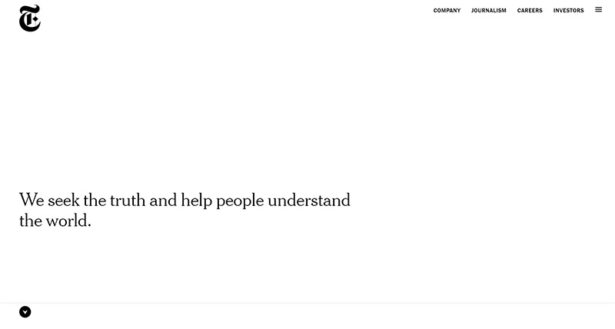

The corporate website of The New York Times Company uses a clean and minimalist design. As you scroll down, large images and headlines will appear. Company information is readily available and a nice touch is the use of numbers and stats throughout the site.
Brighton Park Capital
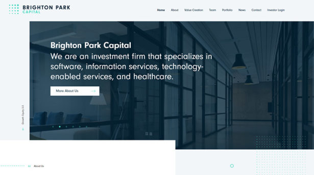

The homepage of Brighton Park Capital clearly communicates what they do. The site provides information related to the types of companies they work with and invest in. A bio is available for each team member, as well as each advisor. The “news” page is essentially a blog that provides up-to-date content about important transactions and other noteworthy events.
Frequently Asked Questions About Corporate Websites:
What is a Corporate Website?
A corporate website or company website is owned by a business for the purpose of communicating with website visitors. Most corporate websites provide content like a company profile, descriptions of products and services offered, company news or announcements, and contact information.
How Do I Create a Corporate Website?
Some companies create their own website in house through a development or marketing department. Others hire a design agency or a freelance designer/developer. Smaller companies with limited budgets often prefer to use an existing platform like WordPress or Squarespace that will save time and money.
What Are the Best Platforms for Building a Corporate Website?
WordPress is the most popular content management system (CMS) in the world and it’s free to use. You’ll need a web host, but you can create a quality company website quickly and inexpensively by using one of the many corporate WordPress themes that are available.
How Much Does a Corporate Website Cost?
Corporate websites can cost as little as nothing and as much as tens of thousands of dollars or more. Options like WordPress and Squarespace are ideal for smaller budgets. If your company decides to have a custom website designed and coded, the costs will be much higher but there is a lot of variation depending on who you hire and the specific details of the site.
For more design inspiration please see:
