Over the past few years, Figma has become an incredibly popular design and collaboration tool. The intuitive interface makes it easy for graphic designers of all skill levels to get started, plus a free plan is available.
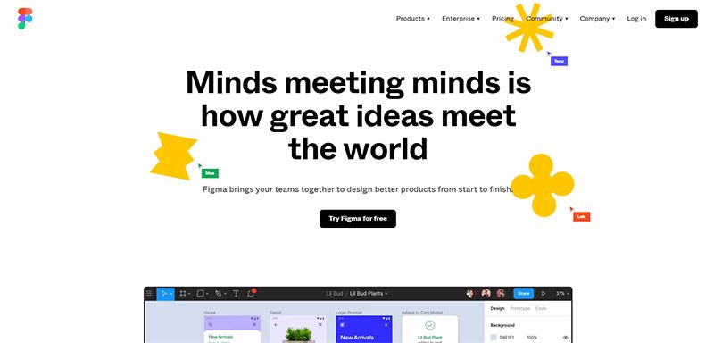
This browser-based editor also allows teams to communicate and work together on designs, wireframes, and shareable prototypes, streamlining the process. If you work on a team, you’ll love being able to share designs.
Figma can also be used to collaborate with clients and other stakeholders outside of your team.
While Figma is user-friendly, there’s still a lot to learn if you’re just getting started. Thankfully, you’ll pick up the key details quickly and the learning curve is relatively short. We’ve put together this collection of Figma tutorials to help you learn how to implement this powerful design tool into your workflow.
UNLIMITED DOWNLOADS: 50+ Million Add-Ons & Design Assets
Figma Tutorials for Beginners
These video tutorials will provide you with everything you need to know to start creating amazing designs in Figma.
What’s Figma?
This short (minute and a half) video from Figma isn’t really a tutorial, but it serves as a good introduction if you’re new to the program. You’ll get a better understanding of why it exists and what it allows you to accomplish. This is helpful in setting the foundation before you dive into more detailed tutorial videos.
Explore Ideas
The Figma team created a series of four videos (all embedded below) to serve as a good introduction for new users. The first video is about 15 minutes long and shows how to get started by designing an app wireframe and prototype. It touches on features like auto layouts and components.
Create Designs
The second video in the series, about 21 minutes long, continues where the first one left off. You’ll learn how to create a high-fidelity design while working with the color and typography options. It also covers some ways to speed up the design process. By working through the app design, you’ll learn small details like how to work with pages, which helps to grasp how Figma works.
Build Prototypes
The third video builds on the work done in the first two videos, designing several screens for the app. Now, it’s on to the process of creating an interactive prototype that puts everything together. With the skills you learn in this seven-minute video, you’ll be able to test ideas and visualize how the final product will work if/when it’s coded. You’ll learn how to create connections between frames so users can navigate and experience the feel of the app.
Prepare for Handoff
The final video in the series is only five minutes long and shows how you can hand your designs and prototypes off to developers for coding. You’ll learn how to use Figma’s features to make it as easy as possible for developers, thanks to features like custom thumbnails, invitations, and permissions, embeds, and more. The video also shows how to export assets that will be used by the developer.
Figma UI Design Tutorials
Here, we’ll take a look at some Figma tutorials that are specifically focused on user interface (UI) design.
Figma UI Design Tutorial: Get Started in Just 24 Minutes
This is a good option for beginners, as it provides an overview for designing apps and websites. It shows how to design interfaces, even if you have no previous experience with the software. You’ll learn how to start a project from a template, create a frame, work with shapes and colors, create buttons, use text, use icons, and more.
UI/UX Design Tutorial – Wireframe, Mockup & Design in Figma
Although Figma is a versatile program, one of the most common uses is designing wireframes and mockups. This is an in-depth tutorial that shows how to create a website design from wireframe to completed design. The video is about an hour and a half long, but it’s well worth your time if you want to master UI/UX design. After working along with this, you’ll be able to design wireframes, layouts, and mockups much faster and more effectively.
Getting Started with Auto Layouts
One of the best features of Figma is auto layouts. They allow you to design complex layouts faster, and this video shows all the details you need to understand. It’s only about 13 minutes long, so it won’t take a lot of your time. You’ll be working with a demo design for a cryptocurrency table that adjusts on the fly in the browser. After watching the video, you’ll be able to use auto layout and frames in your own responsive design as well.
Mobile App Design Tutorial
In 45 minutes, you can follow along and learn exactly how to create this sample mobile app design. It covers everything from finding inspiration to creating the actual design. You’ll walk step-by-step through the app design process, which you can follow and tweak according to your needs to create your own designs. It’s a great overview you learn about specific tools and features in a real-world scenario.
Food Ordering Mobile App Design
This one is from the same designer as the previous tutorial. In about an hour, you’ll go through the entire process of creating a beautiful mobile app design for a food ordering app. The techniques you learn here are extremely relevant because this app design includes many elements and features that are common with a wide range of apps.
Figma Mobile Design Tutorial
Here’s another walkthrough that shows how to design a sample app. It’s just over 40 minutes long and you’ll learn the exact steps to follow.
Create Interactive Components
Interactive components can be used to show different variations of elements based on interaction. For example, a button that changes color (or other qualities) on hover or when it is tapped. This seven-minute video is a great introduction to variants and how to use interactive components quickly and easily.
Design a Website in Under 1 Hour with Figma
If you want to learn web design, this 47-minute video shows how to create a design inspired by Spotify.
Design an Animated Sidebar Menu
One of the best ways to give your prototypes is through details like navigation menus. This video is only six minutes long, but you’ll learn how to create a beautiful slide-out menu that will make your prototype come to life. It involves interactive components, smart animate, and more.
Glassmorphism UI
This one shows how to create a credit card design and background design, with a little bit of background blur. You’ll work with shapes, rounded corners, layer effects, blurs, opacity, blends, and more.
Learn How to Use Figma to Create an Awesome Landing Page
For web and UI designers, this lesson covers the process of designing a sample landing page from start to finish, as well as useful design principles. It’s almost 40 minutes long, but you’ll learn how to use frames and artboards to get started, add a big image, header with navigation, call-to-action buttons, and more.
Dropdown Menu with Variants
Interactive elements are relatively easy to create in Figma, but you need to understand how it works before you can start using this feature. This 10-minute video shows how to add interactivity with a prototype by creating a dropdown menu with several options. You’ll create components that can be re-used. You’ll learn how to add variants and modify the properties for different states.
Wireframes and Prototypes
The tutorials in this section are all focused specifically on wireframes and prototypes.
Designing Wireframes with Figma
This one is an hour long, but you’ll follow along with a real-world example of designing a wireframe. It assumes no previous knowledge or experience with Figma, so it’s great for beginners. By the end, you’ll have an awesome wireframe that you can build on.
Prototyping in Figma
This tutorial builds on the previous one by taking the wireframe and turning it into a prototype (including the use of grids and guides). It shows how to preview your designs as they will appear on specific devices, like the latest iPhone model, or screens of a specific size.
Prototyping and Transitions
This lesson is from the Figma team and it covers some technical details related to prototypes. It’s only four minutes long and you’ll learn how to use transitions, choose animations, set actions, set triggers, control easing, and more.
General Figma Tutorials and Tips
The videos in this section are more general or provide tips that fall outside the scope of the previous sections.
10 Tips to Work 10x Faster in Figma
Learn 10 valuable tips that will speed up your workflow. It covers things like duplicating, resizing, copying styles, holding layer positions, bulk renaming, autolayouts, templates, and more. You’ll learn some keyboard shortcuts and other secrets that will take you to the next level. If you have a little bit of experience with Figma and you want to get better, be sure to watch this.
Pen Tool Basics & Vector Networks
This one is less than four minutes long but it provides a solid overview to the pen tool and vector networks. You’ll learn how to create complex vector shapes, connect them with paths, use the move tool, and much more.
Creating and Using Variants in Figma
This 16-minute video is an excellent overview of variants, working with a to-do list. Once you understand variants, there’s a lot you can do.
Create Reusable Color Styles
This short video shows how to use styles to save and reuse colors and color schemes. You’ll create a master style that determines the colors used throughout a design. This is fairly basic but extremely important for consistency in your design, not to mention the time that you’ll save.
Create a Shareable Team Library
Learn how to stay organized and keep your team members on the same page with a team library (one of the more important collaboration features) and design systems. This is a time-saving feature that allows you to re-use styles over and over in different files.
Conclusion
Figma is an awesome web-based visual prototyping tool and I’m sure you can see why it’s so popular within the design community. It also goes beyond prototypes and can be used for custom icon designs, product design, effective app design, and other aspects of graphic design. With powerful design tools and real-time team collaboration features, there is plenty to love.
The Figma tutorials showcased here will help you to learn the basics and key functions so you can use the powerful tools it provides in your own work on a daily basis.
See more design tutorials here:

