Budget limitations are common with non-profit and charitable organizations. As a result, organizations often compromise on the need for an effective and attractive website due to a lack of resources. This is unfortunate because the website can be one of the most valuable assets for furthering the cause of the organization.
The websites shown here represent some of the most well-designed websites of non-profit organizations. These organizations prove that non-profits can have great websites, and we hope it serves as inspiration for your own work.
Those nonprofit organizations that put a priority on their website can see benefits like increased donations, better involvement from members and supporters, increased visibility and awareness for their cause, and improved promotion for the organization’s events. All of these things can make it worth the time, effort, and cost to create an effective and attractive website.
Related: The Best Church Websites
Are you looking to create a website for a non-profit organization? Our top recommendation is to use the world’s most popular content management system, WordPress. With the help of the Divi theme from Elegant Themes, you can create an outstanding website on a very tight budget, with no need to hire a designer or developer. Divi comes with hundreds of pre-designed pages you can use as templates for your site. Get 20% off Divi here.
Showcase of Non-Profit Websites
Here are some of our favorite current websites of non-profit organizations, charities, and NGOs.
Safe & Sober
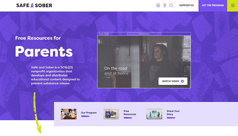
Safe & Sober’s website is colorful and well-designed. The site provides information by way of video, as well as a collection of helpful articles. It’s also easy to find information about registering for the program or providing a financial donation.

Designed by Women
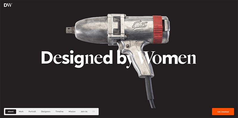
The website of Designed by Women features beautiful typography and big photos. Some video profiles and individual success stories are also included on the site.
What really makes this site unique is the fact that it’s a one-page site with a footer navigation menu that leads to different sections of the page. As you scroll, the active link (black background) changes to reflect your place on the page.

Harbor Path
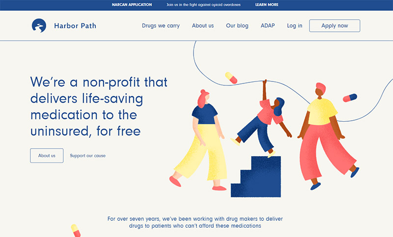
The Harbor Path website features some nice illustrations and splashes of color. There are also some subtle animation effects as you scroll down the page (on the homepage and secondary pages). The About page includes an animated map to show the states that are currently served.

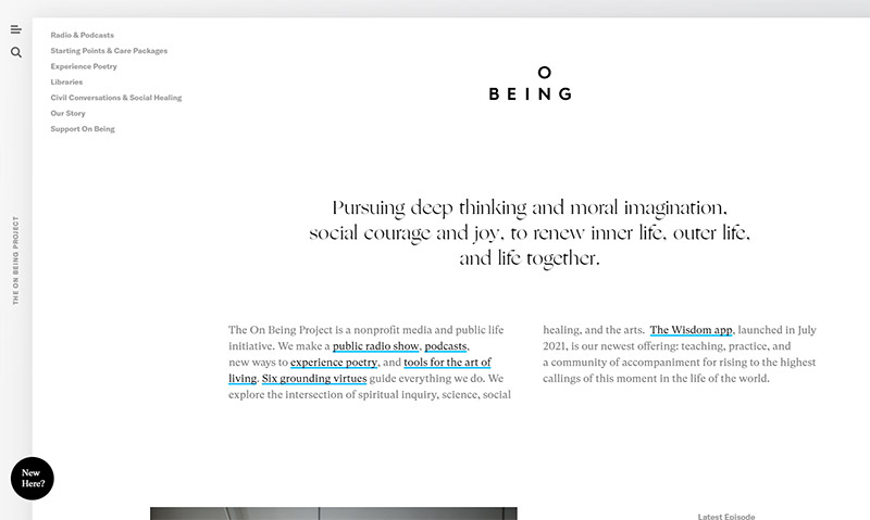
The On Being Project
The website of The On Being Project features a very clean and sleek visual design style. The black, white, and gray color scheme includes a few small splashes of blue. The navigation menu opens up on the left side of the screen when clicking on the icon. The radio & podcasts section includes a wealth of audio content that can be played online or downloaded.

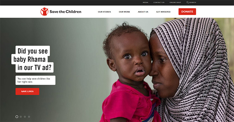
Save the Children (Australia)
The Australian version of Save the Children’s website features a layout that could work very well for many non-profit organizations and charities. The navigation menu provides easy access to important content like “our work”, “about us”, and “get involved”. There’s also a button to donate, which really stands out. The homepage slider features large photos and call-to-action buttons for some of the different programs and priorities. Overall, this is a well-designed website that’s very user-friendly and makes use of simple design elements.

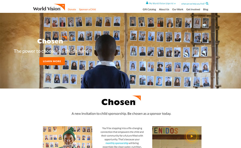
World Vision
World Vision’s website features a video section on the homepage, which helps to grab attention and allows visitors to connect with people being served by the organization. The Gift Catalog is an interesting concept that you don’t see on a lot of non-profit websites. Visitors can see all of the different programs and make gifts of any size, although specific amounts are recommended for each gift.

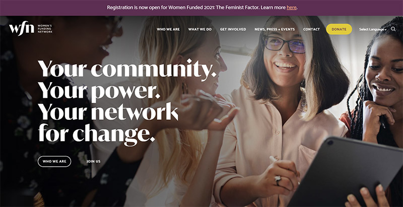
Women’s Funding Network
The Women’s Funding Network uses large photos and big, bold text. Several pages on the site, including “who we are”, “what we do”, and “get involved”, include large photos at the top of the page. Other pages start with a large headline, but most of them include a number of photos throughout the page. This site is a good example of blending both visual and text-based content.

Tennessee Aquarium
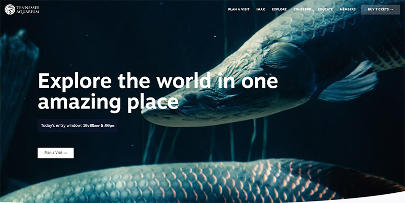
Tennessee Aquarium’s website features a full-screen background video on the homepage that’s sure to grab attention. Of course, there are also plenty of photos and videos throughout the rest of the site as well. It’s easy for visitors to buy tickets for the aquarium of the IMAX theatre directly from the website, with a prominent link in the navigation menu.

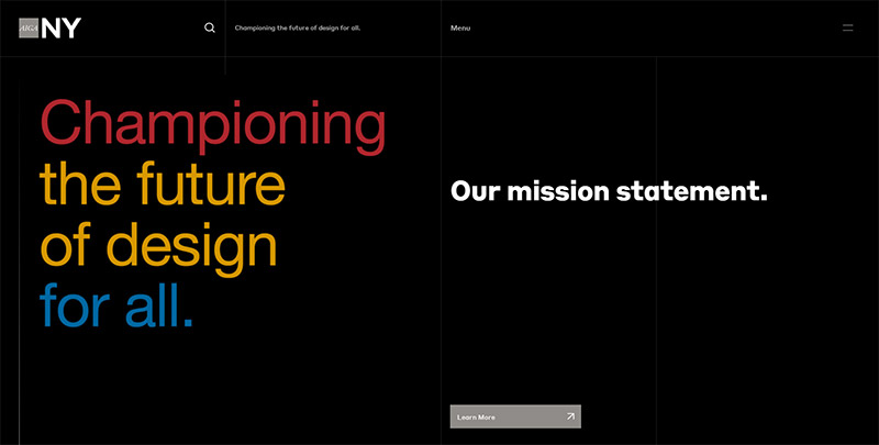
AIGA NY
It’s no surprise that a website affiliated with AIGA would be well-designed. This black website makes excellent use of bold colors and typography. There are very few images on the site, and this is a smaller site that doesn’t include a lot of content.

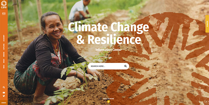
CARE Climate Change
The website of CARE Climate Change is very photo-heavy with lots of images showcasing the organization’s work. The navigation is unique with a vertical menu on the left side of the screen. The “menu” link at the top opens a slide-in mega menu with links to all of the important content on the site.

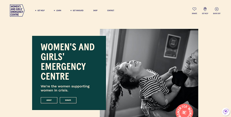
Women’s & Girls’ Emergency Centre
This Australian charity uses a colorful design that includes some illustrations. The header navigation menu opens a dropdown when you hover over some of the links. The site also includes a shop where visitors can purchase different products to support the organization.

OVO Foundation
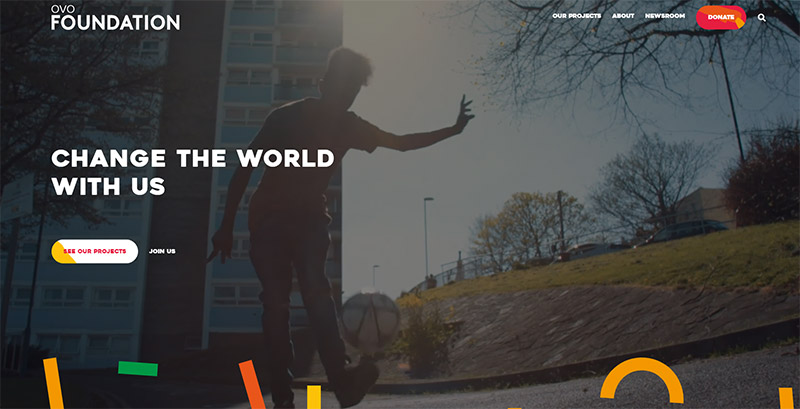
This British NGO uses a full-screen background video on the homepages, with lots of bright colors and images throughout the site. None of the pages are extremely text-heavy. Even the articles and blog content include a large photo at the top, above the fold.

World Wildlife Fund
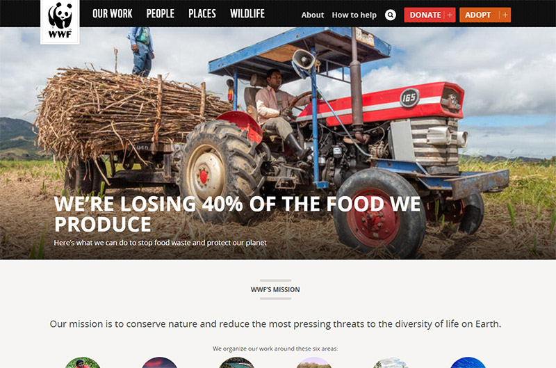
The website of the WWF features plenty of nature, wildlife, and animal photos, as you would expect. They use buttons in the header for two of the main calls to action: donate and adopt. The navigation menu features dropdowns to make it easy for visitors to find what they’re looking for. The lower section of the homepage includes links to many articles and pages with the headline and a thumbnail image.

International Wildlife Coexistence Network
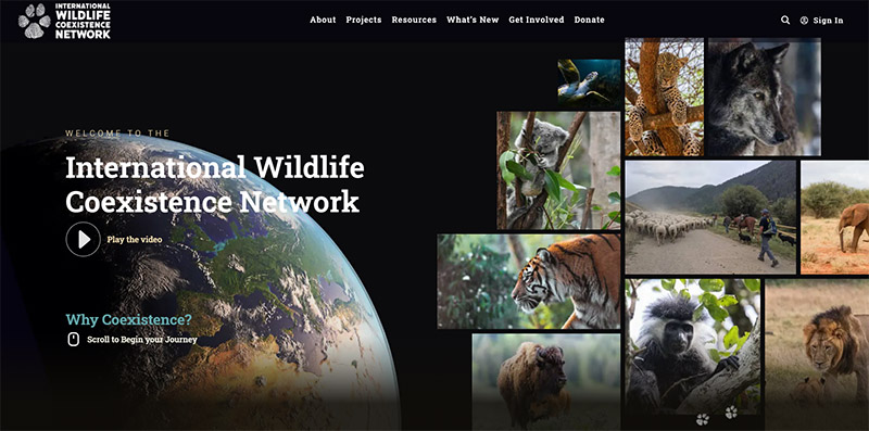
International Wildlife Coexistence Network uses a unique layout that includes horizontal scrolling on the homepage. This dark design uses lots of photos throughout the site, along with some colors that stand out on the black background. Some links in the navigation menu include dropdowns.

Templeton Prize
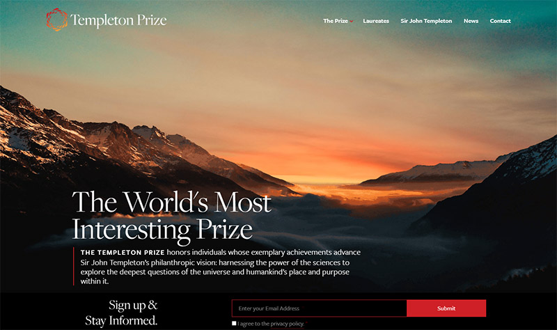
Templeton Prize uses a large background photo on the homepage. As you scroll, there are many other thumbnail images that lead to other pages on the site. The design uses a nice combination of typography, images, and subtle animation effects as you scroll. This is a very large website with a lot of content and educational resources, but there was plenty of attention given to the design of each page.

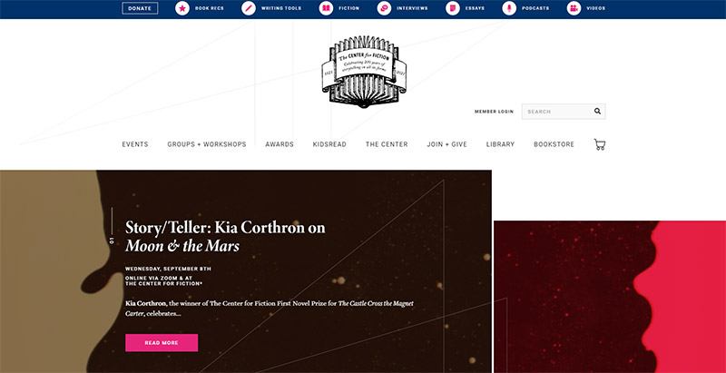
Center for Fiction
This organization’s website features a creative navigation menu with icons and hover effects. There’s also a “donate” link at the left side of the menu that stands out. The entire website is well-designed with excellent use of color and typography. The site also includes a bookstore that’s hosted on a subdomain.

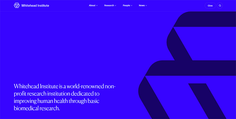
Whitehead Institute
The Whitehead Institute’s website uses a bold blue background above the fold. As you scroll down, the background is white (secondary pages also have white backgrounds). The design also emphasizes colorful photos, and beautiful typography can be found throughout the site.

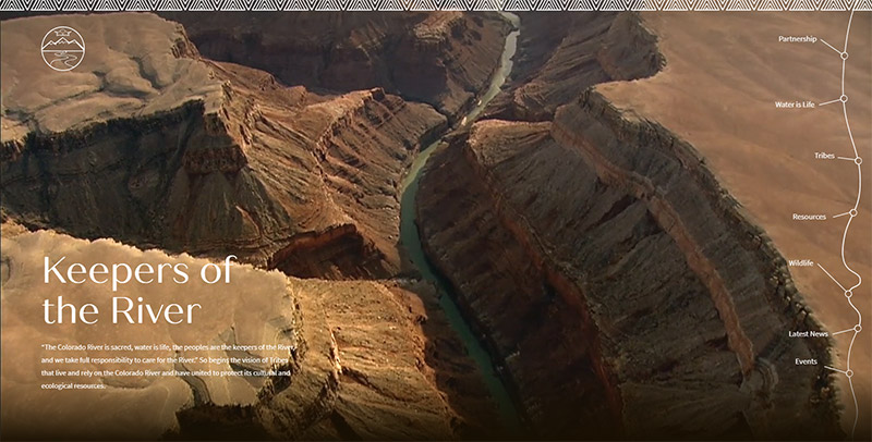
Keepers of the River
Keepers of the River uses a background video that shows the Colorado River from above. This beautiful aerial footage over the Grand Canyon sets the tone for the site. The vertical navigation menu to the right is unique, as it resembles a map of the river.

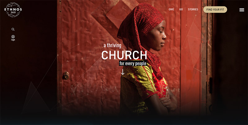
Ethnos 360
Ethnos 360 uses a very image-heavy homepage. After you scroll down, you continue to see more photos and textured images that form the dark background of the page. Most other pages on the site feature large headers or background photos.

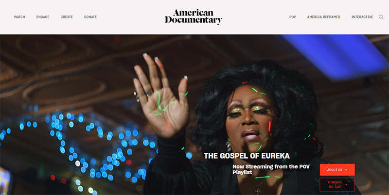
American Documentary
American Documentary uses a beautiful design and a clean layout. The design consists mostly of images, typography, and whitespace. Navigating the site is easy thanks to the basic but effective header menu.

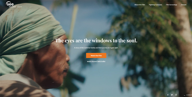
Second Sight
Second Sight is a film by See International, and the film has its own site. Naturally, there is a fullscreen video playing on the homepage. Navigating the site is simple, with an orange button to watch the film and a link to the trailer right below it. It’s not a huge website in terms of content volume, but the pages are well-designed with heavy use of photos.

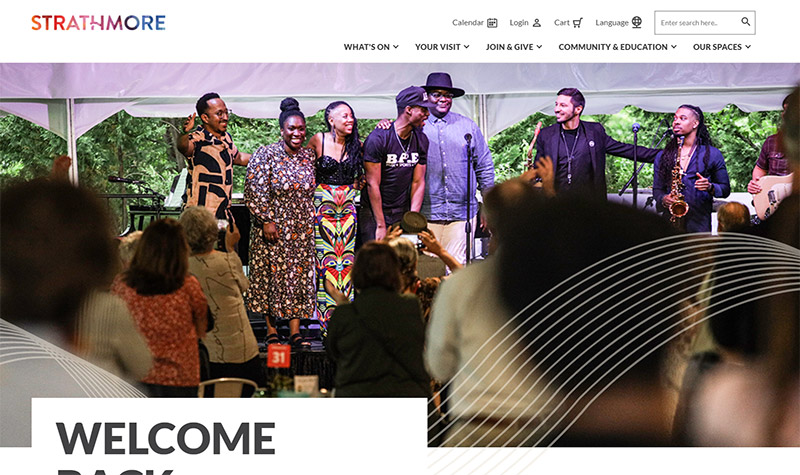
Strathmore
The Strathmore website uses lots of photos and big, bold headlines. The site is well-designed with plenty of color, without going extremely bright or vibrant. It’s a large site with a lot of pages and the dropdown navigation menu makes it easy for visitors to find what they’re after.

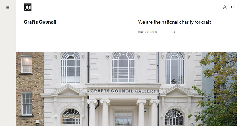
Crafts Council
Crafts Council is a British charity that works with crafts. This is a very content-heavy site with many pages and a lot of information. The clean and minimalist design style works well for keeping the site clutter-free and easy to navigate. The navigation menu at the left side of the screen is hidden until you click on the icon to open it up.

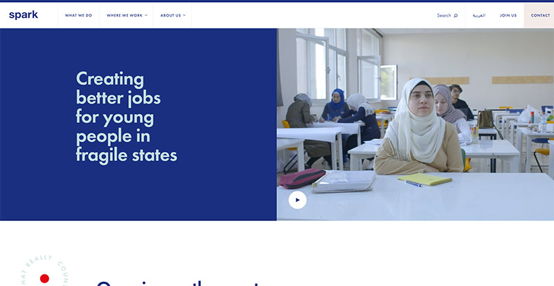
Spark
Spark is an NGO, based in Amsterdam, that works to create better jobs for young people in places like the Middle East, Africa, and Europe. Like some of the others covered here, Spark’s website includes a high volume of content and many pages. The layout is fairly clean, and the design makes extensive use of color (especially blue) and photos.

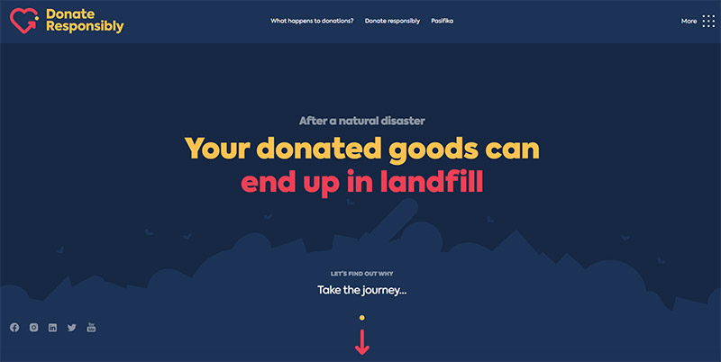
Donate Responsibly
This website features one of the more unique designs showcased here, as it’s filled with creative elements. The site uses a dark blue background with colorful icons, illustrations, and photos that make the design pop. The site also incorporates some animation and scrolling effects on the long homepage as visitors scroll down. Social media links are also used to help visitors connect.

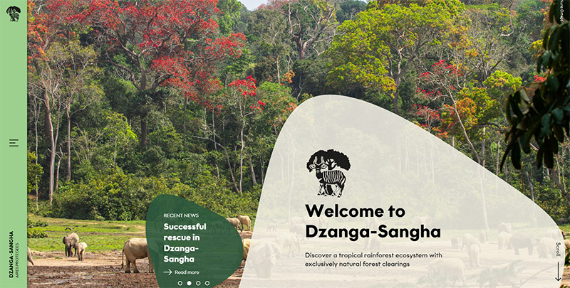
Dzanga-Sangha
The website of this UNESCO World Heritage site features large photos of nature and wildlife, plus a unique navigation menu that opens on the left side of the screen when the icon is clicked. There’s a lot of content on the site in the form of news and stories. Even these text-heavy pages rely on large photos to create strong visual appeal.

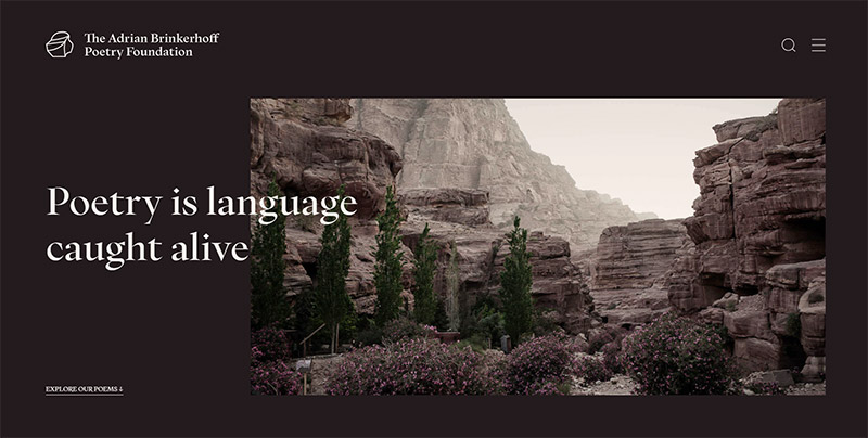
The Adrian Brinkerhoff Poetry Foundation
The website of the Adrian Brinkerhoff Poetry Foundation uses strong contrast between dark and light colors. The homepage has a dark background above the fold, but as you scroll down, the background is white. This clean design uses excellent typography, whitespace, and photos.

KCET
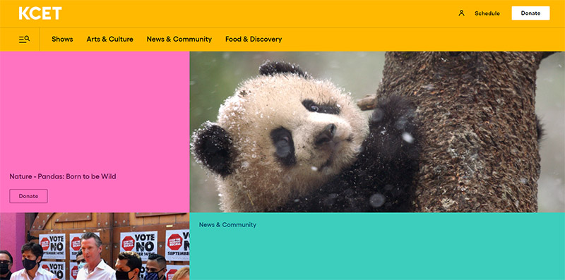
The bright colors of this website will immediately stand out. Many photos are also used throughout the site for visual appeal. As a news website, there’s a lot of content, so navigation and ease-of-use are important.

Equal Justice Initiative
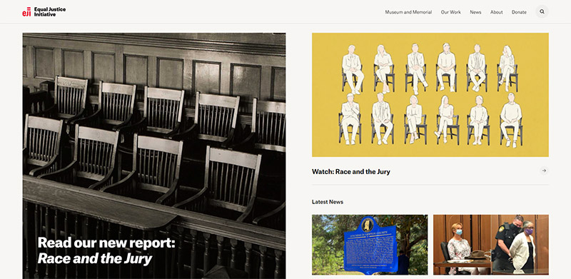
The website of Equal Justice Initiative features a very clean design. The homepage includes large thumbnail images and headlines that link out to articles on the site. The navigation menu is very simple and logical. Throughout the site, large images are used as a major part of the design.

International Energy Agency
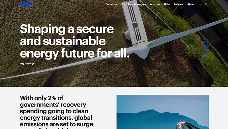
The homepage of International Energy Agency features a full-width video above the fold. The rest of the site uses a lot of large photos, and big, bold fonts. This is a news-heavy site, with the homepage linking out to a lot of articles and reports. A mega menu is used to help visitors quickly find the information they need.

Karel Komárek Family Foundation
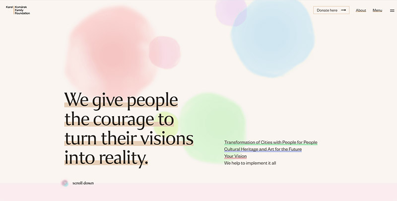
This site uses a pleasing pastel color scheme that gives the design plenty of life without becoming overwhelming. The design also features a strong balance of photos and text throughout the site.

Characteristics of Effective Non-Profit Websites
Now that we’ve looked at many examples of excellent nonprofit websites, let’s take a look at what makes an organization’s online presence effective. Before pouring significant resources into the development of a site, it’s critical to know what needs to be accomplished.
1. Clear Description of the Organization’s Purpose
Each non-profit organization exists for a certain purpose. Website visitors who are not familiar with the organization should be able to quickly get an idea of the purpose when visiting the site for the first time. Ideally, the homepage alone will give visitors a basic idea of what the organization does, and then maybe a more detailed description of the purpose is provided on a separate page.
2. Details of Those Who are Served by the Organization
In order to add a personal touch to the website, information should be shared about the people who are benefitting from the services provided by the charity. In some cases, the flow of content may include specific people named or shown, and their stories are shared with the website visitors through text or an engaging video. In other cases it may be more general information about the audience served, sometimes using numbers and statistics to show the organization’s impact. The personal success story approach is popular and effective because it builds a connection between the viewer and those who are being served.
Photos can also be very powerful and moving, and help to show the impact of the organization. Many effective nonprofit websites include photos of the people who are being helped by the organization, which adds a personal touch and makes it easier for website visitors to feel a connection and an impact.
3. Information About How to Get Involved
Almost every non-profit organization is highly dependant on the involvement of people and groups. This primarily includes volunteer work and financial donations. Volunteer opportunities should be clearly listed so anyone who is interested is able to get involved.
For others, getting involved may mean receiving the benefits of the organization’s services. Details should be provided to explain who the organization helps, and if appropriate, contact information should be listed so people can apply for assistance.
4. History of the Organization
The story of the organization will also be important to some website visitors and potential donors. Most effective non-profit websites will include some sort of bio or history of how the organization came about, and any relevant accomplishments or stories of growth.
5. Details on Upcoming Events
Most organizations use events for fundraising, awareness, encouraging involvement, as well as for service. The organization’s website should list relevant details about upcoming events so that people can get involved in events that interest them. The online events calendar is one of the most effective tools for getting people involved.
6. Quality Design and Consistent Branding
Of course, the best websites are also well designed and feature cohesive branding. Having a quality visual design includes the overall appeal and the user experience. Regardless of the industry, quality design is essential in order to maximize the impact of the website. Many of these websites contain slideshows of high-quality images and the homepage contains engaging content that motivates the visitor to navigate deeper into the site. All the content contained on the site should be linked to each other and there should be a good amount of valid information available to support all the facts and stances. Good designs come in a wide variety of forms, and in the showcase below you’ll see plenty of examples.
7. Online Donations
When it comes to financial involvement, most organizations now make it possible for visitors to donate online. Information should also be provided to inform potential donors how their financial gifts will be used. Some organizations provide details of different projects and allow donors to choose how they get involved (an example would be the many organizations that allow you to sponsor a specific child through that you select through their website).
Today, most charities accept online donations by credit cards and/or PayPal. You want to make it as easy as possible for donors, and adding donation buttons in prominent locations of the site is a great first step. You can either host a donation form directly on the website that processes a credit card transaction, or link to a third-party service, like PayPal, that will process the transaction.
Regular contributors and prospective donors should be able to easily find the giving options and be able to complete the transaction in just a few minutes or less. The donation process should be as simple as possible to encourage more online giving.
Final Thoughts
Since the website is such a critical part of any charity or advocacy organization, nonprofit web design should be given plenty of attention. Not only is the design aesthetic important, but the content, stories, and the ways the site connects with visitors will be crucial.
If your organization is working with a limited budget, hiring a design agency may not be a viable option. We highly recommend using WordPress and the Divi theme to build a high-quality website that will meet all of your needs.
