Today’s consumers have many options for online shopping. In order to generate sales through your e-commerce website, you’ll need to provide an excellent user experience and convince visitors that your products and your site are worthy of their business.
Designing for e-commerce websites presents some challenges, compared to working with other types of sites.
In this article, we’ll look at nine specific factors that are generally present on well-designed e-commerce websites. This discussion should help you to plan your own site and ensure you’re able to create a site that will meet your goals.
Looking to create your own e-commerce website? We recommend using Shopify. It’s a feature-rich platform that’s very easy to use and affordable for businesses of any size.
1. Simple
The focus of an e-commerce site should be on the products for sale. A design that’s extravagant for no legitimate reason will usually do more harm than good. It will draw attention to the design of the site and away from the products.
If you browse our showcase of beautiful e-commerce websites, you’ll notice that many of these sites feature a very clean design and layout. This style works well for e-commerce because it keeps the emphasis on the products instead of the design.
Simplicity in design and layout also helps to improve the user experience. Simple sites are easy to navigate and shoppers can find what they’re looking for with minimal distractions on frustrations.
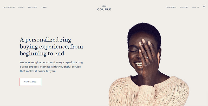
Couple.co uses a clean, elegant layout and design.

2. Branded
Many shoppers are influenced in their purchasing decisions by the brand. The need to establish a strong brand is important for both online and offline selling.
In the cases of stores that sell online as well as in physical locations, the website is only one part of an overall branding strategy. The website should work well with other branding efforts of the company so that customers feel comfortable on the website.
As a startup, branding should be a long-term goal. You won’t have the benefit of a long history and trust that’s been developed with customers. You can start by creating a strong brand image that’s used consistently on your website, your social media profiles, and other marketing materials.
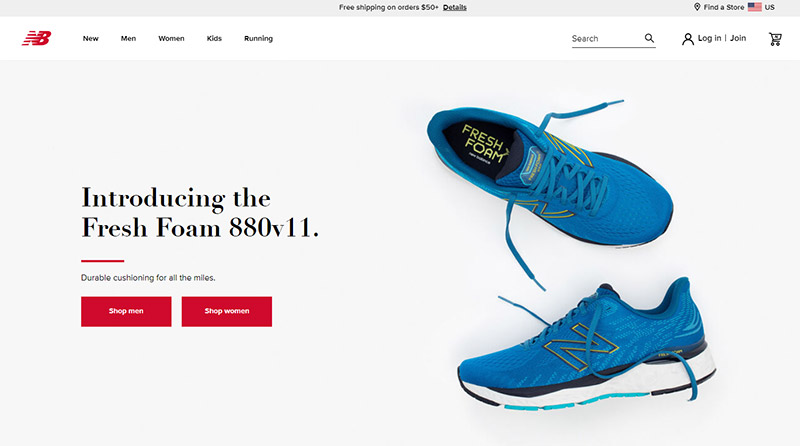
New Balance is a familiar brand to many people. When you visit their site, you’ll see the recognizable New Balance logo in the site header, and the huge photo on the homepage also shows a shoe emblazoned with the logo.

3. High-Quality Photos and Images
Selling online is different than selling in a physical store because the buyer cannot touch the product or see it in person before making a buying decision (unless they’ve seen it somewhere else).
Providing quality photos that accurately portray the product can help overcome this challenge and can make the buying decision easier for visitors.
Ideally, product detail pages should include several high-res photos for each product. Shoppers may want to see different sides or angles of the product. The more they can see, the better they’ll feel about buying a product they haven’t been able to see in person.
The quality of photos and images is also critical because visitors will judge your company and your products based on these visuals. High-quality images will give the impression of a high-quality product.
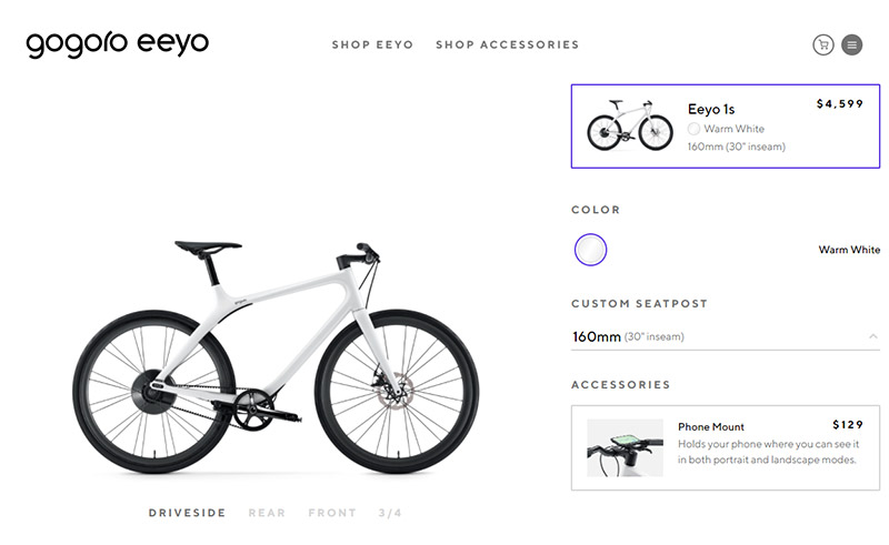
Gogoro Eeyo uses very high-quality product photos on its site. Viewers can see photos of the bikes from the driveside, front, rear, and 3/4.

4. Social Proof
Visitors who haven’t purchased from you in the past are likely to be skeptical. Any type of social proof you can provide will go a long way towards convincing visitors that you’re legit.
Social proof can involve:
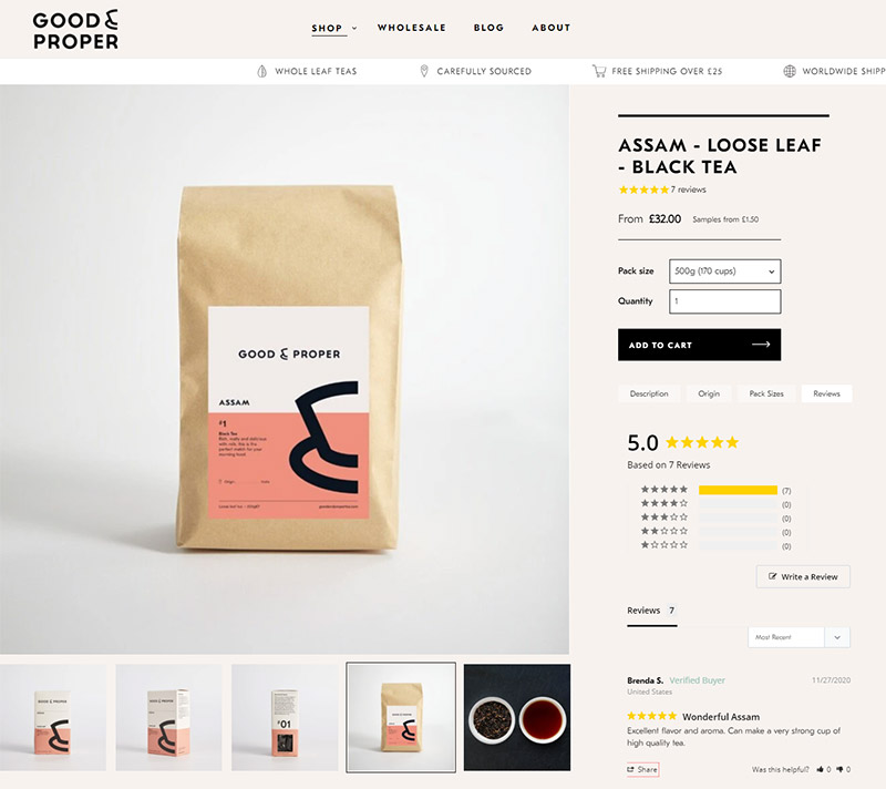
- Genuine user reviews and ratings – Today’s shoppers want to be able to read product reviews from other customers. With a platform like Shopify or BigCommerce you can easily add review functionality to your site.
- Testimonials and quotes from customers – Showcasing customer testimonials on your website can also help to build trust with visitors. Including a photo of the person providing the testimonial will help to make it feel more genuine and authentic.
- Media coverage or recommendations on other websites – Show visitors where you have been featured. You can gain the trust of visitors by leveraging the exposure you’ve gotten elsewhere.
- Social proof popups – A growing number of sites are using small notification popups for social proof. Visitors see that other people are buying your products and it helps to build trust.
Good & Proper (built with Shopify) provides user reviews on product details pages.

5. Easy to Navigate
The first requirement for selling a product online is that the shopper has to be able to find exactly what he or she is looking for. Effective navigation is important to any website, but it’s especially critical for e-commerce sites. Lost visitors will result in missed sales, so every effort should be made to have a site with clear, logical navigation.
E-commerce sites often face considerable challenges with navigation due to the number of products presented on the site. Large sites, like department stores, have to be especially careful with navigation because finding what you want will usually become increasingly difficult with more options. Many e-commerce sites use mega menus so visitors are able to find exactly what they want in a quick and efficient manner.
One factor to consider is how the average visitor will attempt to find a particular product. What makes sense to the designer or to the company owing the site may not be the same path that the average visitor would take to find a product. Sufficient user testing is extremely helpful for identifying potential navigational issues.
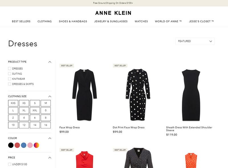
Navigation can also be aided with features like a good sitewide search along with filtering and sorting options. The filtering and sorting may be applicable for browsing categories of products in addition to the site search results.
Other features like related products, lists of top selling products, and breadcrumbs can help with navigation, in addition to having an effective menu.
Aside from a dropdown menu, Anne Klein offers several filtering options to help customers find exactly what they’re looking for.

6. Easy Checkout
User experience on e-commerce sites is critical to success. If the checkout process involves too many steps or is confusing, shoppers will wind up abandoning their cart with items left unpurchased.
Ideally, the checkout should involve a minimal amount of steps and should be as easy as possible for shoppers. Don’t force visitors to create an account in order to checkout. And if they do have to create an account, be sure it involves no extra steps aside from creating a password.
Lots of user testing and generating feedback can help to create an effective checkout process. The easy solution here is to use a platform like Shopify, BigCommerce, or SendOwl that provides you with a user-friendly checkout experience by default.
7. Mobile-Friendly
Mobile e-commerce accounts for about 45% of all e-commerce in the US (source). An effective e-commerce site today MUST be mobile optimized to allow visitors to purchase from their smartphone or tablet.
Several of the details we’ve already covered (including simplicity, ease of navigation, and an easy checkout) are also critical for the mobile user’s experience.
Make sure your site functions well on mobile devices. Again, this is easy if you’re using a platform like Shopify or BigCommerce.
The website of Red Clay Hot Sauce (built with Shopify) looks great, even on a small screen.


8. User-Focused
Everything about an e-commerce website should be done with the user in mind. The success of the site and business depends on visitors being able to find the products that interest them, get the details they need to make a buying decision, and easily complete the purchase. Aim to make the entire process as easy as possible for visitors.
9. Personality
The most effect e-commerce websites do more than just display products. You can connect with visitors and draw people in to your brand by including some personality in your site. This can be done through the visuals on the site as well as the copywriting.
Think about your target audience and what they relate to. They should feel a connection to your brand when they visit your site.
The homepage of TeddyBaldassarre.com includes a welcome video from the founder. The video helps to put a face to the company and provides some personality.


Examples
Now, let’s take a look at some well-designed e-commerce sites. You can see even more in our showcase of e-commerce websites.
K2 Snowboarding


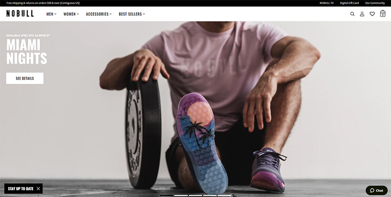
NOBULL

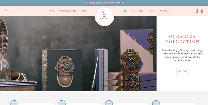
Good Juju Ink

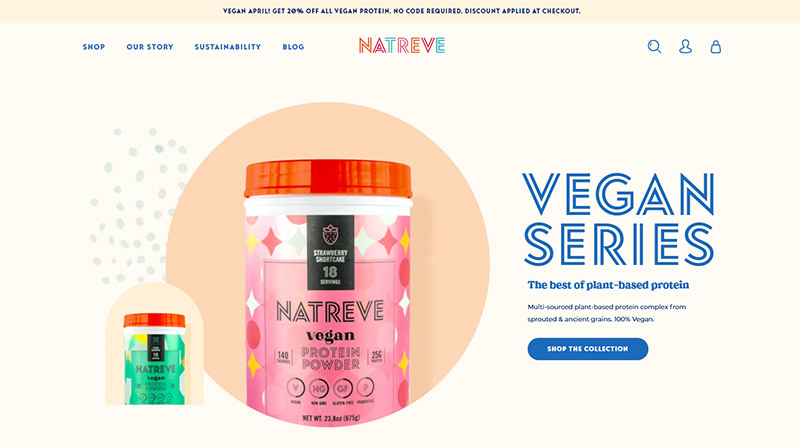
Natreve

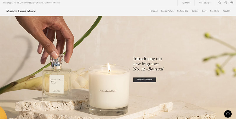
Maison Louis Marie

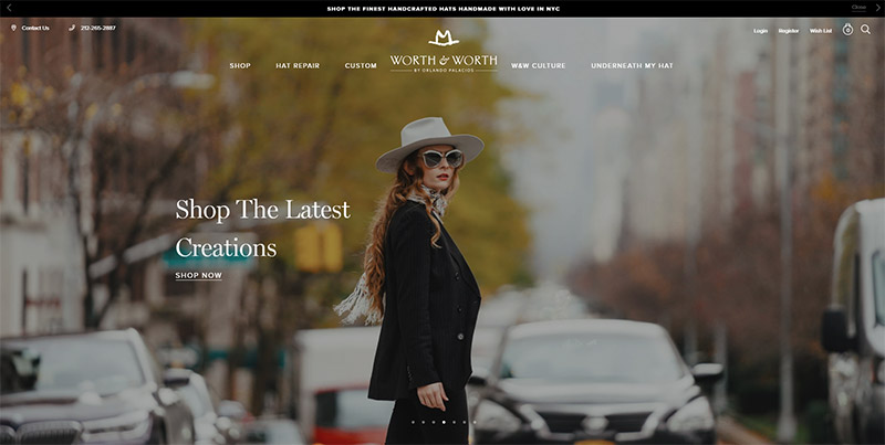
Worth & Worth
