Bands and musicians need to have a website that’s attractive to visitors and provides all of the necessary information fans will want to find. Here, we’ll feature 25 websites for your design inspiration.
Most band or musician websites will have some things in common. Of course, they’ll usually include prominent photos of the artist or band. They’ll probably include a bio, tour dates, a shop to buy or download music, usually some song samples, and possibly a blog.
Most band websites use large photos, full-screen backgrounds, video backgrounds, and other elements, like color, that make a strong visual impact on visitors. However, there are some that are a little more subtle and clean in the design style.
Take a look at the websites showcased here and you’ll see quite a variety of styles and approaches. We’ve also made an effort to showcase examples from different genres as well.
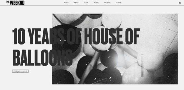
The Weeknd
The star of the Super Bowl halftime show has a great website that features a clean design. It’s monochromatic above the fold, but if you scroll down, you’ll see several colorful photos and videos.

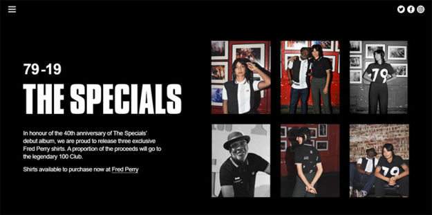
The Specials
The 40th anniversary website of The Specials is an awesome example. It’s fairly simple but very well-designed and user-friendly. The hamburger icon in the top left opens up a navigation menu that leads to all of the important sections of the site.

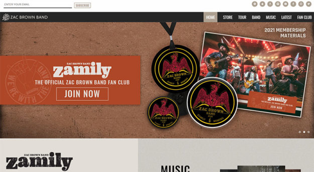
Zac Brown Band
Zac Brown Band uses color and texture throughout the site. The homepage features a large slider above the fold. The header includes an email optin form as well as social media icons.

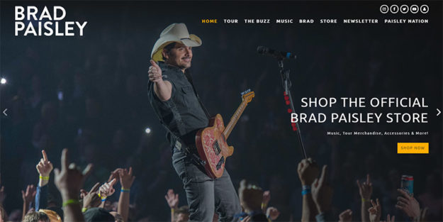
Brad Paisley
Brad Paisley’s site has a full-screen background photo. This is a very image-heavy design with lots of photos as you scroll. Tour dates are listed just below the fold, followed by news headlines.

Lauren Conklin
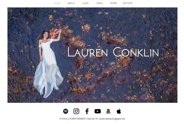
Violinist Lauren Conklin uses a simple and effective web design and layout. Here site is created with Wix and it’s a layout that would work well for just about any band or musician. The homepage has very little content, just a large photo, but the navigation menu makes it easy to find whatever information you’re looking for.

Leeland
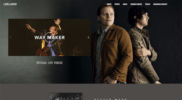
Leeland’s homepage includes a large background photo, as well as a video thumbnail. If you click on the thumbnail, a full-screen video opens up and plays. The navigation is clear and straightforward, helping to make the site very user-friendly.

The Killers
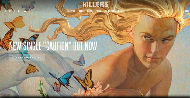
The Killers’ homepage includes a slider that takes up all of the area above the fold. Tour dates are visible as soon as you scroll down.

Francesca Battistelli
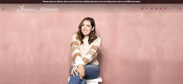
Francesca Battistelli’s site features a large photo above the fold. Lower on the homepage, you’ll find links to listen to her most recent album, as well as a large YouTube video embedded. The homepage also includes recent posts from Instagram.

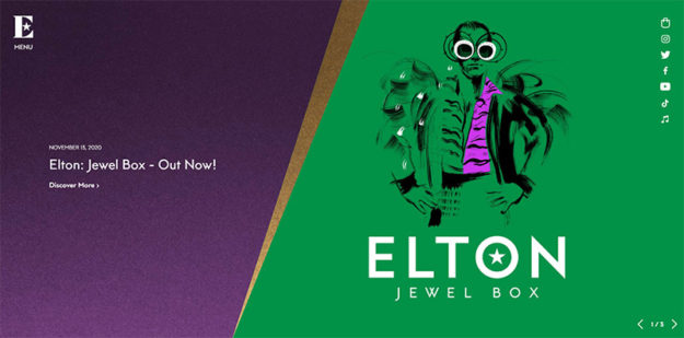
Elton John
The homepage of Elton John’s website includes a large slider above the fold. The design of the site is very clean. There are some large photos showcased throughout the site, as well as some scrolling and animation effects.

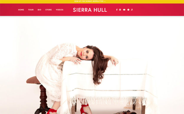
Sierra Hull
Sierra Hull has a colorful websites. There’s a full-screen photo above the fold on the home and then more bold color is visible as you scroll down.

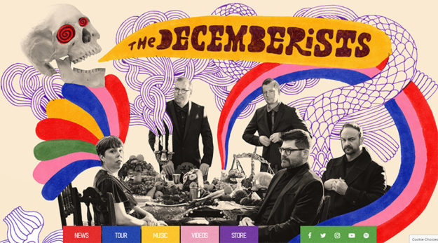
The Decemberists
One of the more unique websites in this list belongs to The Decemberists. It features some hand-drawn artistic elements and a lot of color. It’s not just the area above the fold. It’s a very colorful website all the way through.

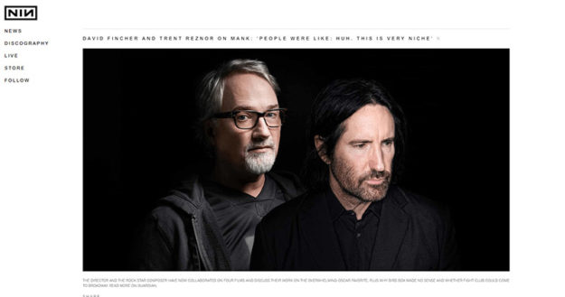
Nine Inch Nails
The website of Nine Inch Nails is very unusual for a band site. When you first arrive at the homepage, it looks more like a typical corporate website. The design is very clean, with a mostly black and white color scheme.

Mary Sender
Mary Sender’s site is also very clean and mostly black and white. The site also links to some music courses by Mary that can be purchased. This is a great idea for other bands and musicians looking for ways to monetize their websites.


Pearl Jam
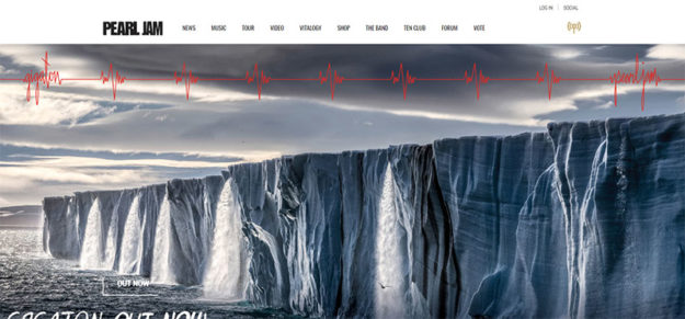
Pearl Jam has been around for 30 years and there’s a lot more content on their site than you’ll find with most bands. News headlines are visible from the homepage as well as the navigation menu. They also have audio and video, tour info, a band bio, forums, a premium club, and more.

TobyMac
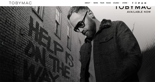
TobyMac’s website is another that features a clean design. It includes all of the essential info you would expect to find. One interesting addition in the primary navigation menu is a link to several causes that he supports.

The Kills
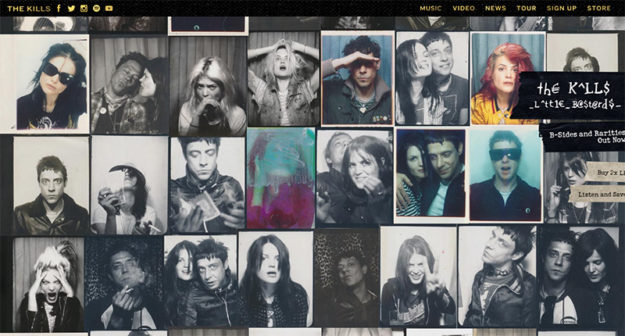
The website of The Kills features a collage-style background image with many different photos.

Tina Guo
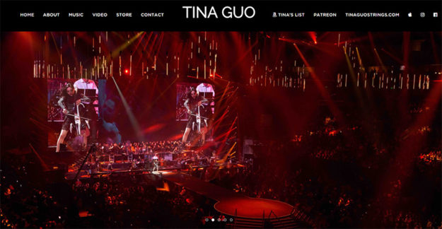
Tin Guo’s site uses a full-screen slider that scrolls through a few different photos. The layout of the site is fairly simple, but effective.

Kid Rock
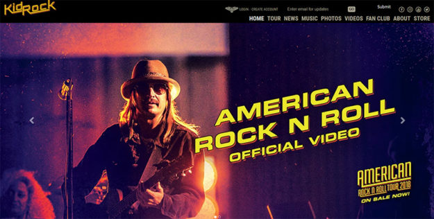
Kid Rock uses a large slider. Below the fold, you’ll find things like tour dates and news headlines. The site also includes a store and plenty of music and videos.

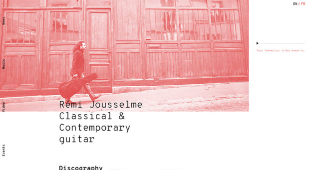
Remi Jousselme
Guitarist Remi Jousselme has a website that stands out from the crowd. It features a navigation menu that runs along the left side of the screen. The accent color changes as you scroll, which is a unique touch.

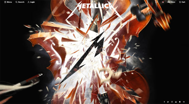
Metallica
Metallica has a huge amount of content on their site, which is understandable from a band that’s been around for nearly 40 years. The navigation menu is collapsed but opens up to many options when you click on it.

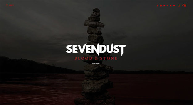
Sevendust
Sevendust’s homepage features a full-screen background image and a hamburger icon that opens to a navigation menu.

Foo Fighters
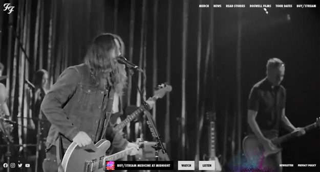
The Foo Fighters’ homepages uses a full-screen background video. There isn’t any additional content on the homepage, but all of the details you’d expect can be found through the navigation menu.

Gatsby
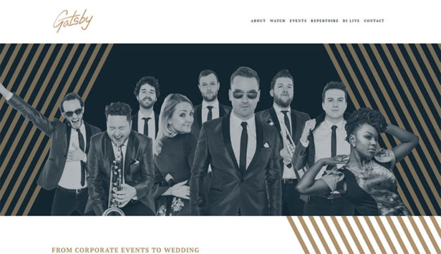
Gatsby is a party band from London, but their website is on-par with global artists. Their site is a bit different from many other musicians because the primary purpose of the site is to encourage visitors to book the band for a wedding or event.

Kenny Chesney
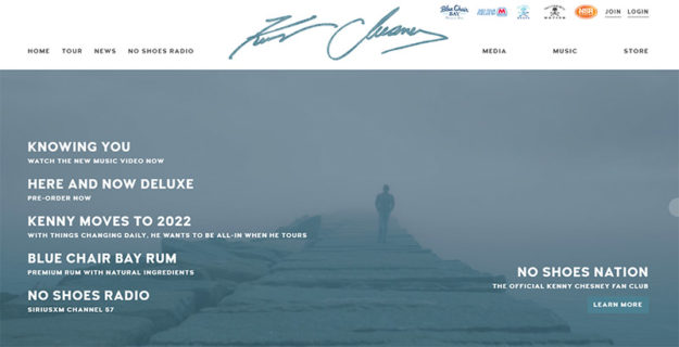
Kenny Chesney’s site uses a full-screen background video on the homepage.

The Fray
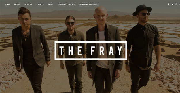
The Fray’s website has a large background photo above the fold. Scroll down and you can listen to their greatest hits, view all of the albums, and learn more about upcoming events.

If you’re looking to create a website for yourself or if you’re creating a site for a band or musician, this selection should give you plenty of inspiration. Be sure to see some of our other showcases:


