A portfolio website is an essential marketing tool for any creative professional. Whether you’re a designer or a photographer, potential clients will judge your capabilities by what they see at your portfolio site. In many cases, your online portfolio will be one of the most significant factors a client considers when they’re deciding who to hire (your photos are your product).
Photography websites showcase work, provide biographical information regarding the artists, often include a contact page for potential clients, and are perfect for inspiration and creative influence. Below are 25 portfolios with different styles and approaches.
Web designers often browse through portfolio websites of other designers for inspiration and ideas that can be used in their own work. Professional photographers, like designers, need to display an attractive online portfolio for their website visitors, and many photographers have excellent portfolio sites.
In this post, we’ll take a look at some of the best sites in the industry, as well as the current design trends. Here you’ll find photography business sites that are well designed and also showcase amazing photos. You’ll see a few different styles and approaches. Many use a large background image or a large slider to showcase the photos at their best. Others use many smaller thumbnail images to fill the screen. A minimalist design style is also common because it allows the photos to be the center of attention rather than being overpowered by the graphic design details of the site.
Create Your Own Photography Website: When you’re ready to create your site, we have an article that walks you through the process – How to Create a Photography Website. You’ll have your own site set up in no time!
You can also see our collection of the best WordPress photography themes for more ideas and options.
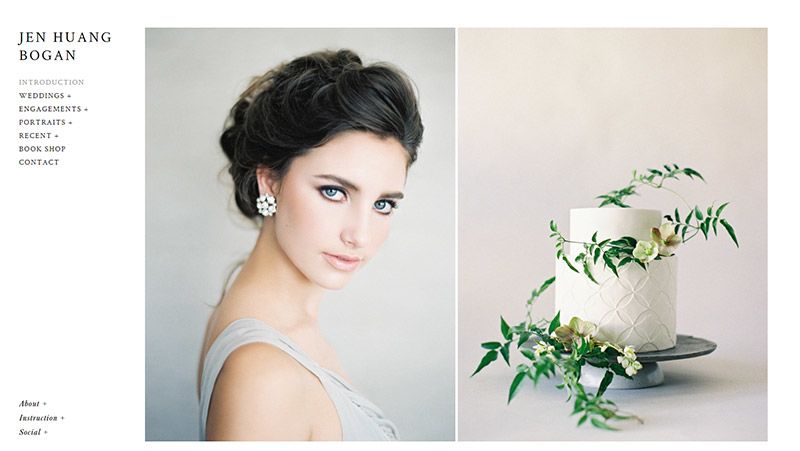
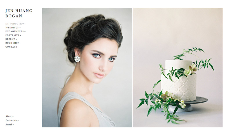
Jen Huang Bogan
The website of Jen Huang Bogan features large photos on the homepage (you can scroll down the page to see more). The navigation menu is simple and located in the left sidebar.
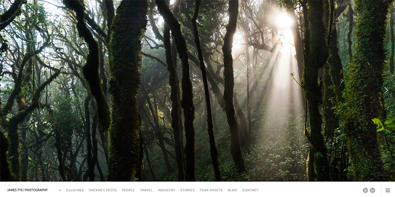
James Tye
This site is different from most others showcased on this page because of the sticky footer navigation menu.

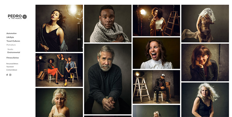
Pedro on the World
Pedro on the World, the site of Pedro Oliveira, uses a splash page that leads to the nice portfolio page shown below.

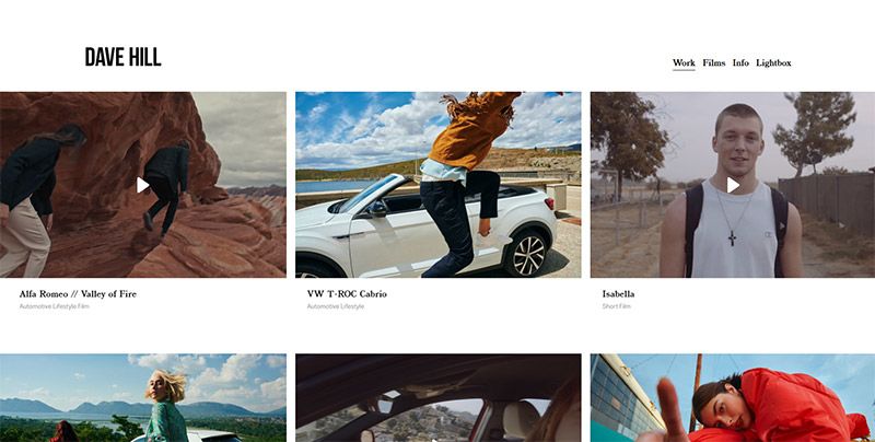
Dave Hill
Advertising photographer Dave Hill’s homepage features thumbnails of several photos and films. The design utilizes a white background and minimal styling with a navigation menu in the header.

Mike Kelley
Mike Kelley’s website uses a clean, minimalistic design and layout that puts focus on the photos.


Peter McKinnon
Peter McKinnon’s site is currently a one-page site that directs visitors to a few different projects.


This Wild Idea
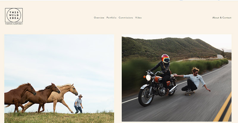
The portfolio site of liefstyle photographer Theron Humphrey uses a light background color and a minimalist style. The front page showcases medium-sized versions of several different photos.

|
Create Your Own Photography Website |
|||
|
Best WordPress Photography Theme |
|||
|
Complete Platform for Photographers |
|||
|
Industry Leader |
|||
|
Solid All-Around Website Builder |
|||
Greg Ross
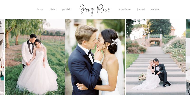
The portfolio of Greg Ross features a clean design and layout with a slider to showcase beautiful photos on the homepage.
Giles Clement
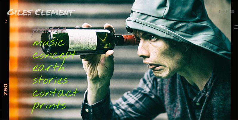
Creative photographer Giles Clement uses full-screen photos and a unique design to create a portfolio site that really stands out while showcasing his work.

Eric Ryan Anderson
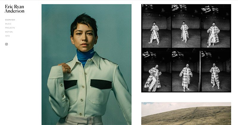
The site of award-winning photographer Eric Ryan Anderson uses a clean design and layout with a white background and very basic navigation menu. The photos take center stage.

Deanie Chen
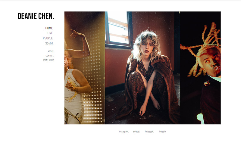
Deanie Chen also uses a white background and a simple design with a left sidebar. The main area of the homepage uses a slider to showcase the photos.

JUCO
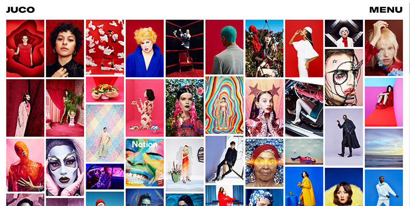
JUCO, the site of Julia Galdo and Cody Cloud, stands out from the crowd with many bright and colorful photos on the homepage.

Jeffery Salter
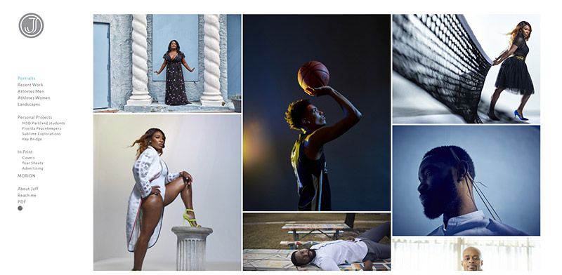
Jeffery Salter’s site is a clean design that showcases several photos above the fold.

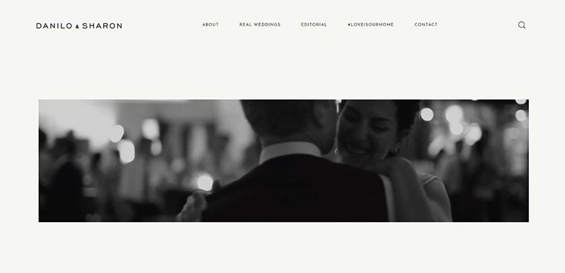
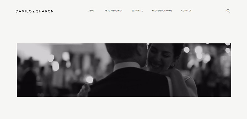
Danilo & Sharon
This site features a video on the homepage and a clean, elegant layout.
Lieben Photography
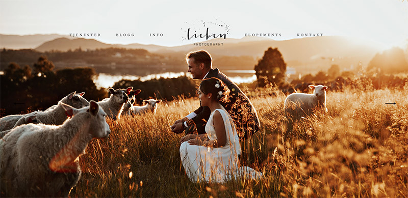
A large background photo is the most prominent aspect of this website’s homepage.

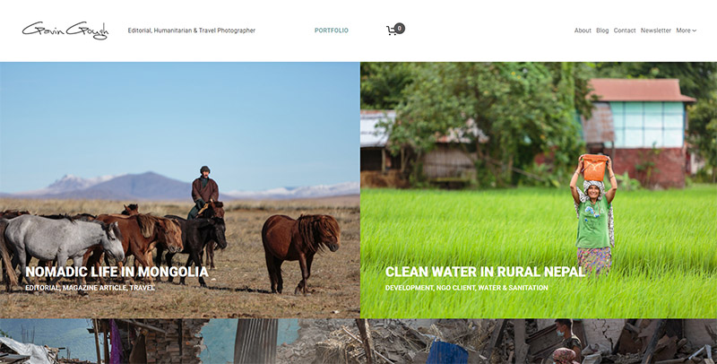
Gavin Gough
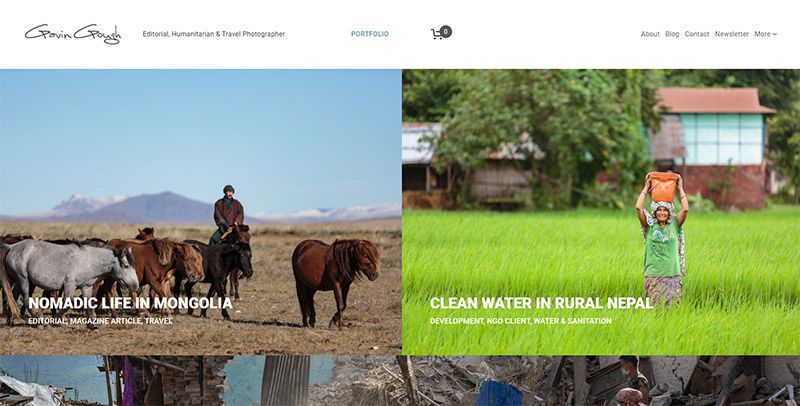
Gavin Gough’s website is unique. While it showcases photos, it uses an approach of showcasing different stories or themes.
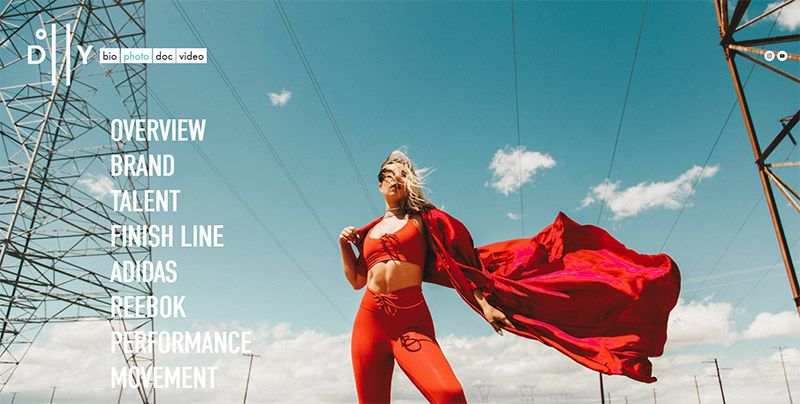
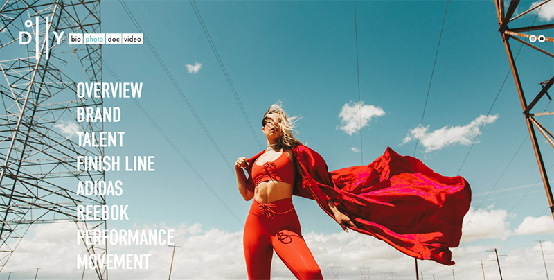
Dolly Ave
The full-size background photo takes center stage in this design.
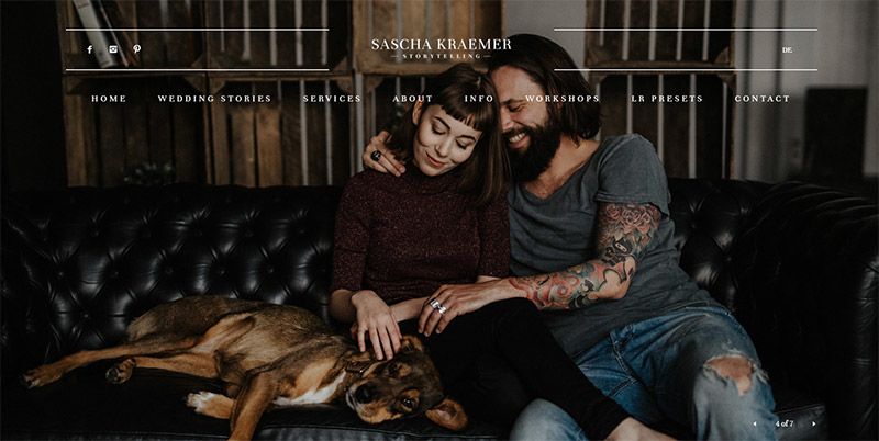
Sascha Kraemer
This is another site that makes excellent use of large background images to show off the work.

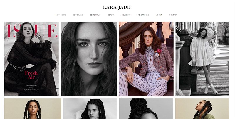
Lara Jade
The website of portrait photographer Lara Jade features a beautiful showcase of photos in a grid.

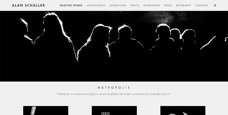
Alan Schaller
This design complements the black & white photos that are on display.

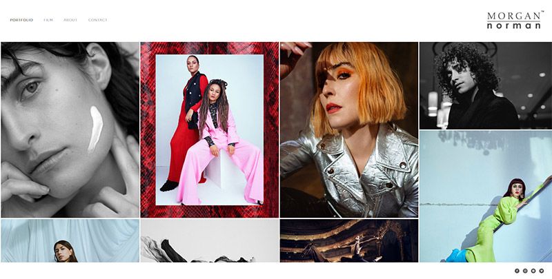
Morgan Norman
Morgan Norman’s site uses a splash page with a large image that leads to the fashion photography portfolio page shown below.

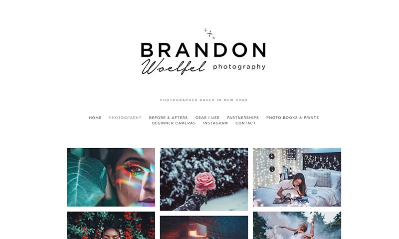
Brandon Woelfel
A splash page allows visitors to choose to enter the website or view details about Brandon’s book, Ultraviolet. If you choose to enter the website, you’ll see the portfolio shown below.

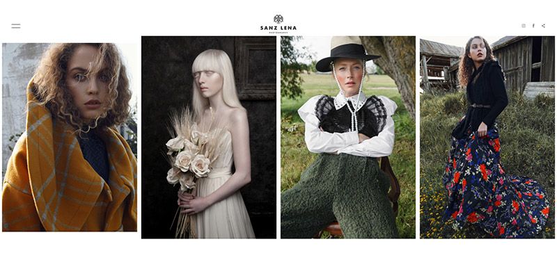
Sanz Lena
Horizontal scrolling is used to showcase the photos on this site.

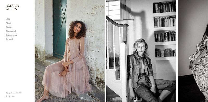
Amelia Allen
Another example of a clean design/layout that makes use of horizontal scrolling.
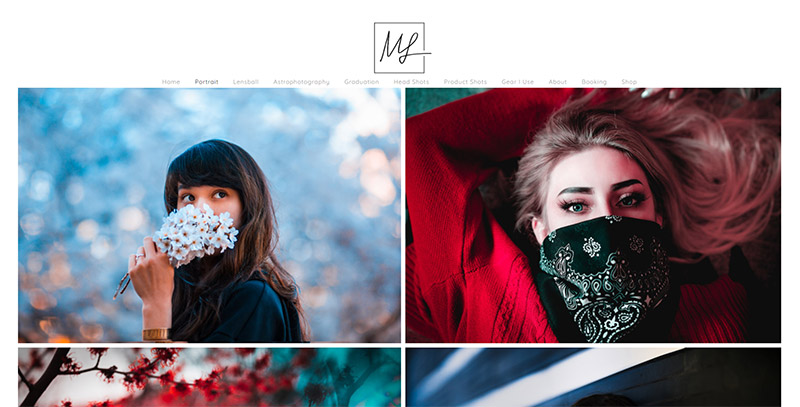
Marvin Lei
Marvin Lei’s website is a clean design and layout with a white background and two columns of photos.

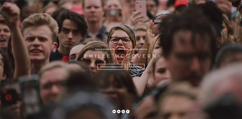
Emilee McGovern
Editorial photographer Emilee McGovern’s homepage uses a full-screen background with links to the two different sections of her portfolio: photojournalism and editorial.

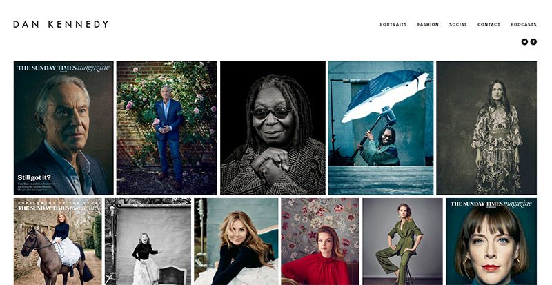
Dan Kennedy
Many thumbnails are used to showcase a variety of portrait photography samples on this homepage.
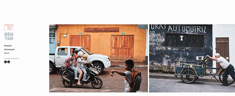
Ben Yan
Ben Yan’s site uses horizontal scrolling to showcase the photos.

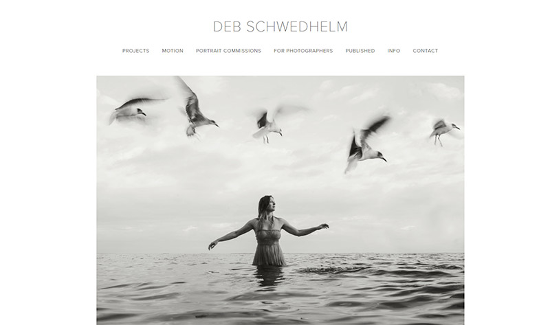
Deb Schwedhelm
Deb Schwedhelm’s site features a clean design and a large slideshow on the homepage.

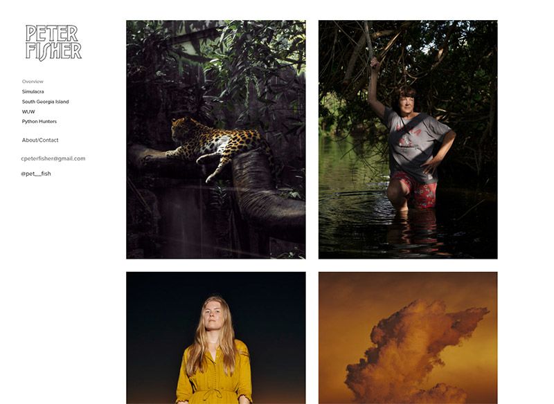
Peter Fisher
Peter FIsher’s site uses a white background and a simple grid layout with minimal styling. The homepage features two columns of photos.

Take note of the obvious and subtle differences in how successful photographers manage their layout and site organization. The design of the site should serve the style and purpose of your portfolio. While there are a number of different approaches used by the sites in this showcase, one thing they all have in common is a simple or clean layout. In order for the photos to stand out, the design and layout should be simple. If you’re choosing a template, be sure to go with a design that won’t compete with your photos for visitors’ attention.
Photographers will have thousands of photos to choose from for their home image(s). It might take some time to decide what imagery you want visitors to see first, but quality is better than quantity. You want to give each photograph the space it needs on the screen. Try to pull visitors in with one or two striking images that will encourage more exploration. For example, travel photographers may choose to showcase one epic photo on their homepage with links to galleries for further browsing. Another common approach is to use grid layouts to showcase several photos.
Many photography sites use a toggle feature that allows for viewing photos one by one or seeing a thumbnail grid for a quick overview. A scrolling grid with mid to large-sized images is a great, simple way to encourage visitors to keep viewing, plus this will feel familiar to anyone who uses Instagram.
Use text wisely. If your portfolio is journalistic or story-based, it might make sense to include some context or explanation with the photos. Testimonials or price information makes sense in some cases, too. Just make sure that the text doesn’t overwhelm the page and detract from the impact of the photography.
Frequently Asked Questions About Photography Websites
How Do You Create a Photography Website?
There are many different platforms that make it possible to create a website to showcase your own photos. Platforms like SmugMug and ZenFolio have been created specifically for photographers. Other platforms like WordPress and Squarespace aren’t exclusively for visual artists, but there are plenty of themes/templates that can be used to easily create a beautiful photography site with either platform.
How Can I Create a Free Photography Portfolio Website?
There are some options for creating a free site, but the features are fairly limited and you may have ads on your site. Wix and Weebly are two options. But for just a few dollars per month you could use a platform like SmugMug or purchase web hosting and use WordPress. You’ll get a much better website and prices start at less than $10 per month. These types of sites can be used for family photograhy, macro photography, editorial photography, or any other photography style. With the quality of customizable templates available, a 100% custom design is not necessary.
Do I Really Need a Photography Website?
If your goal is to make money with your digital photography, you should have your own website. You could use platforms like Instagram, 500px, or Behance to showcase your photos, but having your own website and domain name will give you more control and you won’t be susceptible to decisions made by the platform. Having a website is a must for a commercial photographer.
How Much Does it Cost to Create a Professional Photography Website?
It’s possible to get a professional-looking website for less than $10 per month (SmugMug is one option in that price range). WordPress is the most popular content management system in the world and if you go with WordPress, you can get hosting for about $10 per month and you might spend $50-$100 on a WordPress theme. Of course, if you have a designer/developer create a custom website for you, it can easily cost thousands of dollars.
What Are the Essentials of a Good Photography Website?
The photos should be front and center. Most photographer websites use a minimalist design and color scheme, which helps to keep the focus on the photos. The site should also include you bio, links to any press or media that you’ve received, a description of the products or services that you offer, and a way for visitors to contact you. Allowing visitors to purchase photos is ideal but not essential.
Should I Sell Photos Directly from My Website?
Having e-commerce functionality on your portfolio site is not necessary, but it does work well for many people and may improve the client experience. If you shoot landscapes, you might be able to sell fine art prints to your visitors. Wedding photographers may be able to take orders from clients or from wedding guests through private photo albums with purchase options. Leading platforms like Imagely, SmugMug, and Zenfolio provide e-commerce capabilities with credit card processing.


