Web design needs to do several things at once. It must look good. It must make sure the navigation of the website is clear. It must hold an internet user’s attention for as long as possible. And it must gently lead the user down the conversion funnel, quietly urging the user to take whatever action the site owners have as the goal of the site.
Because web design needs to have an influence over people’s behavior, more and more designers have been looking to the psychology of color to help them create websites. They can play on cultural references to suggest trust, urgency, or mystery to the target audience.
Studying the psychology of color is crucial for maximizing your site’s web design. Using the right colors can help put your customers in the frame of mind that compels them to take action. Color has the power to improve conversions by grabbing customers’ attention and triggering the right emotions for sales.
Colors often define the public’s perception of your brand and what you stand for. However, the ultimate question remains unanswered: Which color is right for my brand? What color should I choose for maximum impact?
It’s important to understand that the psychology of color plays a big role in persuasion. Keep in mind that persuasion is different from coercion, manipulation, or simply being pushy. Instead, it’s about bringing the change in attitude necessary to encourage customers to take action. In this case, the action would be a conversion or purchase.
Color and Conversions
There has been a proven scientific connection between the color of products and the urge to purchase. Every time you see a color, there’s a chain of reactions taking place within the hypothalamus in your brain. Hormones are released to your thyroid, thus triggering emotions that affect your behavior. In fact, 62% to 90% of purchasing decisions are based on colors! So, digging deeper into the psychology of color can significantly improve elusive conversions for your website.
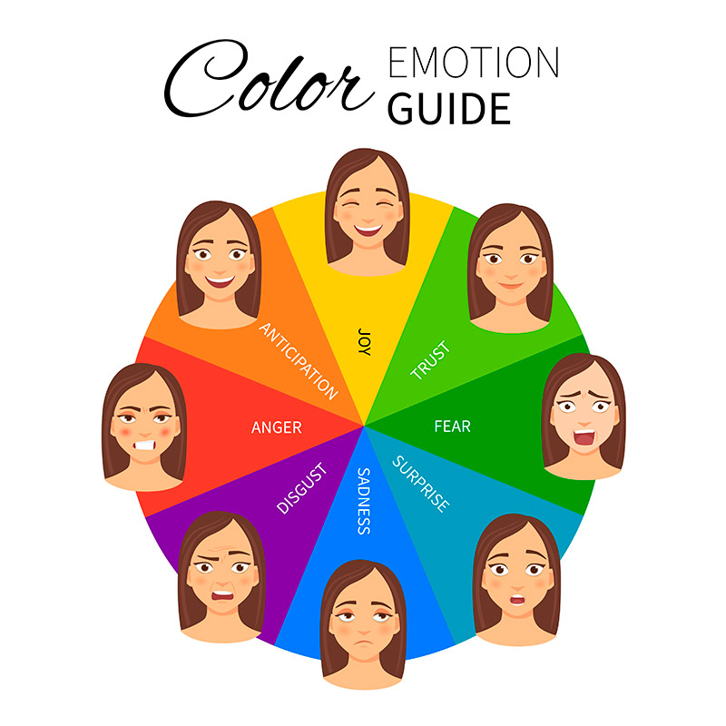
Where Should I Use Colors?
The colors that you use might not be outright apparent sometimes, but they do make a difference. The key areas that you must be careful about are:
- Images
- Pop-ups
- Borders
- Headlines
- Background hues
- Primary web banners or hero graphics
- Buttons, especially call for action
The choice of colors in these prominent areas depends on the kind of audience that your website targets. Let’s discuss this further now.
Contrast and Brightness
Brightness also plays a vital role in the success of your website. In general, it’s believed that women prefer soft colors while men prefer brighter colors.
Contrast is another essential color factor that impacts the website’s readability. No one enjoys struggling to read what’s written on your call for action button or any other part of the website. Overlapping content with extremely bright or dull fonts is a strict NO. Imagine seeing a black “Buy Now” button on a light black background. It would likely go completely unnoticed.
Your website’s color scheme can impact accessibility and usability. If you create navigation tabs and dropdown menus using unnoticeable colors, it’s just as bad as not having them at all. Go through your website from the perspective of the user and you’ll know what we’re talking about. According to the psychology of color, orange, yellow, red, and blue would typically be the best bets.
Case Studies on the Psychology of Color
According to a study published on Moz, an online slot machine company simply changed the call to action button from green to yellow. This resulted in a whopping 187.4% rise in conversions! Trying different color schemes for your website is advised. You could use multivariate testing with several different colors. The colors with the maximum impact on your targeted audience will be the best options.
Here’s another study that proves the validity of the psychology of color. In academia, the color red is usually associated with error markings. Researchers at the University of Rochester put this to test through four different experiments. They found that the use of the color red, such as wearing a red t-shirt, actually affects academic performance negatively.
10 Colors from the Internet Marketer’s Perception
We’ve compiled the list below of colors and the emotions they inspire based on the psychology of color. When used in the right manner, these colors can go a long way in giving your website the right personality for improving conversion rates.
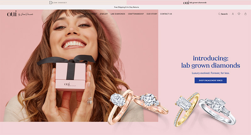
1. Pink: Let’s start with pink. If your target market is made up mainly of women, then pink is a good color for you. The color is known to raise emotions of fun and romance. Pink is associated very strongly with youthful femininity. It is playful and brings to mind bubble gum and innocence. It is ideal for websites that hearken back to the olden days or that target a particularly feminine audience.

For more inspiration, see our showcase of pink websites.
2. Blue: Blue signifies trustworthiness and provides an air of coolness. Any website that caters to online prescriptions, monetary transactions, or any other niche that demands reliability would be best served by this color.


For more inspiration, see our showcase of blue websites.
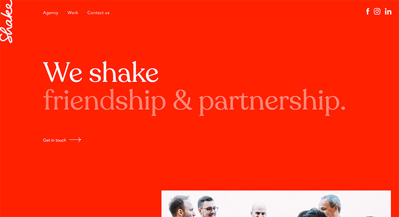
3. Red: Nothing holds people’s attention like red. It’s considered the most effective color for a call to action. If you’re designing that “act now” button, red is your color. Red is a stimulating, exciting color. It’s associated with passion, power, and sometimes anger. It can be used for warnings or to show danger, but it can also suggest strength, determination, and boldness.
Warmer reds, like brick or maroon, and strong and comforting – good for sites that want to suggest the lasting qualities of a brick wall. Brighter reds, like true red or tomato, are great for youthful websites that want to suggest energy and eagerness to leap before they look.

For more inspiration, see our showcase of red websites.
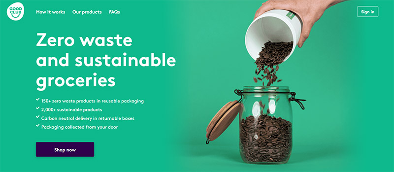
4. Green: Green is the color of peace, tranquility, and nature. It can give users feelings of calm, rejuvenation, affluence, and optimism. Darker shades are more linked to money, so sites that want to suggest affluence, growth, and stability often use those shades. Lighter shades are more associated with spring and growth, so websites that want to reflect relaxation, freshness, and honesty often use lighter shades. So if your website is about a great environmental cause or selling organic products, green should be the predominant background.

For more inspiration, see our showcase of green websites.
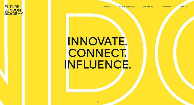
5. Yellow: In the marketing world, yellow is said to describe a healthy mind without worries or depressing thoughts. It’s best suited for online stores that sell products like kids’ apparel and toys. This color is also associated with caution. Y
ellow is often considered the most energizing color. From the earliest ages, people learn to associate yellow with the sun, so it becomes associated with warmth and happiness. That makes bright yellow perfect for sites designed for children, as it grabs their attention. More subtle shades of yellow have more complex associations. Darker shades can suggest antiquity, suggesting yellowed parchment. Because of that, it can also be associated with wisdom and curiosity. It, therefore, is great for sites that want to demonstrate a sense of authority and intelligence.

For more inspiration, see our showcase of yellow websites.
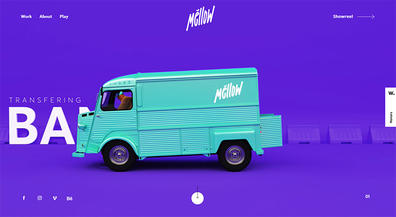
6. Purple: Purple oozes elegance and sophistication. This color is ideal for a website that features niche, luxury products.

For more inspiration, see our showcase of purple websites.
7. Orange: Orange can also signify sophistication, but at the same time be attention-grabbing. Orange is a more balanced and less overwhelming color than red. Vibrant, energetic, friendly and inviting, it is ideal for designs that need movement and energy. Websites that want to showcase their creativity often choose orange because it is unique and exciting, but it still has the comfort of a warm color. This color is suitable as a background for tech companies or websites that deal with gadgets.


8. Gold: As a metallic color, gold signifies power and prestige. It works well with other colors that signify elegance, such as green and purple.
9. Black: Black is versatile and goes well with any other color. It’s best used to bring about a contrast with the rest of the colors used in the website.


For more inspiration, see our showcase of black websites.
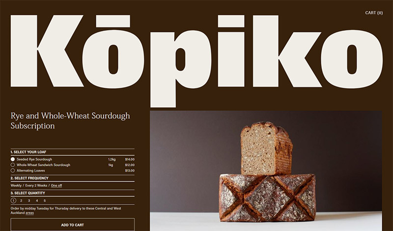
10. Brown: Brown is a nondescript color that enthuses relaxation and calm. This color is perfect for websites that deal with health and wellness. Creams are calm, elegant, and pure, making them a great background color for a website that wants to imply a sense of tradition.
Tans are conservative and bring to mind piety. They can be dull, but they can also be reassuring, which makes them ideal for a site that doesn’t want to be too bold or outrageous. Dark brown feels wholesome and reliable, like a loaf of bread. It is associated with warmth and comfort. Sites that want to demonstrate experience and reassurance often use brown.

For more inspiration, see our showcase of brown websites.
Conclusion
Colors can create a very specific mood or impression on a website. If a site’s color gives the wrong impression, it can result in high bounce rates, as the site will suggest inexperience, unprofessionalism, or even untrustworthiness. If the impression is the right one, it lets users know that the site is trustworthy and that it ‘gets’ its niche. Little wonder, then, that the psychology of color will remain a major concern for web designers.
Make use of these color scheme tools to get some help with creating color schemes and palettes. Experiment with how good each color looks. Remember the psychology of color to choose hues that persuade the best. Picking the right palette will surely help maximize your conversion rate.
Today’s globe is getting smaller and more diverse. Keep in mind that colors in cultures vary. What one culture considers positive might be considered negative by another. For instance, white is associated with death in China while the same color is worn by brides in Christian countries. Purple is considered feminine is most countries, but it’s also associated with death in Brazil. Therefore, you need to consider all aspects of your audience to zero down on a color combination that suits your prospective customers the best.


