Mega menus are often used on large sites that have a considerable number of pages for users to navigate. Rather than just using a dropdown, the mega menu opens offering more options.
While mega menus can make it easier for users to get deeper into a site with fewer clicks, the vast number of links can also overwhelm some visitors. For this reason, great care should be taken when designing mega menus to make them as user-friendly as possible.
Mega menus can be very useful for corporate websites and e-commerce websites in particular. These types of sites often include a lot of content that can be conveniently grouped in different categories and made accessible through a mega menu.
Large e-commerce can be especially challenging to navigate if not laid out and structured well. The mega menu helps to show visitors how the products are organized or categorized so they can go to exactly what they want.
The drop-down menu must appear to be neat and all the sub-categories must be properly organized as well. Drop-down menus are supported on all sorts of devices and provide a great deal of comfort for the users to navigate quickly and easily.
In this post, we’ll look at some well-designed mega menu examples in action on live websites.
For more inspiration, see our collection of beautiful navigation menus.
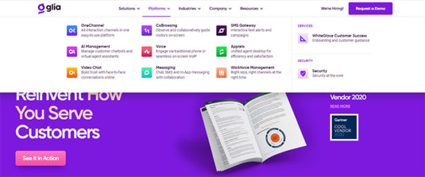
Glia
Glia uses colorful icons that look great and really stand out. It’s one of the more visually-appealing examples you’ll find.

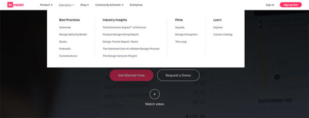
InVision
The design of this menu is fairly simple, but it looks good and is user-friendly.

CreativeLive
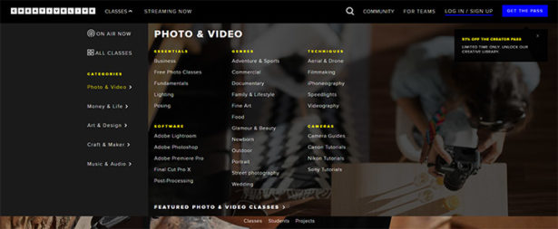
CreativeLive uses a big menu to showcase the available classes broken down by category.

Puma
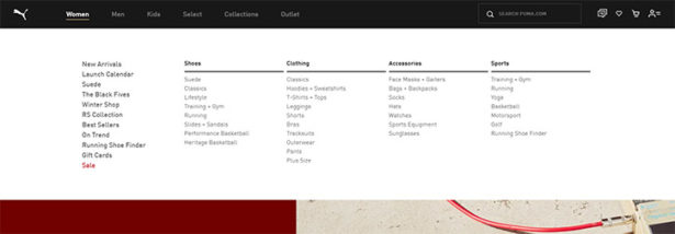
The primary navigation links like men, women, and kids have many subcategories that are display on hover. If you want to browse men’s running shoes, you can easily get straight to that subcategory from any page on the site.

Visme
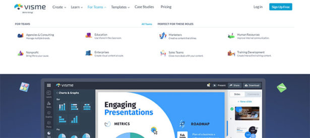
Visme uses icons for a visually-appealing approach that’s also user-friendly.

Bras N Things
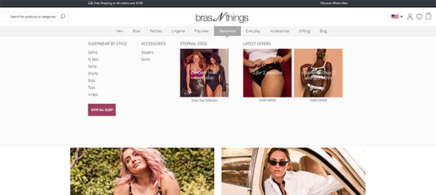
The menu opens up subcategories and also continues to show some of the same promotions constantly to the right.

Office Depot
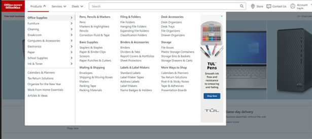
Office Depot breaks down the content on the site under products, services, and deals. Products and services have a huge number of options that open up. Deals is a much smaller category but still has a dropdown with several links.

Target
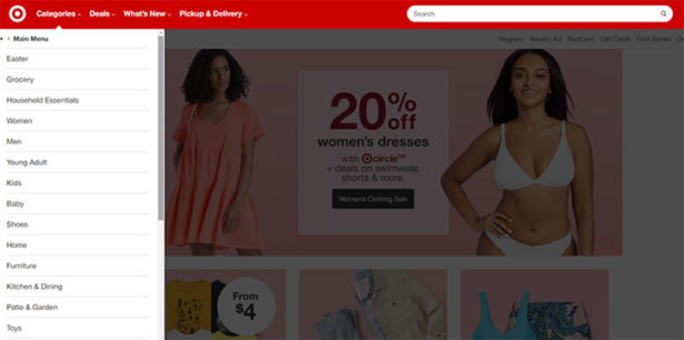
Target’s implementation of this concept is different from many of the others that you’ll see. At first, it appears to be a typical dropdown menu, but when you click on one of the links, the menu changes to show the subcategories available. This may be helpful by not providing an overwhelming number of options as soon as the dropdown is visible.

Daniella Draper
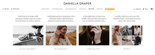
Daniella Draper’s website features a beautiful mega menu that includes thumbnail images and text. The layouts vary depending on which top-level link you’re browsing.

Grant Burke
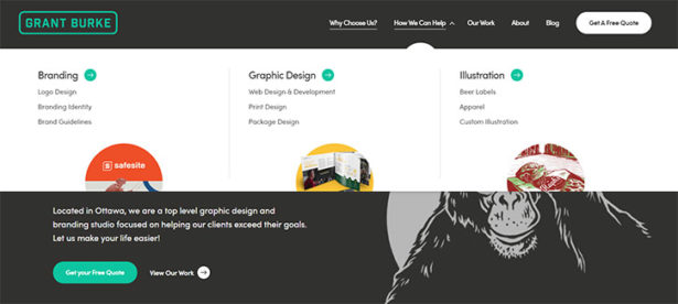
Grant Burke’s menu isn’t so “mega” in terms of the number of links, but it does go beyond a simple dropdown and it’s a great example that might provide some inspiration. Click on “how we can help” and you’ll see their services listed in three different sections, with an icon included for each.
Adidas
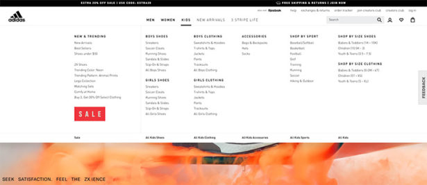
The Adidas menu is huge with many options listed. It covers the full width of a desktop screen with several columns of links under each primary link.

Wal-Mart
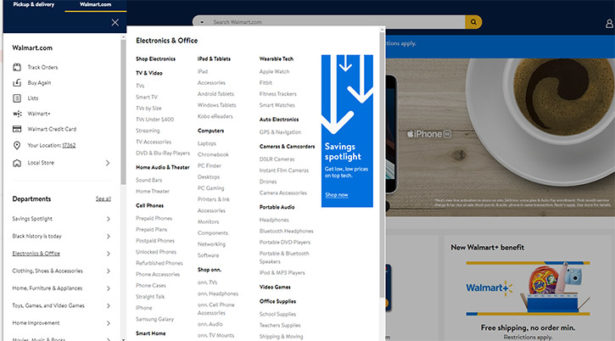
Of course, Walmart sells about as many different types of products as any retailer or website. That means they’re website needs to be stuctured and organized effectively in order to provide a seamless user experience. One of they ways they do that is through the use of a mega menu.

Moosejaw
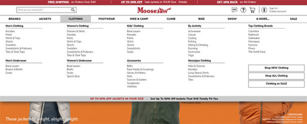
Moosejaw allows visitors to browse products by brand or category, and it’s all accessible through the use of a full-width mega menu.

Mashable
Mashable shows that content-based websites can use this approach as well.


Quiksilver
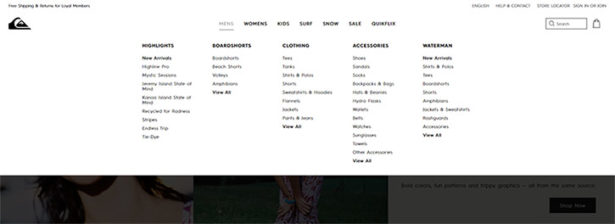
Quicksilver’s site uses a very clean design, so the look is very basic but everything is well laid out.

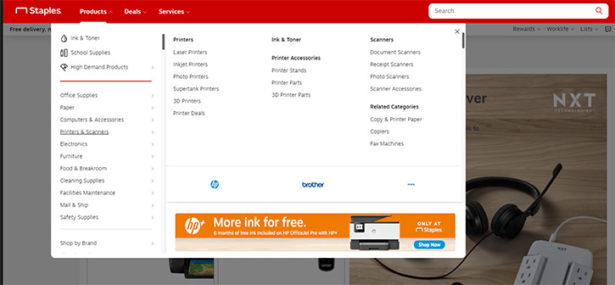
Staples
The layout of Staples’ navigational structure is similar to that of Office Depot with the top-level links being products, services, and deals. One are where I think Staples could improve in terms of usability relates to consistency. You have to click on the top-level links to open the dropdown, but the extended options open when you hover over the dropdown links. The confusing part is that there is a little delay, so you think you need to click again. It looks good, but in my opinion, could be improved.

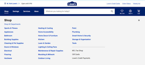
Lowe’s
The mega menu used by Lowe’s is maybe not as visually attractive as some of the other examples, but it functions well and serves its intended purpose. Click on one of the primary links and it will open up subcategories. Most of those subcategories also have their own subcategories. With a few clicks you can really drill down to exactly what you want.

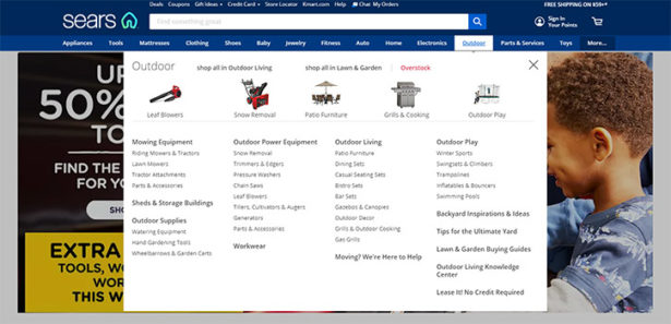
Sears
Sears uses thumbail images to make it even easier to navigate the site.

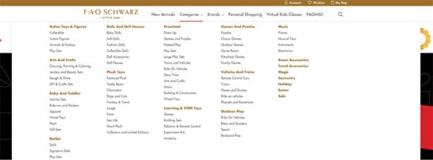
FAO Schwarz
On this site, the categories and brands links have dropdowns will multiple columns of options, but the other links do not since it is not needed.

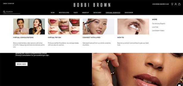
Bobbi Brown
Bobbi Brown uses a combination of images and text links. The dropdown under each top-level option is somewhat different.

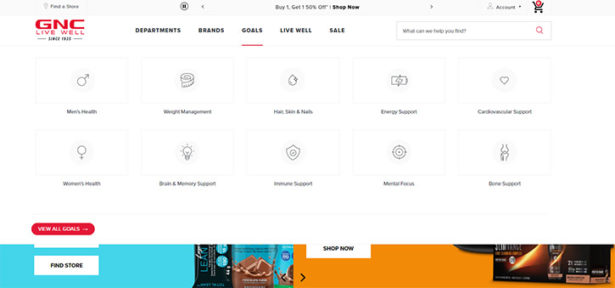
GNC
GNC’s implementation is pretty unique. While the dropdowns are different depending in which top-level option you select, under “goals” they show topics like weight management, energy support, and others. Rather than focusing only on the types of products they sell, this helps visitors who know what they want to accomplish but not the exact product that they need.

Frequently Asked Questions About Mega Menus
What is a Mega Menu?
A mega menu is an expandable menu that is displayed horizontally and vertically. While dropdown menus simply list links in one direction (usually vertically), mega menus are bigger and may include multiple columns of links. They are popular on large sites that have a lot of content.
Are Mega Menus Good or Bad for Usability?
Mega menus can be either good or bad, depending on how they are used and how they are designed. Megu menus shouldn’t be used simply for the purpose of looking. A website should not include a mega menu unless it needs to do so in order to make the site easier to navigate. It’s also critical that mega menus are tested on mobile devices to ensure that they are user-friendly.
How Can I Create a Mega Menu for My Website?
Some WordPress themes come with the capability to create a mega menu. If you’re not using a theme with this capability, there are some WordPress plugins that will do the same. And if you’re not using WordPress, you can download or customize a script if you are not comfortable designing and coding it from scratch.
For more design inspiration check out these related galleries:

