Ease of navigation is one of the biggest keys to the usability of a website’s interface. If visitors can easily find what they’re looking for they’ll be more likely to stay on the website rather than leaving and going to some other site. Effective navigation design can help to increase page views, improve the user experience, and even increase revenue and profit.
As more and more users are accessing sites via mobile devices, responsive web design has continued to increase in popularity. One of the challenges of designing and developing responsive websites is to create a user-friendly navigation menu that works equally well for mobile users on all types of devices.
In this post, we’ll showcase 40 different navigation menus for your design inspiration. Some of them are creative and unusual, while others are basic but effective. This will showcase many different styles and approaches that can be put to good use in your own design and development work. We’ll be showcasing the websites as they appear on desktop, but the best way to experience these navigation menus is to click through and see how it works in the browser. Adjust the width of your browser and see how it impacts the menu.
UNLIMITED DOWNLOADS: 50+ Million UI Kits & Design Assets
DOWNLOAD NOW
Showcase of Responsive Website Menu Design
Get some ideas that can be used in your own designs by browsing the selection below.
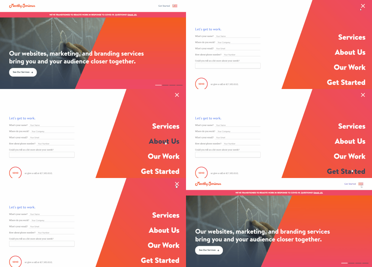
Mostly Serious
Mostly Serious uses a typical hamburger icon (three horizontal lines) to indicate the presence of the menu. When the icon is clicked, it opens up the menu that contains the primary links.

Magnet Co
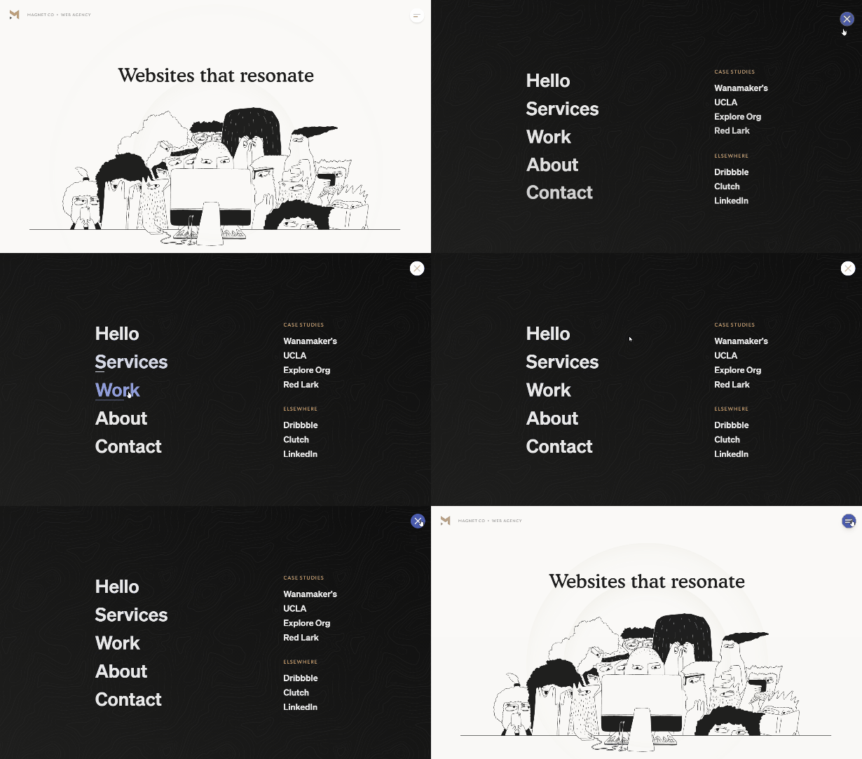
Magnet Co also uses a hamburger (with two lines instead of three). When users click the icon, a full-screen navigation menu opens on a dark background.

Sam Goddard
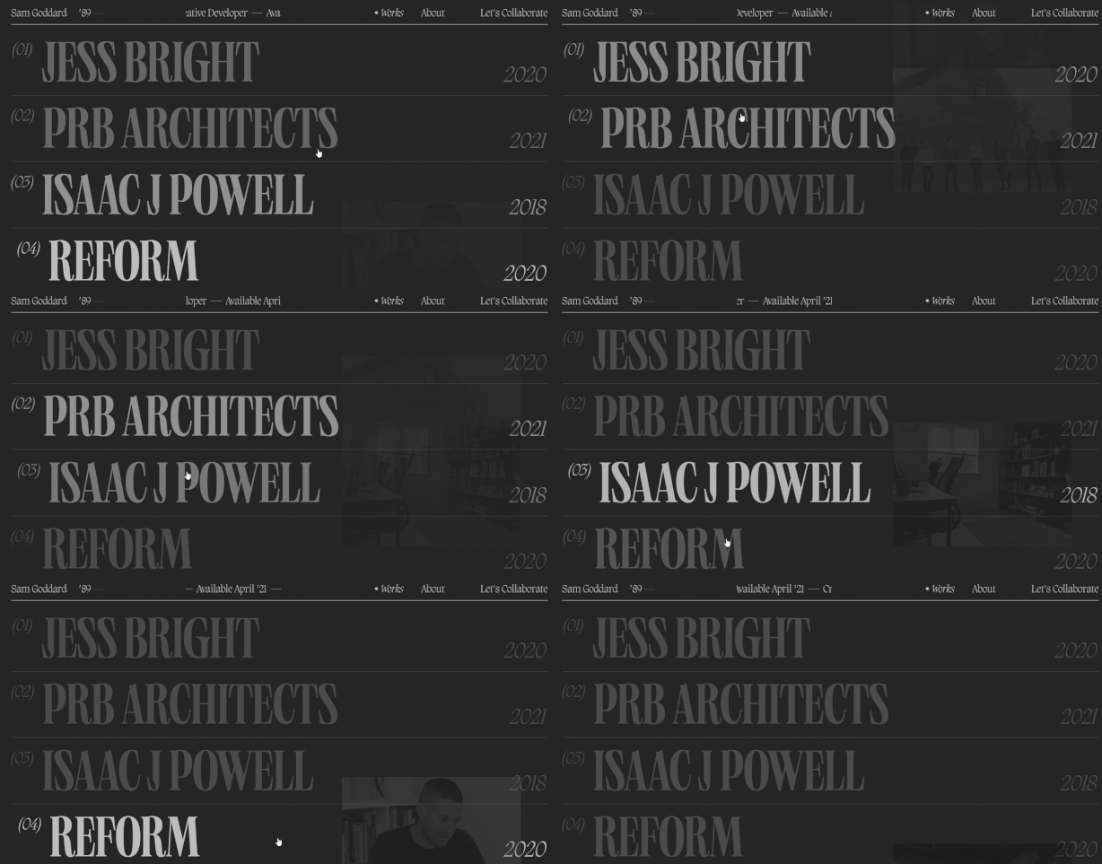
Developer Same Goddard displays his portfolio projects in a unique menu. Each project is listed in large type along with the year of the project. When you hover your mouse over one of the links, a thumbnail image also appears in the background.

Martin Building Company
The website of Martin Building Company includes a hamburger icon to the right side of the screen. Clicking on the icon opens a menu that features links to the primary pages of the site.


The Alienist
The menu of The Alienist is both unique and attractive. Clicking on the menu icon opens a full-screen menu on a read background.


Pipe
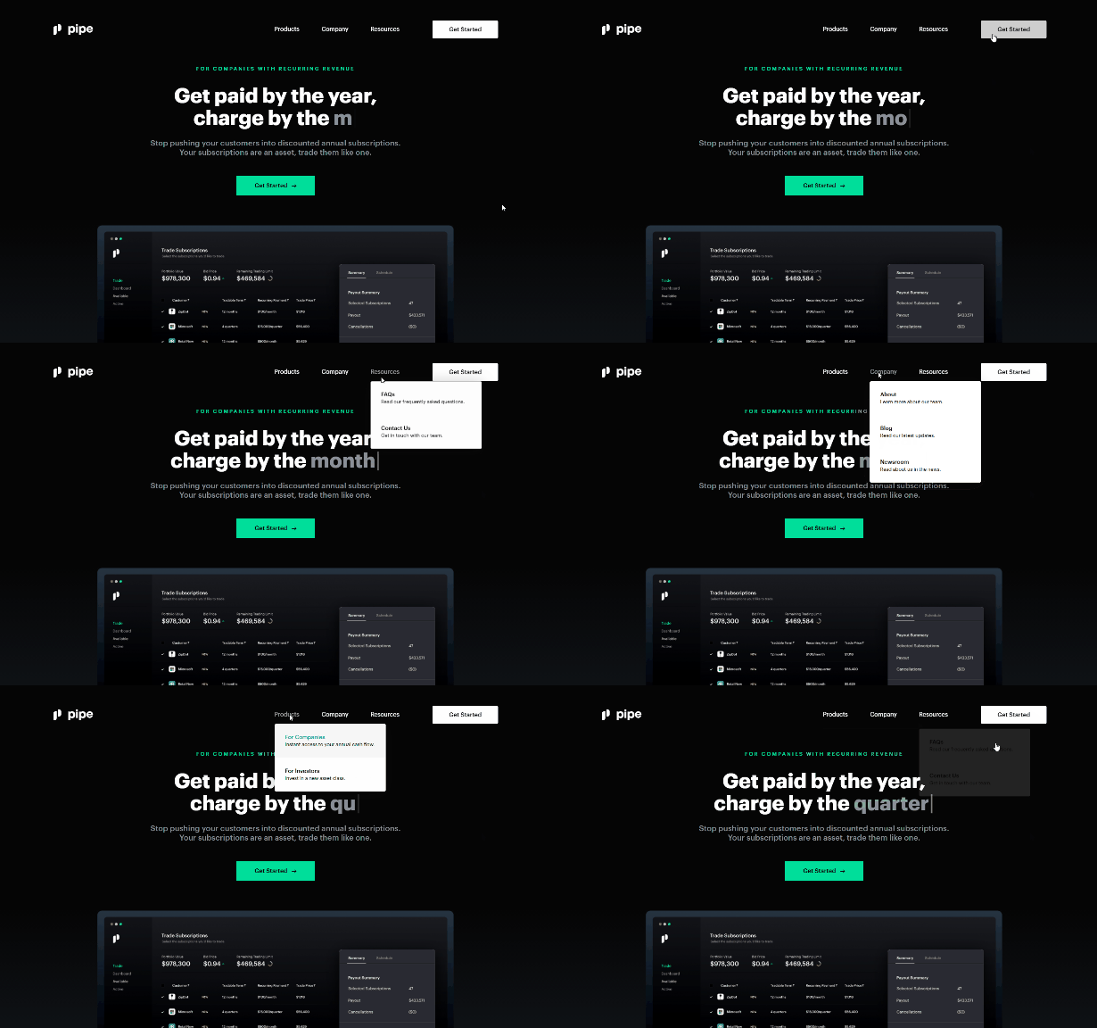
Pipe’s nav menu is fairly simple, but effective. Hovering over the links opens up a basic dropdown with a few second-level links. The main level of the menu also includes a “get started” button. Putting this link in the form of a button really makes it stand out.

Carnival Sounds
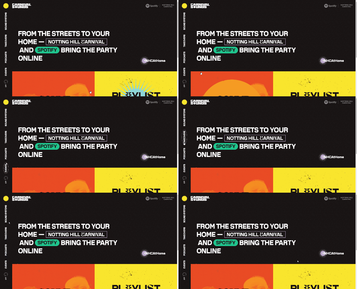
Carnival Studios takes an interesting approach by having the links displayed vertically and sideways. There are no dropdowns, but this is a visual effect that outlines each link as you hover over it.

Canal Street Market
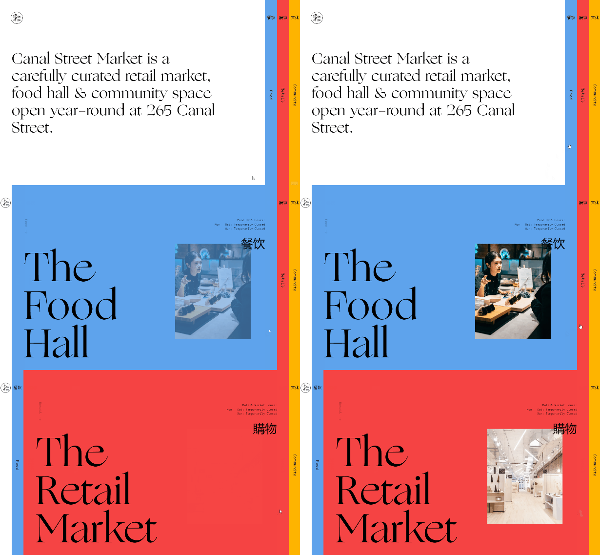
Canal Street Market uses tabs to organize and display content. The multi-colored tabs can be access on the right side of the page.

Parker
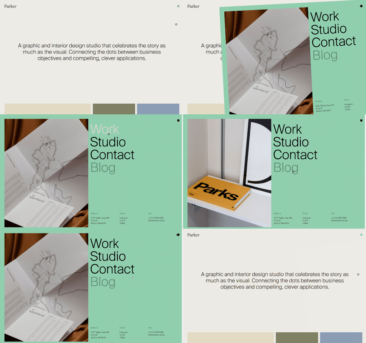
Clicking on the square in the header of Parker’s website will open a full-screen navigation menu that slides in from the side, which features the most important links as well as a large image.

Rino & Pelle
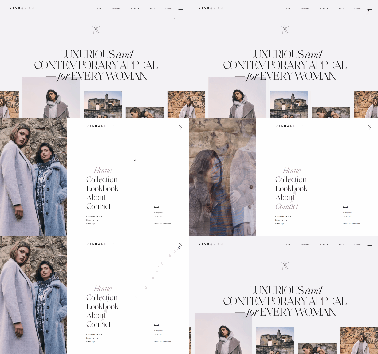
Fashion website Rino & Pelle uses a hamburger icon in the header menu, which is essentially a secondary menu since the main links are listed in the header. Clicking on the icon opens a full-screen menu that slides down from the top of the page.

Free Markets Destroy
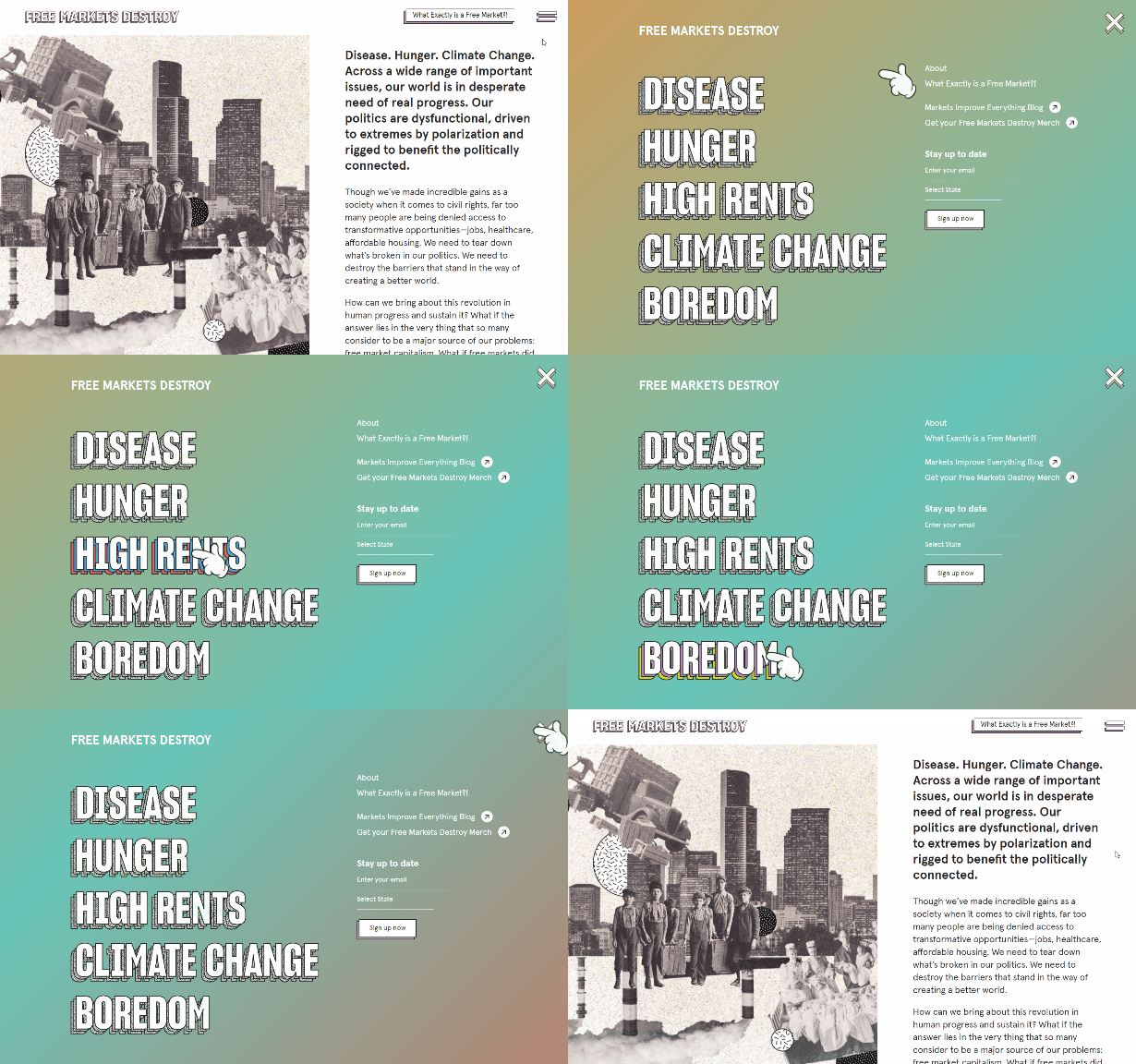
Free Markets Destroy uses a hamburger icon and a unique design for the navigation menu. The links feature 3D effects, different colors on mouse hover, and a large finger pointer.

Sercopointweb
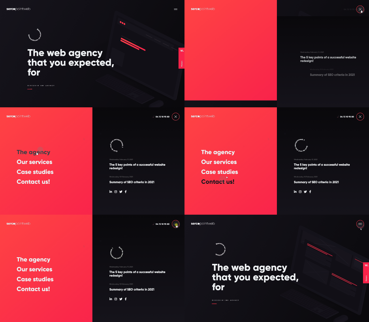
The website of Sercopointweb uses a hamburger icon that opens up a full-screen menu with a two-toned background.

Stripe
Stripe’s header menu features dropdowns. Unlike some dropdown menus, each dropdown displays the available links a little bit differently.


Good & Proper Tea
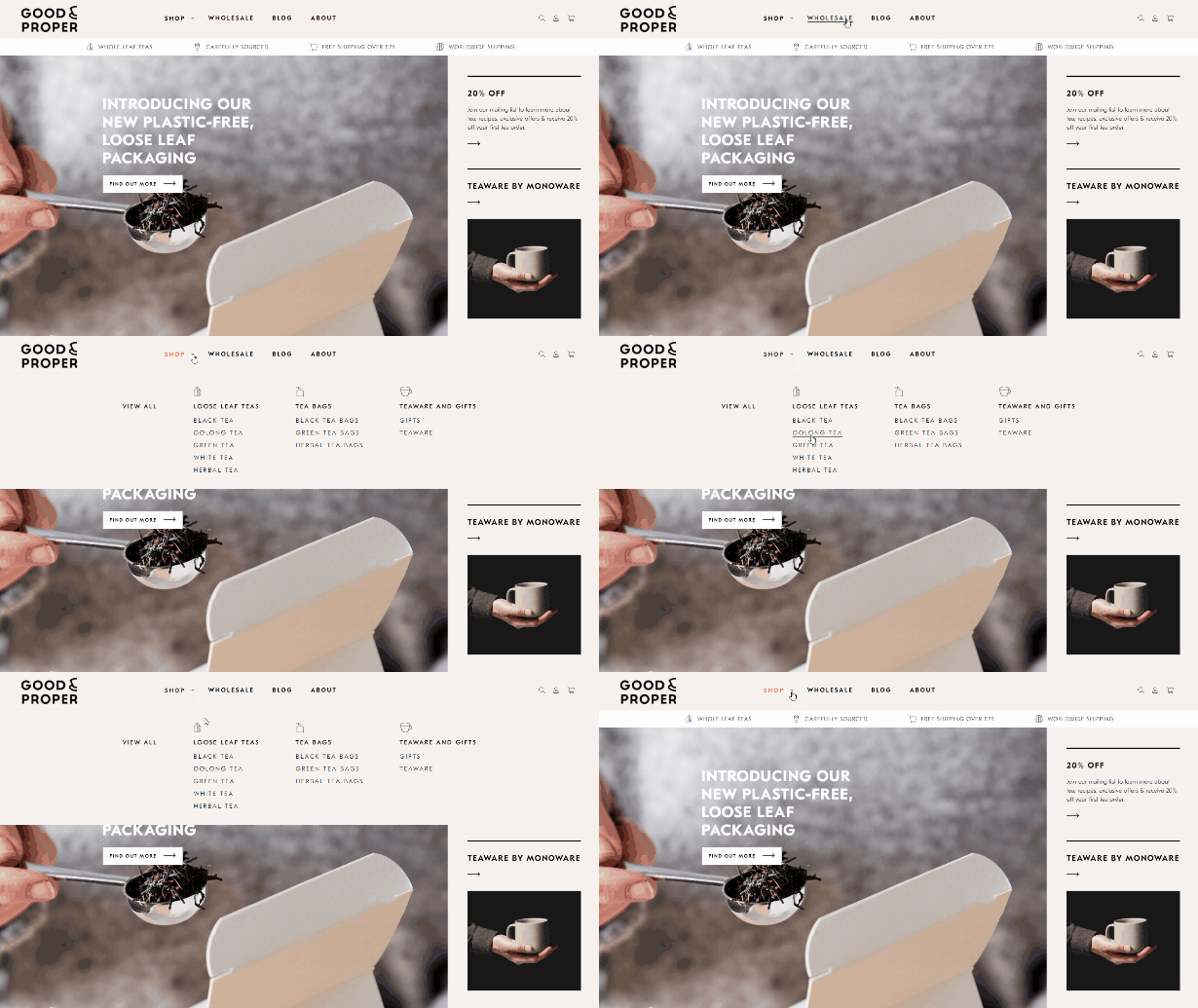
The navigation menu for Good & Proper Tea is fairly simple, although it’s well designed and fits with the theme and style of the site. The “shop” link opens up a dropdown with the categories of items in the shop, making it easy for users to find what they’re looking for.

Pier 70
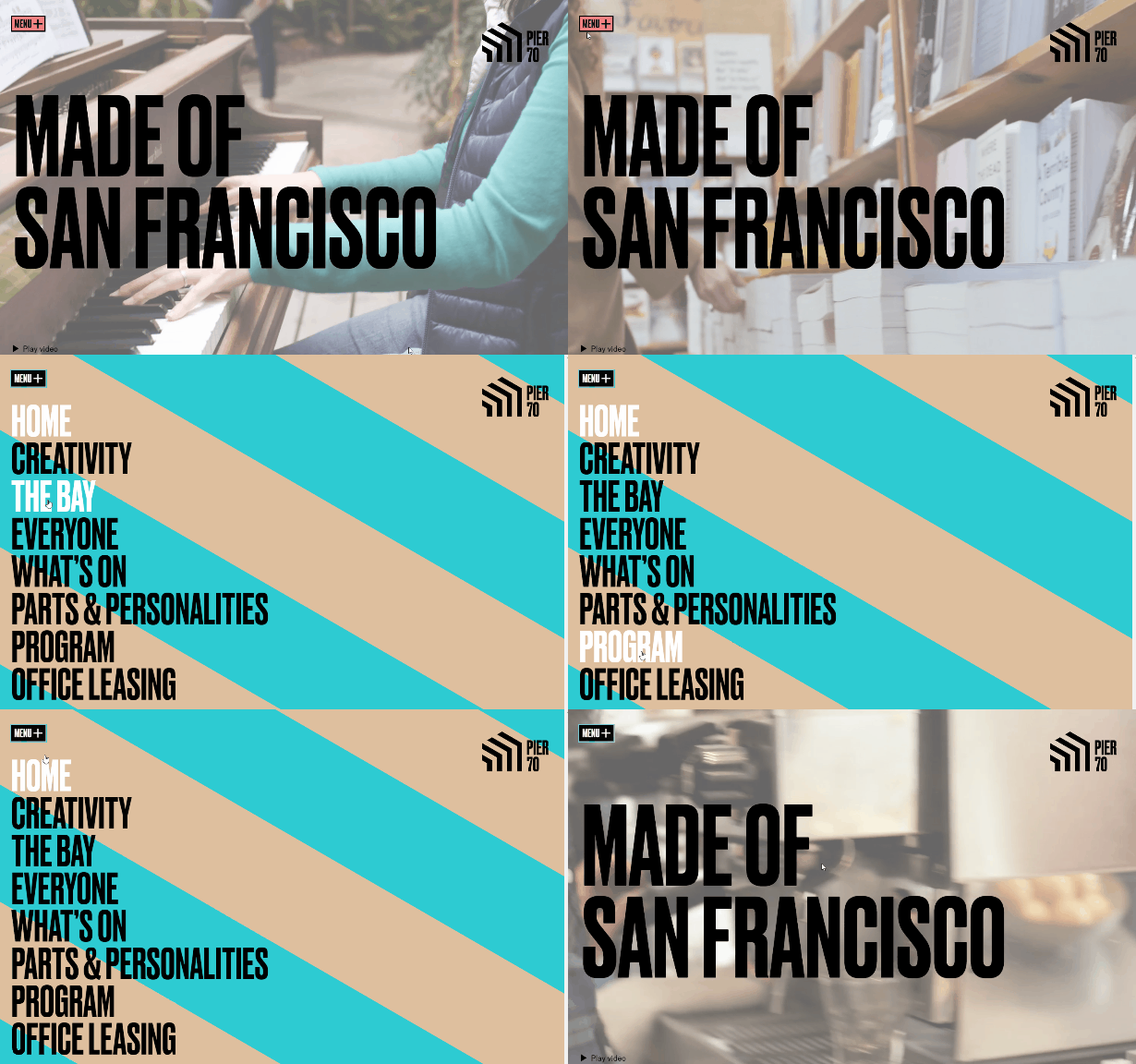
Pier 70’s navigation menu is accessible by clicking on a button. The opens a full-screen display with a bright striped background. The links are shown in big, bold text.

Anne Klein
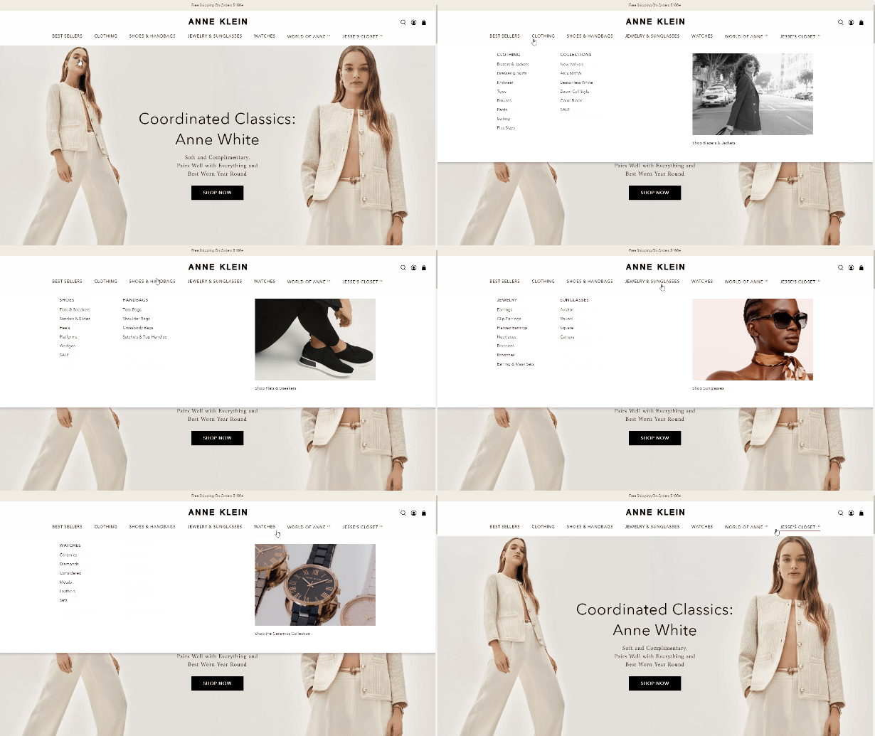
The E-commerce website for Anne Klein uses a mega menu with links to subcategories and images in the dropdowns.

Sandbox Films
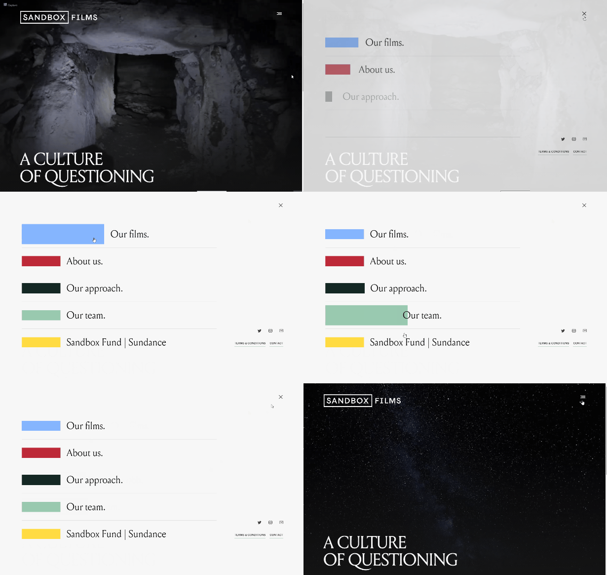
Sandbox Films features a unique design that isn’t quite like anything else. Click on the hamburger icon to open the menu and then you’ll see the five primary links, each with a different color block. On hover, the block and text increases in size.

BORN Group
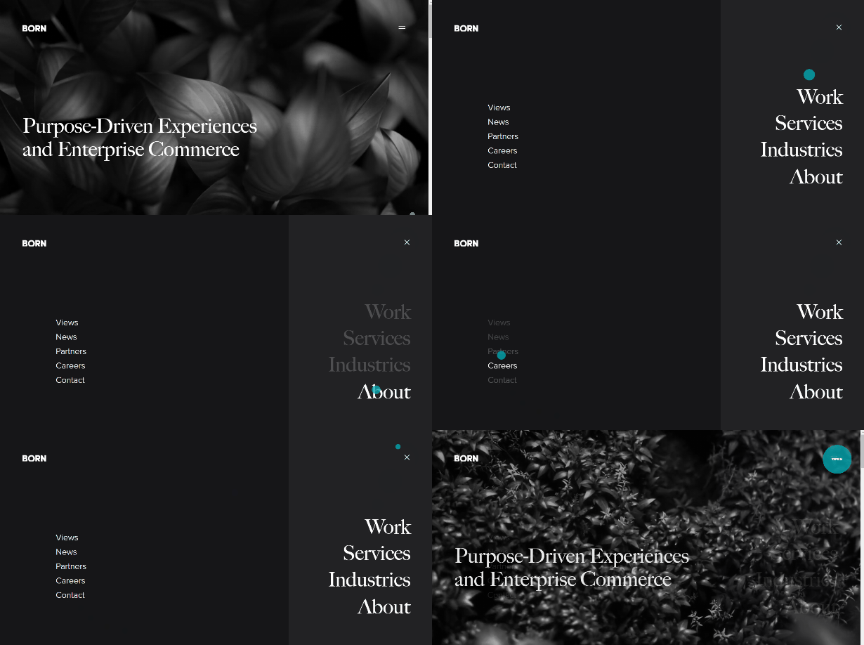
BORN Group’s menu is accessible to users through the icon at the top righthand side of the screen. It opens a full-screen menu with two columns of links.

UPQODE
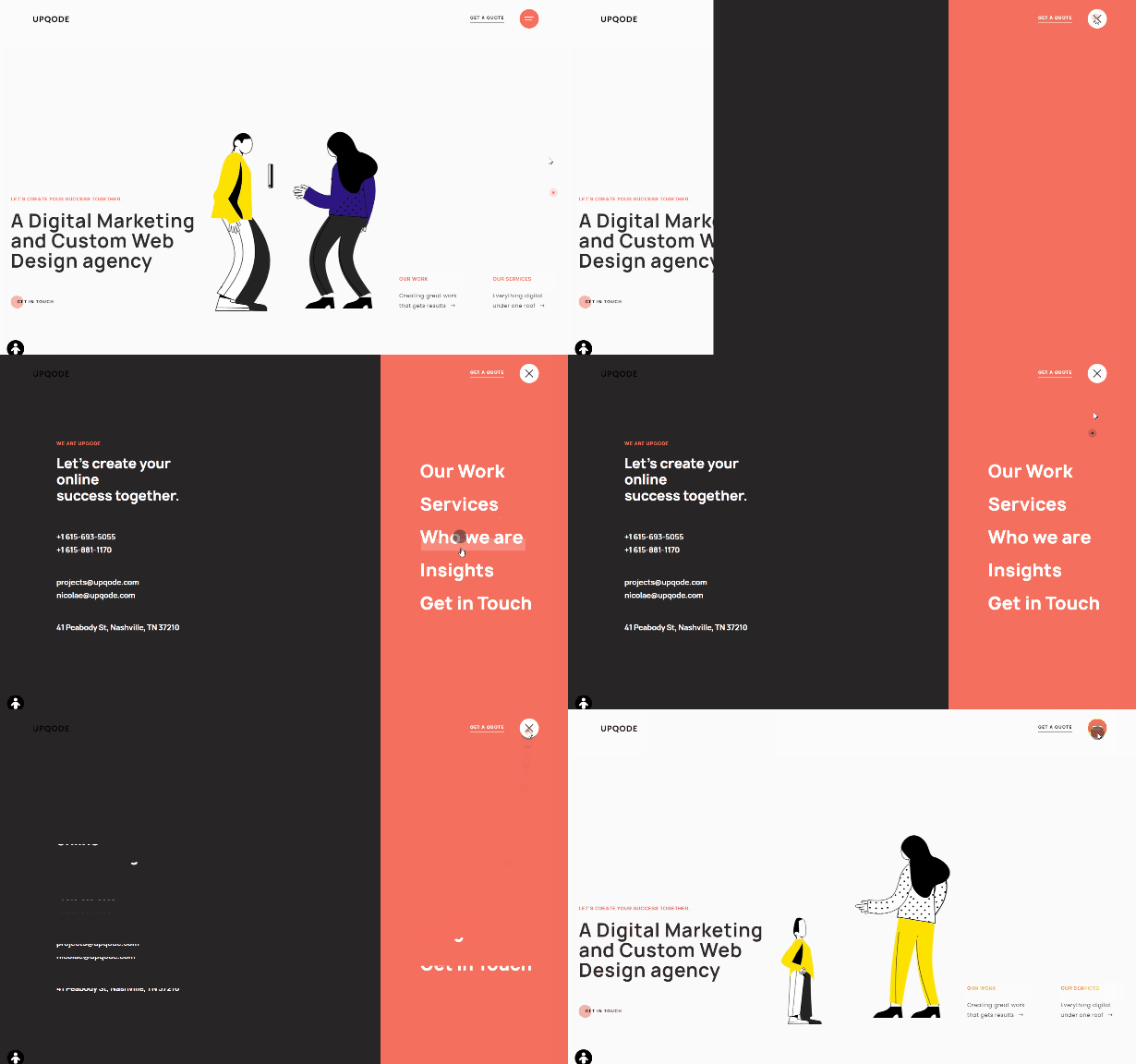
UPQODE’s functionality is fairly similar. The menu is accessible from the top right and it displays in two columns, but the left color shows their contact info.

Brews & Grooves
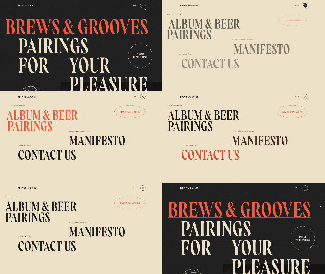
The website of Brews and Grooves features big, bold fonts, and the navigation menu takes a similar approach. Clicking on an icon in the header opens the full-screen menu that features a few links to important content on the site

Young and Hyperactive
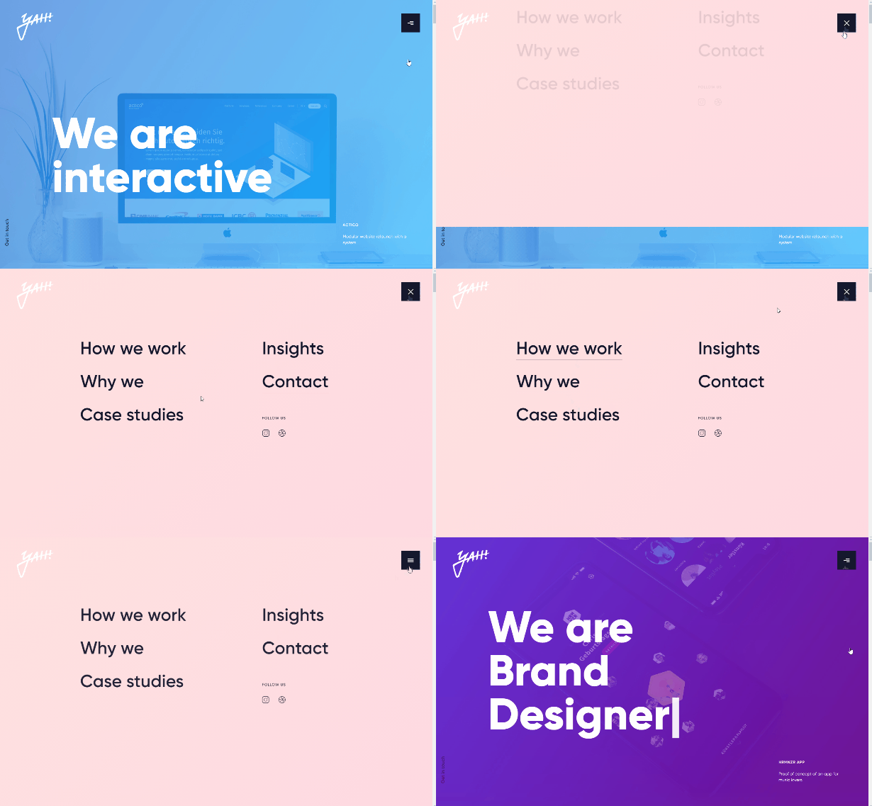
Portfolio websites are often excellent sources of design inspiration, and the site of Young and Hyperative is a good example. The icon/button in the header opens the full-screen menu, which slides in from the top. There are two columns of links, plus small social media icons.

This is Amber
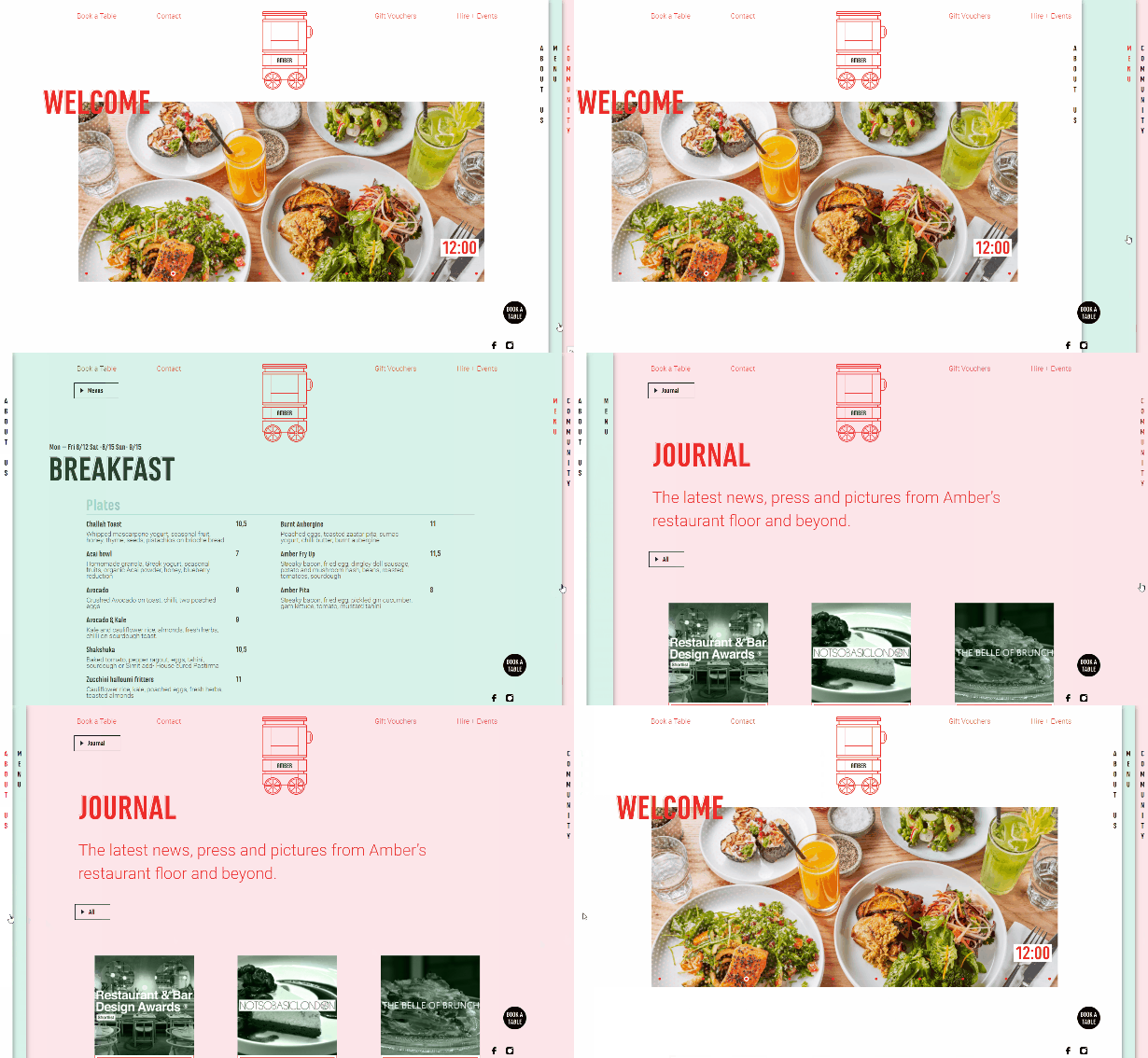
Amber’s website uses tabs to the right side of the screen to open up the different pages. Using a sidebar menu like this is not the typical approach, but it provides a unique touch.

Bien
Bien’s website design features a navigation menu at the left side of the screen with the text sideways going vertically up the screen.


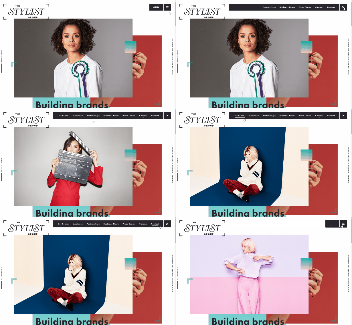
The Stylist Group
The menu at The Stylist Group is fairly standard, aside from the fact that it is hidden by default. Clicking on the “menu” link will open up the navigation bar, which slides out from the button.

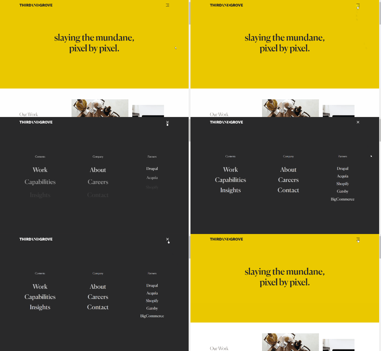
Third and Grove
Third and Grove uses a minimal website design with a clutter-free layout. The menu opens when you click on hamburger icon. It uses a fairly basic two-column layout for the fullscreen menu items with partners displayed in a third column list of links.

Plug & Play
The design agency website for Plug & Play uses a hamburger icon that opens up the menu, which slides in using two different columns or sections.


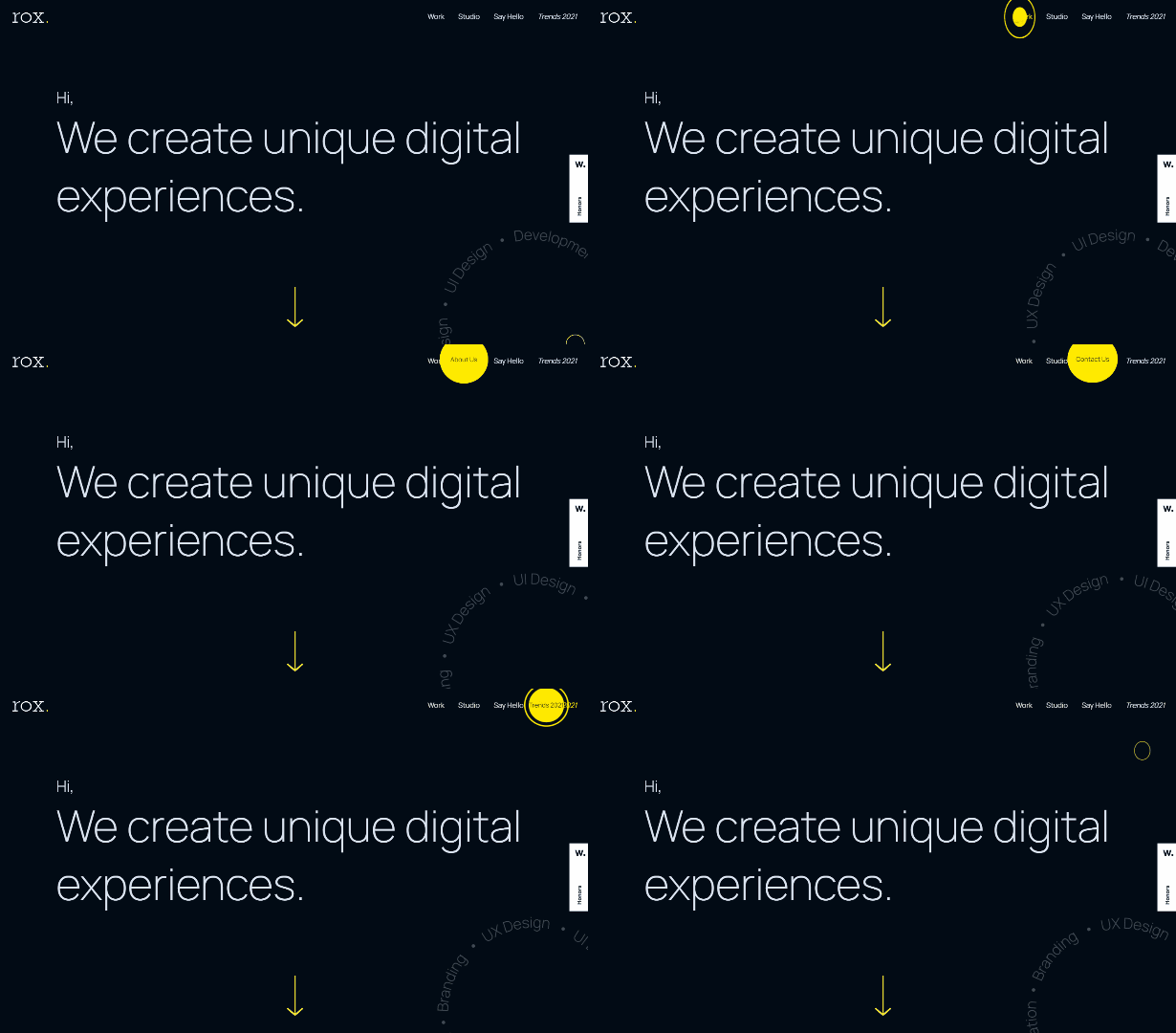
Rox
The nav at Rox’s website looks pretty standard at first, but it gets more interesting when users hover over the links. A yellow circle appears in the background and the text of the links changes. For example, the “work” link becomes “our projects” on hover.

Spline
Spline’s colorful website uses a “+” in the header, which opens the menu. It’s not quite a full-screen menu but it slides down from the top and covers the majority of the screen.


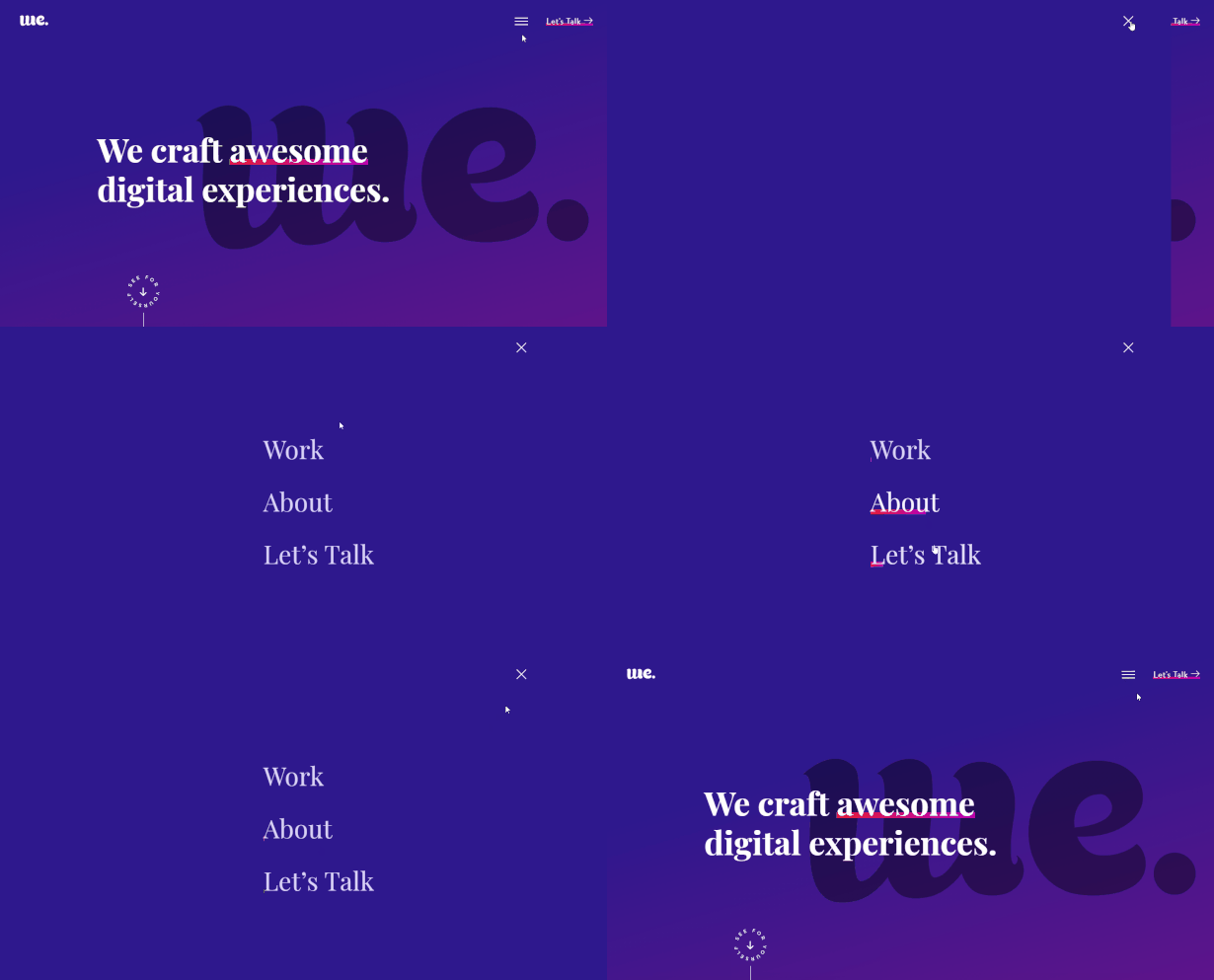
Web Effectual
Web Effectual includes a basic hamburger icon that opens up the menu. The menu is full-screen with just three links and a solid background. On hover, the links get a colorful underline.

Blackbird Cigar Co
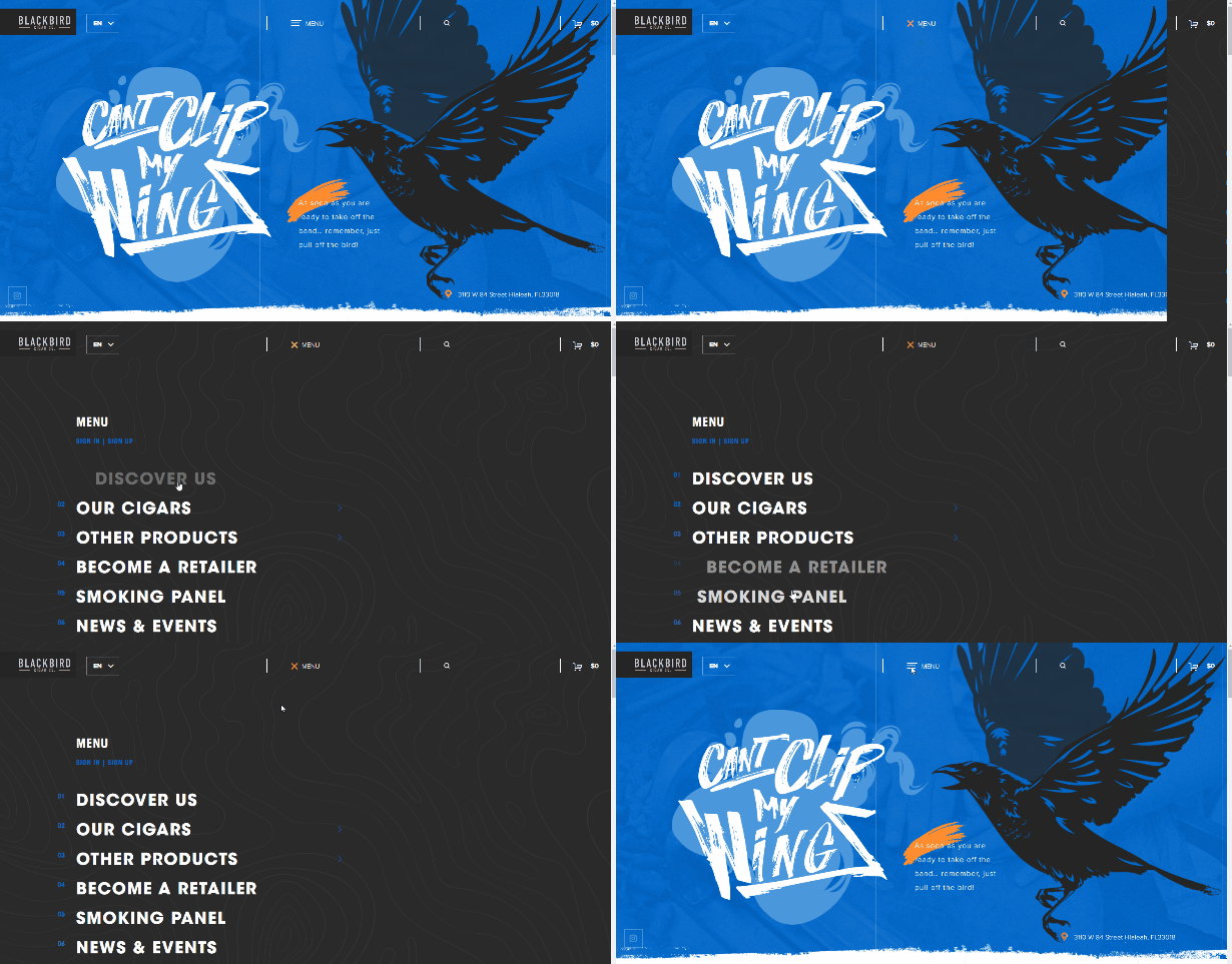
The menu icon at Blackbird Cigar co is in the middle of the header. It opens a full-screen display that slides in from the right. Some of the primary menu items also include a secondary menu that opens on hover.

Tambien
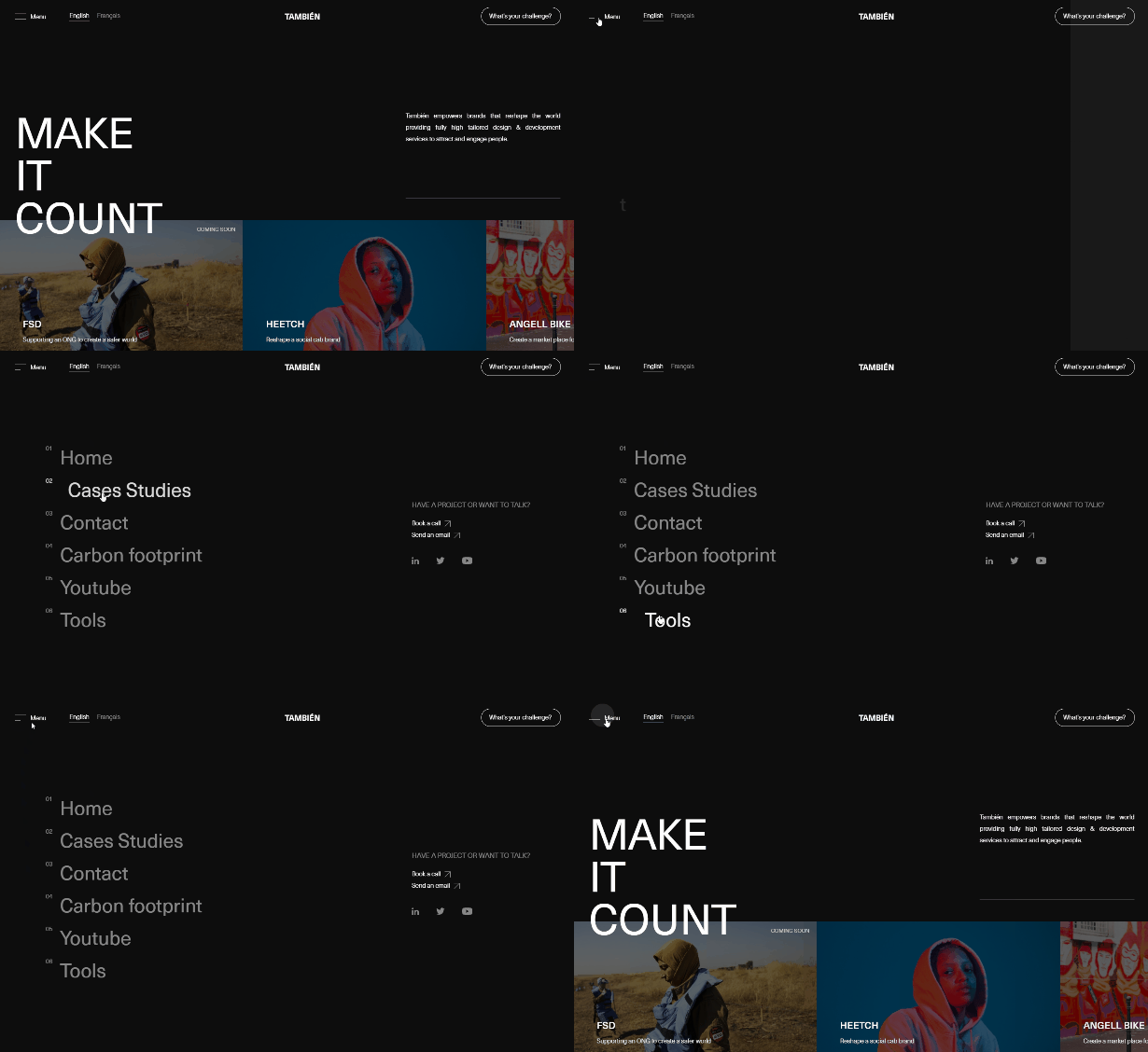
Click on the icon in Tambien’s header to open the navigation links to the main pages on the site. It slides in from the left.

Le Petit Salon
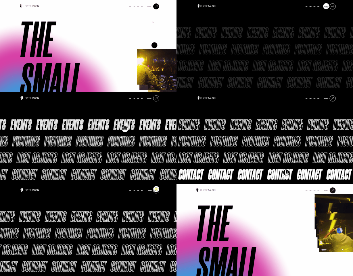
Le Petit Salon has one of the more unique and interesting designs showcased in this article. When you click on the menu icon it opens four links that scroll across the screen in bold outline text that repeats.

Unique Brands
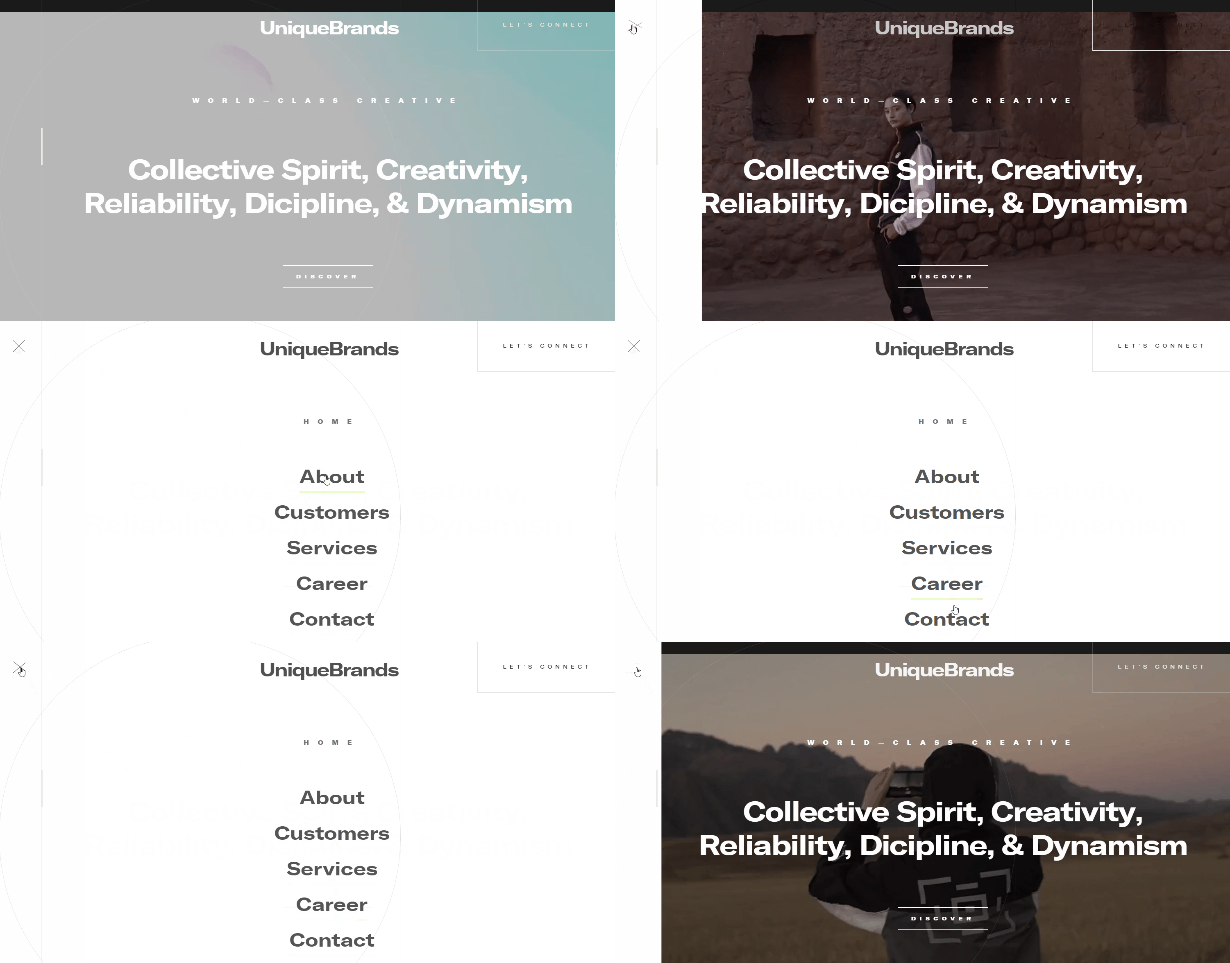
If you click on the icon in the header of Unique Brands’ website, it opens the full-screen menu with five links on a white background. The background slides in from the left.

EDF
EDF uses a primary navigation menu with three links and a hamburger icon that opens a larger selection of links.


An Event Apart
The menu at An Event Apart’s website is fairly simple, but it’s attractive and well-designed (as you would expect). The text features a thin underline that becomes bolder on hover, and a top border also shows up on hover.


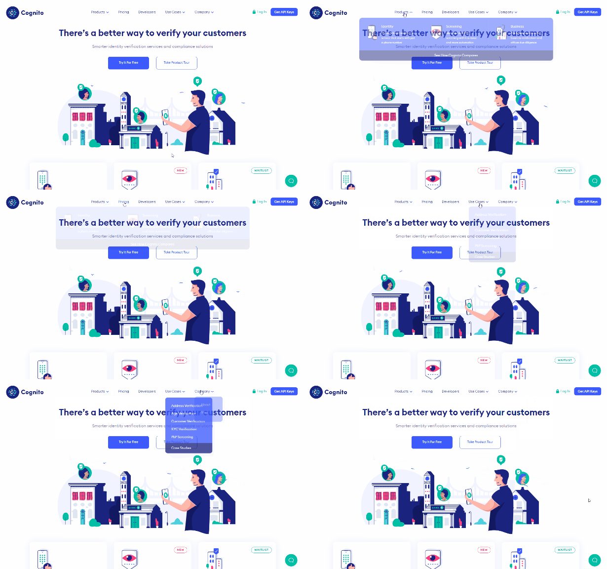
Cognito
Cognito uses dropdowns to showcase some secondary options for visitors. The dropdowns use a blog background and the “products” section is shown with the options listed horizontally with icons included.

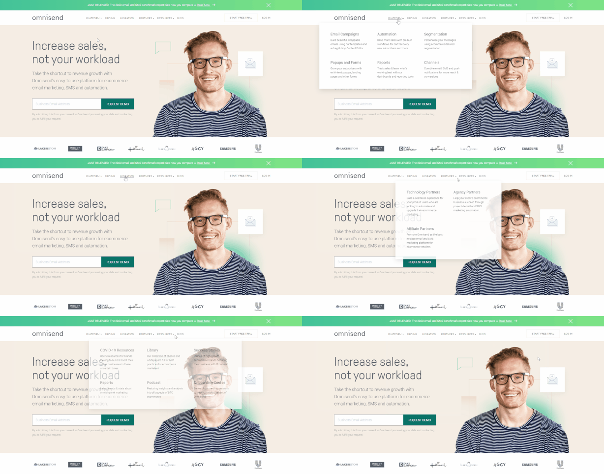
Omnisend
Omnisend uses a mega menu with several options that open up under some of the top-level links.

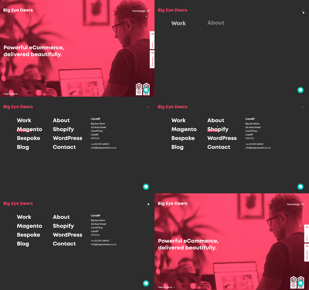
Big Eye Deers
Big Eye Deers has a hamburger icon in the header that opens a full-screen menu, which slides in from the side.

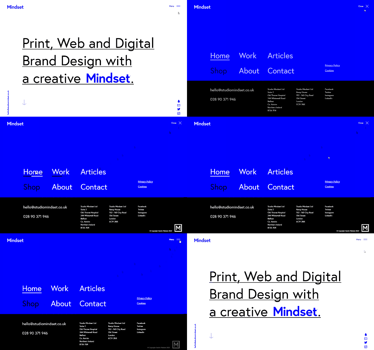
Mindset
Mindset also uses a hamburger icon and a full-screen menu. The two-toned background slides in from both sides, which is a unique design touch.

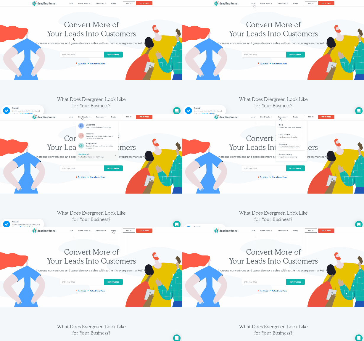
Deadline Funnel
Deadline Funnel has a fairly standard menu but the “how it works” link includes a dropdown with some colorful icons. At the right side, you”’ find “log in” and “try it free” buttons.

Frequently Asked Questions
What Is a Menu In a Website?
A menu provides links to the most important or top-level pages of the website. The purpose is to improve user experience and make it easy for visitors to find the content they’re looking for.
Why Is Navigation Important On a Website?
It’s a critical element that impacts the user experience. Poor navigation will make it different for visitors to find what they’re looking for.
What Is the Navigation Structure of a Website?
The structure refers to how the pages are connected to each other and the hierarchical layout (which pages connect to each other, and how) of the site.
Are Website Menu Design Templates Available?
WordPress themes include a template for your menus. You can control the links that you want to include, and (depending on the theme) other factors like dropdown menus.
