The type used to communicate a message is every bit as important as the language used to do it. Different typefaces, or, in this digital age, fonts, signify different levels of sincerity, whimsy, or authority.
Some fonts automatically feel more official, while others cannot help but feel like fun. Some are easier to read, while others are more of a struggle for the eye. Is there a computer-using, high school or college student who hasn’t played with different fonts, font types, and sizes to try and extend a paper that is running a bit short of a required page length?
Ultimately some fonts wind up being consistently more popular across discipline, user population, and purpose. The following is a guide to the top five best-loved fonts and top five most hated.
UNLIMITED DOWNLOADS: 50+ Million Add-Ons & Design Assets
Most Loved Fonts
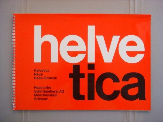
Helvetica
Helvetica was created in the late 1950s by two Swiss designers looking to create a sans-serif typeface. Sans-serif is a design term, which indicates the lack of projecting flourishes at the termination points of letters. To many readers, this gives Helvetica and other san-serif fonts a cleaner, more modern look that is easier to read.
Sans-serif texts are commonly used for online reading because they’re easier for the eye to trace in a slightly flickering, digital interface. Since its creation, Helvetica has become the most commonly used font in the world, especially for official printing like municipal signs and notices. It may also be the only font to boast its own documentary, a 2007 film called, what else, Helvetica.

Garamond
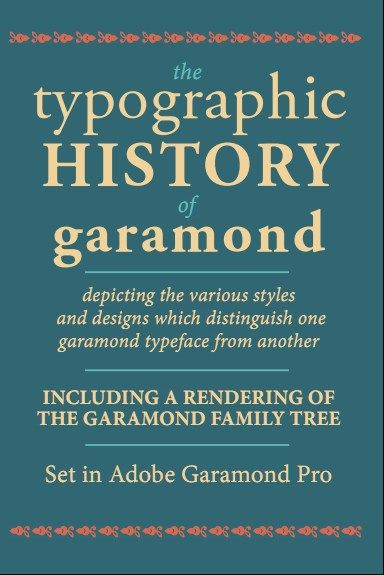
Garamond is a serif font named after a typeface that dates to the Renaissance. It owes its name to its creator Claude Garamond.
Like Helvetica, Garamond is easy on the eyes, with the addition of the slight bit of poetry that a serif adds to the letters. Garamond is more commonly used offline and is considered a “green” font because printing in this font uses less ink.
Frutiger
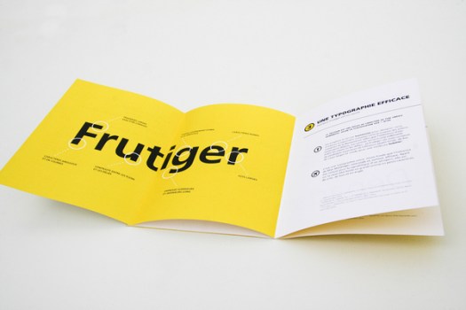
Frutiger is a font originally developed in the late 1960’s and is sans serif. However, it has since developed a serif counterpart. It is one of a multitude of fonts created by Swiss designer Adrian Frutiger, and the font has added many updated versions to its family since then, including special licensed versions to Microsoft.
Originally created as a typeface for Charles De Gaulle Airport, the appearance is clean and modern, readable without feeling stark and cold. It is popular for advertising because it is legible while still feeling “friendly.”

Bodoni
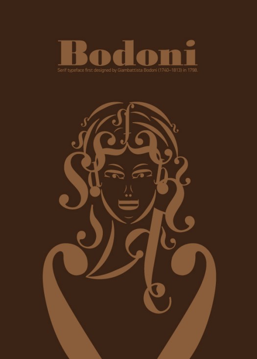
Bodoni is another serif font created by an Italian designer in the 18th century. It will be recognizable to almost any reader as the font relied upon most frequently for the “classic look.” It is characterized by alternating thick and thin lines within a single letter that gives it dimension and interest and evokes the typefaces of 18th and 19th-century books and documents.
Bodoni’s popularity suffers a bit from legibility issues on the computer screen. The varying thicknesses of the letter strokes can make the words seem to dance in front of the reader’s eyes after a while. This font may not fare as well for digital publication duty as it does for print jobs requiring a more refined appearance, like invitations, announcements, and even literature.

Futura
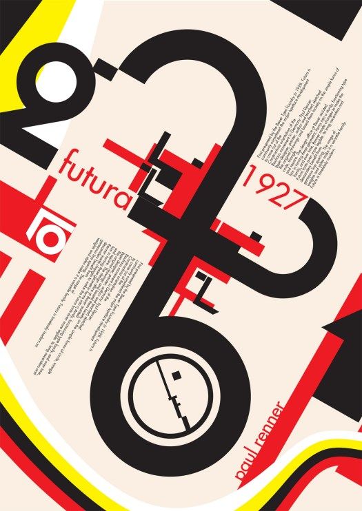
Futura is a sans-serif font whose origins date to the 1920s. The font appears to embody the modern ideals and aesthetics, simplicity, and mechanistic qualities so popular during that era. As its name suggests, Futura has a futuristic appearance in which nothing is perfectly round. Everything is sleek and minimal and almost seems aerodynamic, built for a rocket age. It is used widely in advertising and print to convey a sense of efficiency and progress in a way that the extra strokes of a serif font or the bolder lines of other sans-serif fonts do not.

Most Hated Fonts
Impact
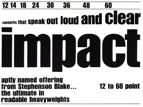
Designed in 1965 by Geoffrey Lee, Impact is easy to read and grabs attention. But that is where the good qualities end. As a headline font or logo font, it is too thin and amateurish to be taken seriously by professional designers. It’s most commonly used on documents that have been designed by people who don’t know what they’re doing when it comes to typefaces, and as such, it should be avoided.
2012 Headline
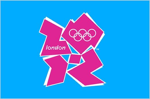
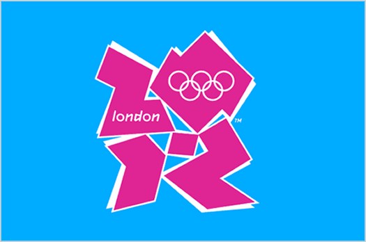
2012 Headline is perhaps better known as the London Olympic font. Like the Olympic logo, the font seems to try to reference 1980s graffiti, mixed with a little Grecian stylization.
The problem is that it is trying so hard to be cool, but like a dad, it simply isn’t. It also has a perfectly round O, which is jarring to the reader. Luckily, it fell out of use once the Olympic Games were over.
Souvenir
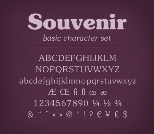
Souvenir was developed in 1914 by influential American typeface designer Morris Fuller Benton. It really came to the forefront in the 1970s, appearing on Bee Gees album covers and advertisements. When punk came along, it made things like the fluffy design of the font look outdated, silly, and foolish. It is having an ironic retro resurgence, though, as designers are now drawn to its soft yet graphic look.
Comic Sans
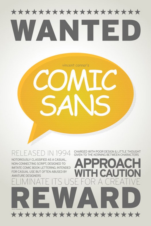
Comic Sans was designed by Vincent Connare and released in 1994 by Microsoft. It was designed based on the letter styling of comic books, but its widespread use in the wrong situations have made it despised by many designers.

