Identity design is deeply ingrained in with psychology and marketing. To design a readable identity you need to understand what works and what doesn’t work.
It’s not hard to find examples of bad logos all over the web. You can quickly tell which logos got a professional design job vs which ones were thrown together haphazardly. But some are very subtle and lie right in the middle. They’re not terrible, but they’re also not effective. So how do you avoid these poorer quality logo designs?
I want to share examples of poor logos contrasting with better designs. By recognizing design patterns you’ll quickly adapt to a certain aesthetic and feel more comfortable in your logo/identity design work.


What Makes A Bad Logo?
Logos should be crisp and memorable. They should represent the brand in all ways and should be easy to recognize.
By comparison this means bad logos could have many unpleasant qualities: confusion, murkiness, over-complexity and/or poor recognition.
A great logo is easy to recognize and connects directly to the product. The Nike swoosh is a great example of quality branding. Everyone should be able to recognize it and understand what it means or what it stands for.
Bad logos are often too bright, too loud, or too confusing. They simply don’t make sense and don’t fit with the quality of the brand.
The biggest mistake I see is over-complication and merging ideas together that just don’t fit. Take a look at some of the logos used as examples in this article. You’ll be left ruminating on how designers could actually make these and pass them off to real companies.
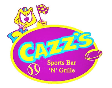

But not all bad logos look like this. I’ve seen logos that are so-so but still have too much going on.


This logo is a great example where it seems OK, but not great. Every element in the logo feels too bright and it seems like everything pulls for attention from the viewer.
Subtlety and layered elements work best.
Design some part of the logo to stand out above all the others. Great logos follow a give-and-take methodology where some elements are flashy while others are not pushing for more attention.
Choosing The Right Fonts
Typography is crucial to logo design because lettering is always part of branding. The lettering you choose should match the company’s goals and products. Consider the different font types to decide which is the best fit.
Do not go overboard because it’ll quickly become an eyesore. For example, cursive letters with smaller uppercase letters can go well together if they fit the identity.
You also don’t want to use too many different fonts within a logo. There’s no need for more than two different fonts.
Here’s an example where the “C” is an octopus in the logo. This logo feels too busy and it’s somewhat confusing to remember. It’s not exactly bad, but it feels too busy with uncoordinated font choices.


Go with your gut when designing and be willing to change anything last minute. If you really have an odd feeling when looking at your design then there’s probably something that needs to be corrected.
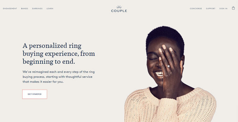
However over-simplifying can have issues too. Take a look at the following logo and notice how the letters are arranged in a whoosh design.
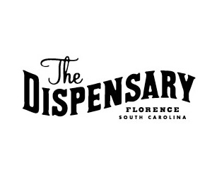

Here’s a different all-text logo where the fonts seem to work well together. It’s obvious what the company does. This is a good example where simplification helped the logo design to be effective.


Keep Things Memorable
I rarely think a company rebrand is needed. Or if it is, the rebranding should be subtle enough that consumers would still quickly recognize the logo.
I always look back to the Pepsi logo as an example. Their revised logo (right) is similar to the previous design (left) and it’s not really bad.
But it does seem more confusing and it was almost unnecessary that they redesign that logo in the first place.
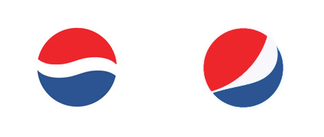

The previous logo had rhythm and symmetry. The new design feels fractured with parts of the inner white band extruding further than other parts. This creates asymmetry, which is a completely viable tool for logo designers.
But by comparison I’d much prefer the old logo.
This may be a subjective opinion but to me this rebranding wasn’t necessary.
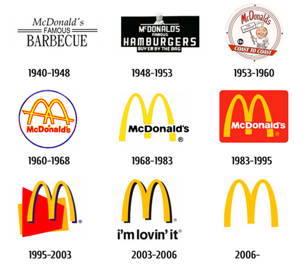
Contrast the Pepsi redesign with McDonald’s which has been running their same logo for years. Their “M” has seen gradients, simplification, multiple colors and varied positions. But the “M” remains the same and it’s still noticeable decades later.

This is also true of ReCode’s logo redesign from a few years ago. It’s still memorable because it keeps that distinct forward dash between the letters.
When people connect your logo with symbols or colors, it’s best to stick with them. Consistency breeds memorability and that’s what you want to achieve with great branding.
Use Relevant Symbols
Most great identity designs use some type of graphic or icon for the brand design. This icon can be used all over for social media profiles, website favicons, and for posters/banners/flyers for the company.
But always make sure your graphics are relevant to the logo. Relevancy is crucial especially for food & restaurant logos.
Here’s one that just doesn’t make much sense to me. How does a campfire icon relate to Sushi?


It’s not a horrific logo, but it’s certainly not the best I’ve seen. The fireplace wood uses chopsticks which does make sense. But wouldn’t it match better to use an icon of a sushi roll, a shrimp, or a related utensil (like a bowl or platter)? The fire icon isn’t terrible but I simply can’t make a connection between sushi and open-fire grilling.
The text is crisp, typography choices match, and colors blend well. This is not a repugnant design by any means. It does look good. My critique is with the relatability in the sushi logo and the fact that it just doesn’t seem congruent.
Common Logo Mistakes to Avoid
Let’s take a look at a few areas where some logos come up short. If you’re looking to design a good logo, be sure to avoid these mistakes.
- The logo does not work in black and white – Logos may be used in color or black and white. If the color is essential, it’s going to cause problems when the logo is displayed in black. A common practice is to create two different versions of the logo, one for color and one for black and white.
- The logo does not work at small sizes – The logo will be displayed in different sizes depending on where it is used. It could be on a billboard or on a mobile app and it needs to work well in each scenario. This is one reason why there shouldn’t be a lot of text in a logo.
- The logo is too complicated – Effective logos are often very simple. If there is too much going on, it will be distracting. This applies to text as well as the other visual elements within the design. When in doubt, keep it simple.
- The logo is not unique – Avoid clichés and designs that look very similar to other logos, especially well-known logos or logos from other companies in the same industry.
- The logo is not memorable – A big part of the logo’s job is to create recognition for the purpose of branding. If the logo is not memorable, it’s unlikely to be effective. Simple logos are often much more memorable than busy logos that have a lot going on.
All examples in this post are genuinely good enough to be used as real logos. My goal with this post is to outline very specific details to show how minor changes can greatly impact how an identity & branding design can appear to viewers.
I hope this guide can illuminate some important concepts for logo designers and ideally help you avoid bad design practices.
And if you’re looking for logo design inspiration be sure to check out our related galleries:
What Makes a Logo Bad?
There are a number of common problems with logos including lack or memorability, lack of unique design, poor font choices, too many competing elements in the design, and more.
How Can I Avoid Having a Bad Logo for My Business?
The most effective approach is to hire a professional designer with a solid portfolio and a proven track record. There are a lot of ways to create logos for cheap, but typically you get what you pay for.
How Do I Fix My Logo?
The best approach is to start from scratch. If the current logo isn’t effective, going a different route is usually the best solution. However, there may be some elements or concepts that can be retained or modified from the current logo.

