Every digital typeface from free fonts up to a $1,000 font pack goes through a similar design process. It’s rigorous for a beginner and does require an understanding of foundational typographic principles. But for what it’s worth, learning how to create a font from scratch is one of the most fulfilling creative endeavors in digital design.
Professional font design takes years to master, but this shouldn’t dissuade you from learning the process. Once you understand the steps needed to create a new font, you may be surprised by how easily they can be replicated.
This guide is meant for hobbyists and typographers who want to get into the world of font design. Bear in mind, I won’t be covering specific techniques in font creation software, but rather the steps necessary to go from initial idea to completed font. At some point, you will need a font creation program and I’ll cover the most popular choices to guide you along the way.
UNLIMITED DOWNLOADS: 50+ Million Add-Ons & Design Assets

Font Fundamentals
It’s imperative that you understand how typography is structured before you start designing characters. This phase requires knowledge of terms like baseline and x-height. If you’re unfamiliar with these terms please skim this typographic glossary published by Codrops.
Here are the most important things you need to know:
- Baseline: Where all the letters sit. Think of this like a shelf where the bottom of each letter should rest.
- Overhang: Rounded bottoms of letters like O and B that dip just below the baseline.
- X-Height: A line representing the height of most lowercase letters (notably the letter “x”).
- Cap Height: A line representing the height of most capital letters.
- Ascender Height: Limits the very tip of lowercase letters such as “k”.
- Descender Height: The length of descending marks from characters like “y” and “q”.
It helps to know other terms like finial and ligature, but these are admittedly useful in more advanced typefaces. When just getting started, you mostly need to understand how your letters should be organized in a grid system.

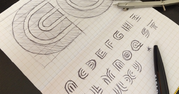
At first glance this stuff will be confusing. But to design fonts, you really need to love & understand typography. The best way to learn is to dive right in to see what you can make.
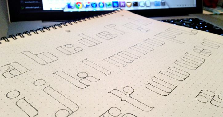

Every professional typographer recognizes the importance of paper & pencil (or pen). The very first step to creating a new font is drawing out your letterforms. This is relevant for creating any of the font types, not just for hand-drawn fonts. If you don’t have much prowess in the way of drawing that’s okay, but it’s highly recommended that you develop some handwriting & drawing capabilities.
Letterform Sketching
Most professional-quality fonts include a standard character map, plus alternative styles like italic, bold, and small caps. You may not want to be this ambitious at first, so instead focus on the basics.
Start with pencil & paper by drawing a simple baseline grid. Use a ruler to make perfectly straight lines and measure dimensions proportionally. There is no exact rulebook for relationships between x-height and cap height, so you’ll need to use your best judgement.
Take a look at this article, Finding the X Height, on finding the measurement of an x-height from pre-drawn letters. All you need is patience to keep trying different ratios until you find a match that looks good. There’s a lot of trial-and-error involved but keep in mind this early stage is also the most important.
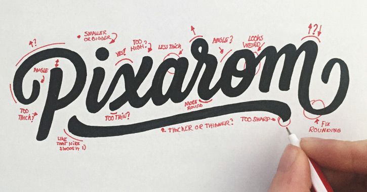
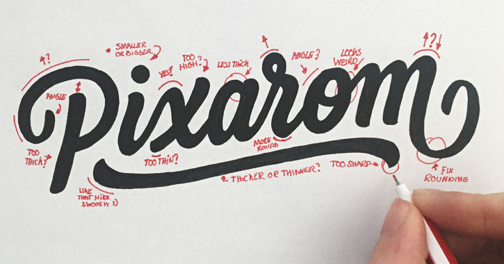
Don’t be afraid to revise or make drastic changes to the point of starting over from scratch. Your goal is to eventually create a final set of characters that can be scanned into the computer for digitization.
It may help to draw letters on a blank sheet of paper first. Don’t follow any particular grid – just doodle away to find shapes you like. Then you can draw out the 26 characters in uppercase and/or lowercase following the grid to see how they should look.
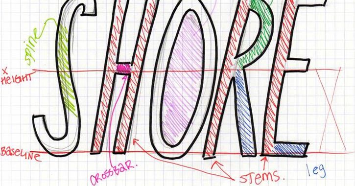

If you really don’t like sketching then try following this minimalist design guide which explains how to make a font without a lot of drawing.
Be sure to finish up your letters & numbers with grammar marks like a question mark, comma, and exclamation point.
From Paper to Vector
Once you have the letterforms sketched out, it’s time to move into the digital realm. If you don’t have a scanner you can get by with photos from your phone, but a scanned copy of your work is the best way to go.
You’ll need to trace these sketches in a font design program and you’ll want them to be as close to proportion as possible.
Some designers prefer to trace letters using a vector program like Adobe Illustrator. Others prefer to jump right into a font creation program like FontForge or FontLab Studio. If your goal is to create a final OTF/TTF font file, then it may be quicker to start tracing from a font creation program (more info on these later).
Adobe Illustrator can be used for a slight degree of automation. Jenn Coyle has a great post on lettering with Illustrator that explains how to pull your photos into Illustrator and live trace the letterforms. Live trace is not perfect and you most likely will need to perform some cleanup.
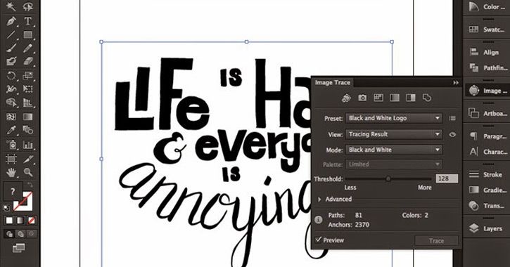
If your goal is to create a vector logo or brand symbol, then Illustrator is definitely the way to go. Font programs typically aren’t meant for large-scale vector manipulation. Plus Illustrator makes it easy to export your work into graphic file formats rather than font files.
Take note that it’s possible to use live trace on a font and then copy/paste those vectors into a font program. It just requires a bit of editing and may turn into a headache.
Those who want to design a full typeface should move ahead to the next section. But if you’re curious to learn more about Illustrator’s live trace feature or how to convert hand-drawn text into a vector, then check out the following resources:
Font Creation Software
Font creation programs have a marketplace of products just like graphic design and photo editing programs. You’ll find many suggestions online but the same names often pop up time & time again.
Let me clarify that a font creation program is necessary to make any real usable font. TTF/OTF files are generated from these programs and they’re an essential part of the workflow.
If you’re new to making fonts you’ll probably go with a free option like FontForge. Naturally, there are alternatives where most professional type foundries rely on FontLab, kind of like how creative agencies rely on Adobe.
I’d like to keep this topic simple for beginners, so unless you have a personal preference try to pick one of the following 3 programs for custom font authoring.
FontForge
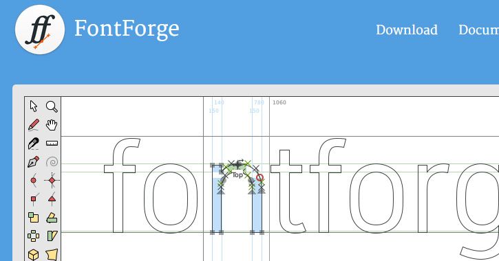
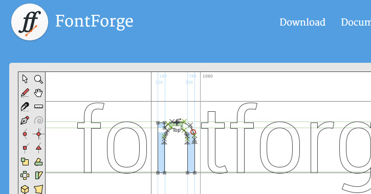
The splendiferous open source movement has blessed typographers with the gift of free font creation. FontForge is completely free and runs on Mac, Windows, and Linux systems.
If you’re completely new to type design then FontForge is the best choice for amateur work. It has every feature you could need and even some advanced methods of glyph manipulation that you’ll likely never use. Plus other programs will cost money, so if you’re new it’s not worth sinking dough into a program that you may never use.
It’ll take practice to learn FontForge just like nobody opens Photoshop for the first time and crafts a perfect photo composite. You’ll struggle and probably get frustrated. Use Google to your advantage.
There’s also a free online guide to FontForge which is very comprehensive.
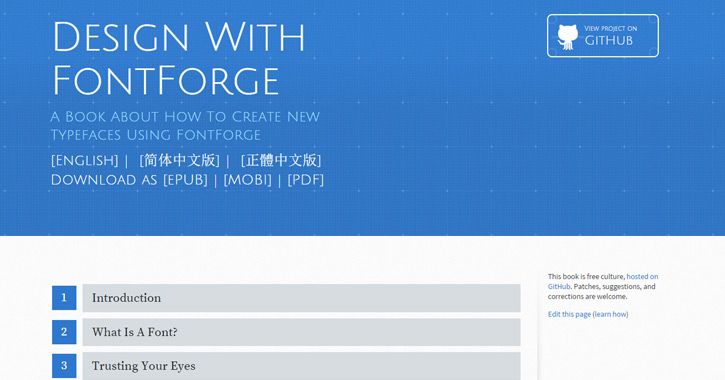
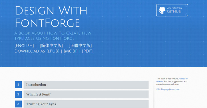
A search for “fontforge tutorials” on YouTube may also produce helpful results. The point is, you can’t easily learn FontForge on your own – but thankfully you don’t have to. If you put in the hours to study this program, you will be able to make awesome fonts from scratch.
FontLab Studio

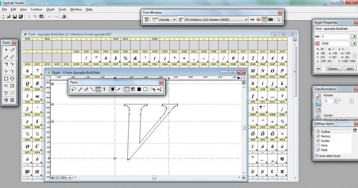
Almost every typographer knows about FontLab and their assortment of programs, the most notable being FontLab Studio. Professional design agencies & type foundries often rely on this program given its standing as the most popular type design program on the market.
The biggest downside for new designers is the $459 price tag. If you’re familiar with Adobe’s pricing then you know design software isn’t cheap. At some point, it may be worth shelling out for this premiere program – but designing your very first font probably isn’t this point.
A cheaper alternative is FontLab TypeTool which is only $48. It runs on both Windows & OS X with many similar FontLab features – the most important being a similar interface. If you learn TypeTool then you’ll have an easier time learning FLS if you ever want to spend $400+ on their top-tier program.
Glyphs App (Mac Only)

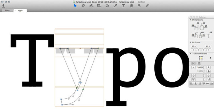
The previous two programs support all operating systems which is definitely advantageous. But Mac OS X users may want to check out a 3rd option named Glyphs in the Mac App Store.
It follows a different interface than FontForge and FontLab which means learning this program may not transfer well into others. But Glyphs contains all the features you’d need to make a basic (or complex) font from scratch.
Again this may not be a popular choice since it’s not supported on any Windows machines. But OS X users with a taste for adventure may come to know & love Glyphs as their preferred font creation program.
Building the Typeface
Each piece of software is very complex and would require its own guide to explain every feature. Thankfully most of the basics remain familiar across all programs – the differences lie in the interface & workflow techniques.
For example, FontForge covers Bézier curves which are common to those who understand Illustrator’s pen tool. There’s an entire bézier curve guide explaining how this works for PostScript fonts. If you’re new to drawing with curves then try following this great tutorial by Tuts+ which explains the pen tool step-by-step.
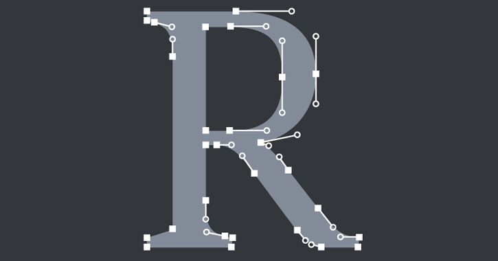
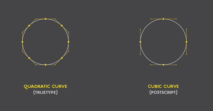
Another style of drawing is Quadratic curves which are mostly used in TrueType fonts. These can be auto-generated from Bézier curves and as such many designers prefer Bézier. You can read about these two methods and decide for yourself.
In general it’s easier to stick with Bezier since it’s more familiar and follows the same techniques found in Illustrator/Photoshop.
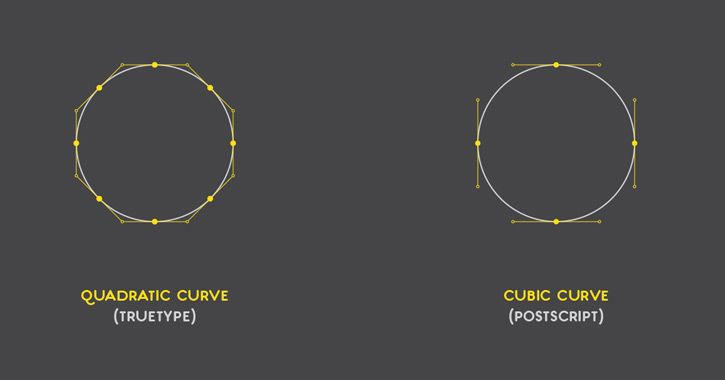
Each font design program allows you to import scanned photos as background references and trace the letters to perfection. This is highly recommended but not a perfect solution because hand-drawn artefacts do not always come out perfect.
The beauty of digital type design is precision. You can (and should) align an x-height along with other values that best match your font. Sometimes you’ll deviate from your original sketch but that’s okay. Your ultimate goal is to make a completed font that works as smoothly as possible.
Leading & Kerning
Space is something you’ll need to consider while designing your letterforms. Leading refers to the space between lines of text while kerning refers to the space between individual letters in a word (similar to text tracking).
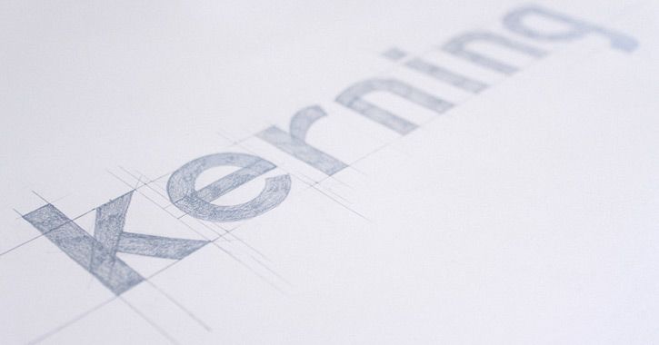

Both features are built into fonts and while they are changeable using Photoshop’s Type panel, each font needs to have default metrics. If you’re completely new to type design then a lot of this process will be trial-and-error.
Go by other examples and trust your eye. If something looks wrong then it’s probably wrong.
Individual letter-spacing needs to be considered but there’s also the potential for ligatures. Again the FontForge guide covers word spacing and line spacing with incredible detail. There may also be differences in weights if you create italic/bold versions of the font.
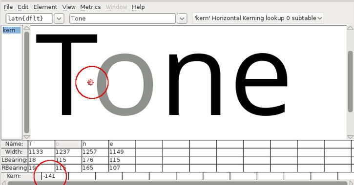
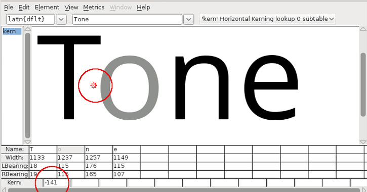
Kerning and leading are two large topics that require practice and a keen eye to fully comprehend. The best advice for a new designer is to do your best and trust your gut. If you’re itching to create a new font then you should jump right into the process without hesitation.
Just don’t forget the importance of measuring space, and more specifically the kerning/leading attached to your typeface design.
File Types & Export Options
Towards the final design stage, you’ll want to export your font for testing. This can take many drafts before completion and requires a lot of exporting.
The two common file types are OTF (OpenType) and TTF (TrueType). Most type designers feel OTF is a superior choice because it supports more features and more drawing formats. OTF is newer and generally regarded as better for complex fonts.
But if you’re just practicing a simple typeface, you wouldn’t notice much of a difference between TTF & OTF.
As you get more complicated you may run into different OTF styles like Std, Pro, and W1G. These are font varieties used to outline which features are supported in a particular font (ex: FF Tisa vs FF Tisa Pro). OpenType font varieties are not necessary for beginners since they’re mostly used by type foundries – but it doesn’t hurt to have a little background knowledge.
For any general purpose typeface I’d recommend exporting as OpenType. It’s a general font wrapper for PostScript and/or TrueType font glyphs that work on both Mac & PC. If you’re still confused check out Adobe’s font formats guide.
The export process is different with each program and simply takes a bit of research. Since FontForge is open source, they do have a free export guide that covers some basic differences and the step-by-step process.
Go Forth and Design
Type design is like most areas of the design world: you’ll learn best by doing. Of course, that advice can be off-putting when you have no idea where to start, so I hope this guide offers a roadmap for typographers & calligraphers of all skill levels.
Designing a masterful typeface requires years of practice – but it may take only a couple weeks to complete your first font and learn quite a bit from the experience.


