User interfaces are made first-and-foremost to fulfill a user experience. This can be achieved with very basic elements, but is often dressed up with colors and textures. The use of design colors for digital UI work is tough to understand without practice.
But in this post I’d like to look into how color can be used in UI design to dramatically affect the layout. An understanding of color psychology plays a big role, along with an overall understanding of user experience design.
If you at least have some practical knowledge of building user interfaces then this post should offer guidance for picking design colors and building a style around your layouts.
UNLIMITED DOWNLOADS: 50+ Million Add-Ons & Design Assets
Context is Everything
Each project will have a different feel and naturally gravitate towards a different color scheme. There is rarely a single correct answer, but there are some choices that typically work better than others.
If you haven’t read our guide to color theory I highly recommend at least skimming the post. You’ll want to know the fundamentals of color selection to understand why some colors fit better together.
But just understanding color theory won’t get you too far. Color selection is in many ways an art, and it’s often subjective based on context. So each individual project has its own goals and certain colors will fill those goals better than others.
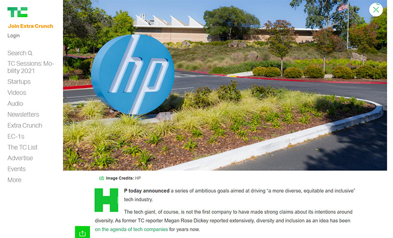
Take for example the simplicity of TechCrunch. This multi-million dollar magazine site has built an entire brand with off shades of green.
This works because fancy textures and icons wouldn’t add much to the overall design. People visit TechCrunch for content so a simple recognizable branding works best.
Always consider what type of project you’re designing and the needs of the project before anything else. The project most likely contains all the answers you need, it just takes some creative thinking to build an interface that works.
Play with Simple Ideas
Try starting with 1-2 colors or a couple different shades of a single color. Mix these together and see what you get.
Reason being that it’s complicated to successfully mix multiple colors into a single design to create a color scheme. Of course, it can be done (amazingly I might add) but it takes a lot of practice.
So when first starting a design it’s better to start small rather than feel discouraged after trying too many colors at once.
When starting simple you should be looking for differences in color choices. Try to find a single color that could be dominant throughout the layout, compared with others that might work better as highlights or background colors. For example a CTA button should stand out against all other elements within view.
The dominant color is often used in a website’s branding so you’ll want to take that into consideration. Ultimately try to feel out how the design should look and focus on the larger elements first.
Once you choose a dominant color that you like it becomes easier to find matching colors.
Draw Attention with Contrast
When searching for a relevant color pair try to think about contrasting effects. A very common example is black (or dark grey) and white. These two colors produce a lot of contrast which makes it easier to consume information like the text on a page.
Contrast can be used with buttons, hyperlinks, image galleries, or any type of background/foreground combination. Attention can be pushed in a certain direction with the use of contrasting colors.
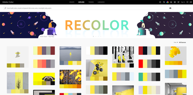
Try visiting Adobe Color’s explore page and do a search for “contrast”. You may be surprised how many color schemes have already been developed with high contrast in mind.
To learn more about these ideas check out this post covering the basics of contrasting colors and how they work together in digital UI design.
Learn to Match via Example
Spend time looking at other websites and study their layout styles. Learn from their color choices, try to think critically about why certain colors were placed together.
The subject of colors in web design is long and almost unending. There really is no correct answer, only better choices within the context of a single project. So if you can find similar projects that have noteworthy color schemes you can learn by studying how they operate and what makes them feel so unique.
Start by searching in Google or by making a list of similar websites relevant to your project. Alternatively, you might try CSS galleries like Siteinspire or Webdesign-Inspiration. Both have methods for sorting entries by color so you can browse through designs with a certain color range.
Popular Color Tools
The best way to dynamically design a color palette is with a color tool. There’s a handful of these online for free and they all work to solve different problems.
The following tools are great for any designer from beginner to seasoned expert. These tools can help you test color ideas or find matching colors to go with a pre-selected color choice. Granted these are not perfect tools and you’ll want to use some of your own creative ingenuity, but these tools are perhaps the best place to start when designing a new project.
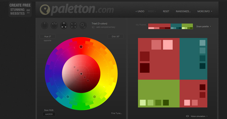
Paletton
Whether you have an idea in mind or need a place to start, Paletton is a fantastic color tool. It can generate suggestions for color palettes based on a main color plus a color style(monochrome, triadic, etc).

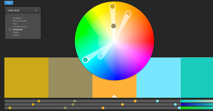
Adobe Color CC
Originally named Adobe Kuler, the new Adobe Color CC web app is a free tool built right into your browser. You simply choose a color scheme style and drag around color choices to build your new design scheme. You’ll get full RGB/Hex details and most colors can be adjusted to include lighter/darker hues that still fit within the scheme.

Material Palette
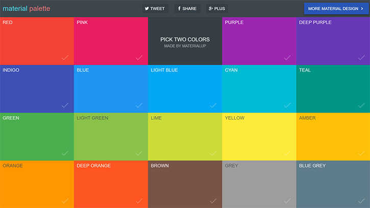
My favorite thing about Material Palette is how you get to see a preview of the colors in action. The webapp pairs 2 colors together into a mock UI design with dominant and subordinate colors. Although the site is limited to material design colors, the live testing feature is a great way to train your eye and learn which colors often work best together.

COLRD
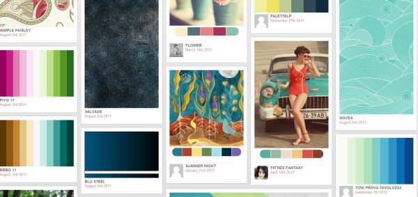
Colrd has a database of single colors, palettes, gradients, patterns, and images, but some of these categories are more useful than others. Choose a palette to edit with sliders that suggest similar colors, note the hex numbers, or view similar results.
Best Feature: A CSS snippet is available for recreating each of the gradients, which makes this site particularly useful within that section.
Downside: Other sections (particularly the single-hued one) are of limited use, and search results are difficult to narrow down by anything other than popularity.
Color Explorer
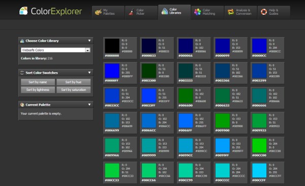
Color Explorer is the destination for working with pure color, ignoring the intermediaries of patterns, gradients, or images. You can import and alter your own color palettes, explore standardized color libraries, analyze and convert hues, and much more.
Best Feature: Their Color Matching algorithm allows you to create various related palettes by selecting different combinations based on color theory, such as split-complementary colors.
Downside: Should you be searching for inspiration that goes beyond simple color, this isn’t the site for you.
Tineye
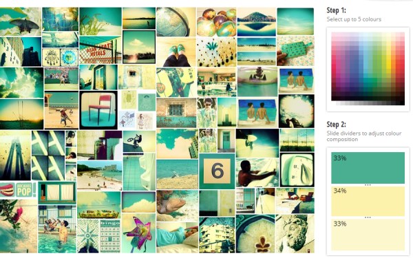
Tineye operates along the same lines as Shutterstock Spectrum, except that it culls its imagery from the creative commons. Using a panel of up to five colors, you can adjust the percentage of each; your image results will fluidly reflect the changes you make to your palette.
Best Feature: The ability to stipulate the weight of each color gives you perfect control in finding the exact combination of hues.
Downside: There’s no way to narrow results by topic, so if you need an image in the right color palette and of the right subject, you may be in for a lengthy search.
As you can see, each of these sites has a particularly strong point; a powerful tool that works exceptionally well for a specific need. And using a combination of them all should give you the right resource for any situation when you find yourself lacking in color inspiration.
If you need more color resources check out these related posts:


